Driving the public debate on DC’s multi-modal transportation vision
Statistics
- Client
- The District Department of Transportation
- Awards
- Red Dot Design Award
- CSS Design Award – site of the day
- The Webby Award – Honoree
- BNO Infographics Jaarprijs
- Communication Arts Design Award
- European Design Award – Finalist
- Awwwards – honorable mention
- Deliverables
- Microsite
The challenge
The District of Columbia - District Department of Transportation (DDOT) asked CLEVER°FRANKE to create a digital experience that informs citizens, commuters and stakeholders on the opportunities and solutions for the growing mobility challenges within the district.
Value delivered
Using data visualization to inform and shape the public debate and empower people to talk about a variety of mobility topics and opportunities including accessibility, reliability, and mode options.
Background
The District of Columbia has one of the most elaborate and multimodal transportation systems in the USA. Residents, commuters and visitors can use motor vehicles, taxi cabs, public transit, bicycles and the pedway network to access goods and services across the District.
However, traffic congestion, poor accessibility and poor travel time reliability are issues that have a negative effect on these means of transportation.
DDOT is working to understand these challenges and to better define a program of improvements that addresses these.
Thorough research of congestion management studies and a two-day workshop with all DDOTs business stakeholders, traffic engineers and analysts provided valuable insights on the ‘pains’ and ‘gains’ of commuters. This laid the foundation of the design process hereafter.


Phases and toolkit items used
Solution
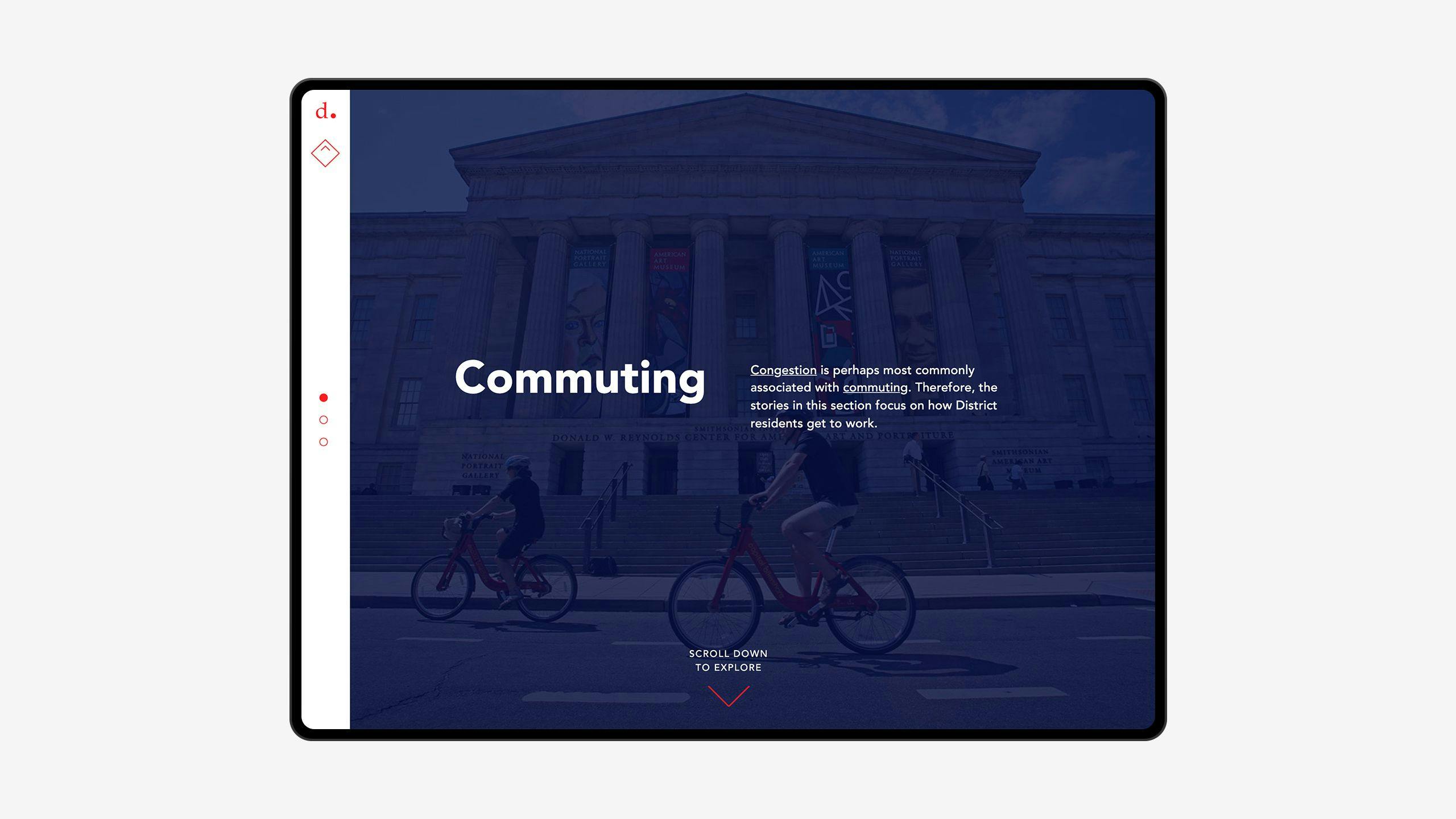
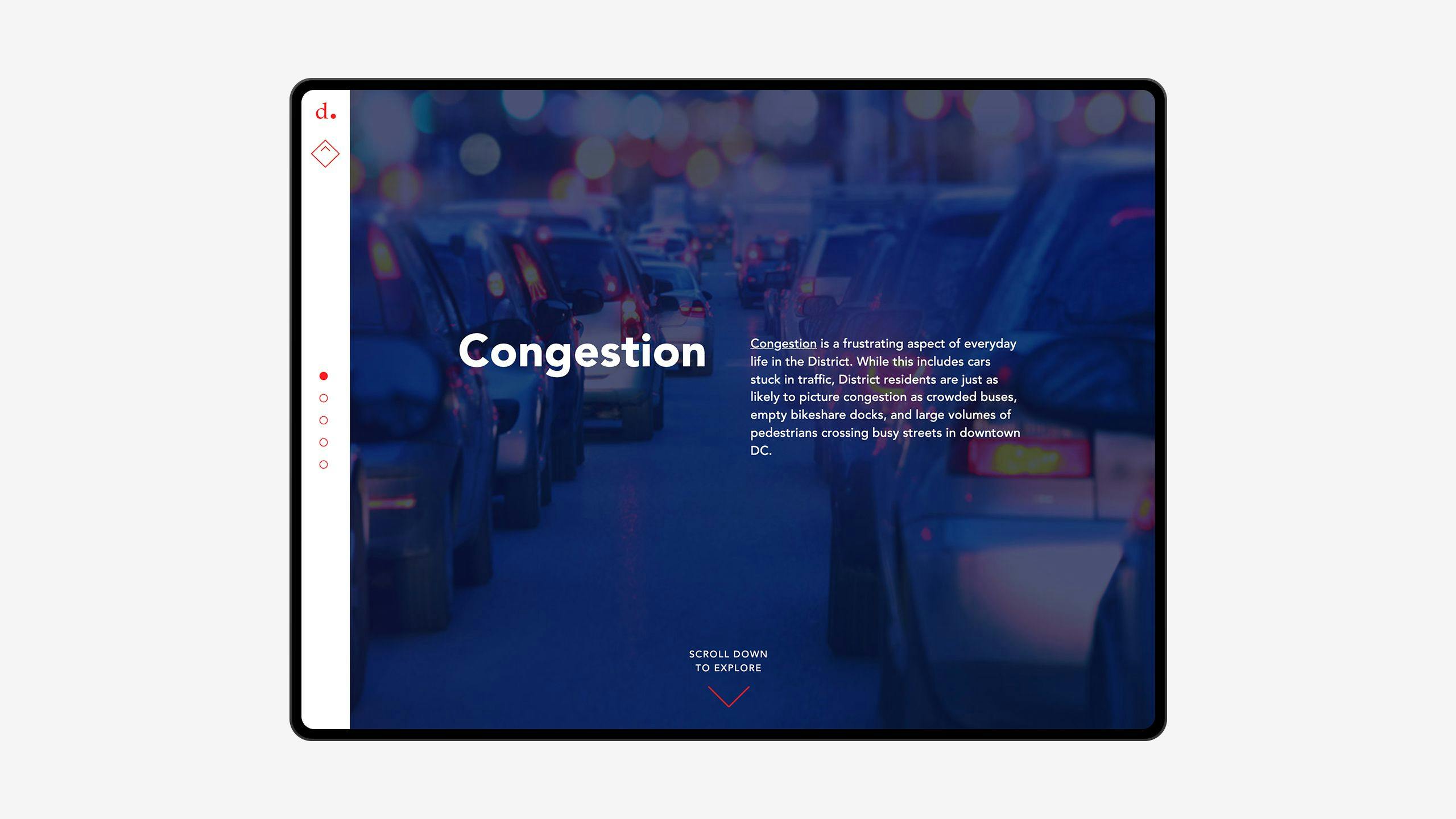
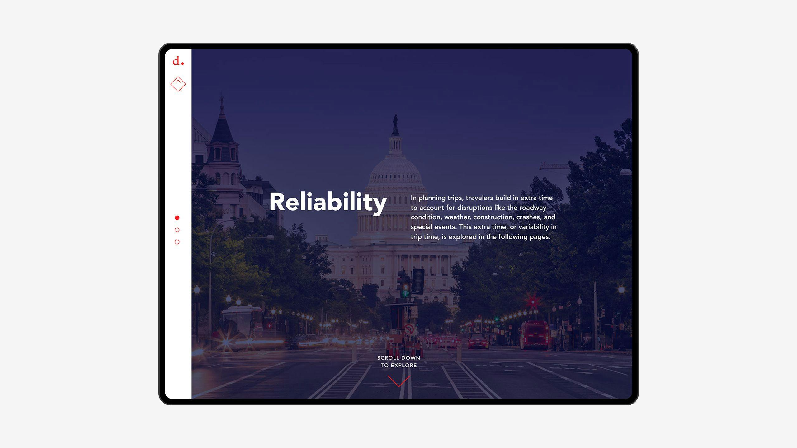
Every chapter begins by telling a story around a certain topic. A brief introduction outlines the topic and explains the challenges faced by the district. We employed captivating, purposefully photographed imagery to complement each topic.
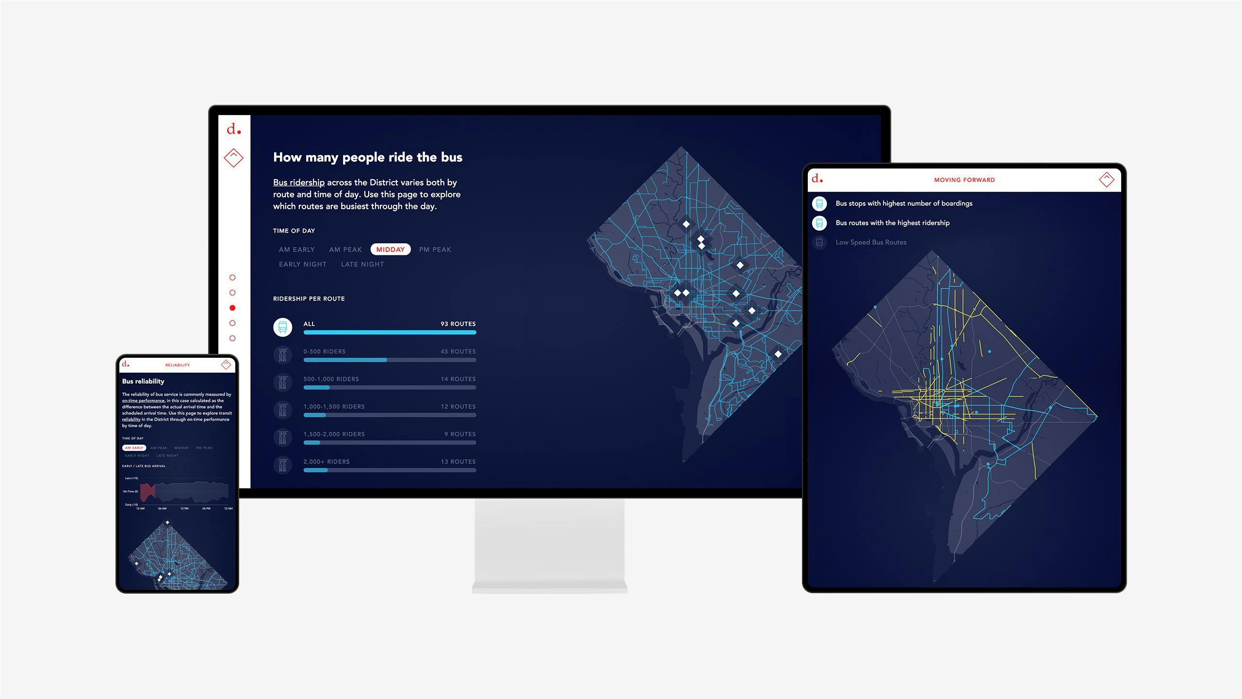
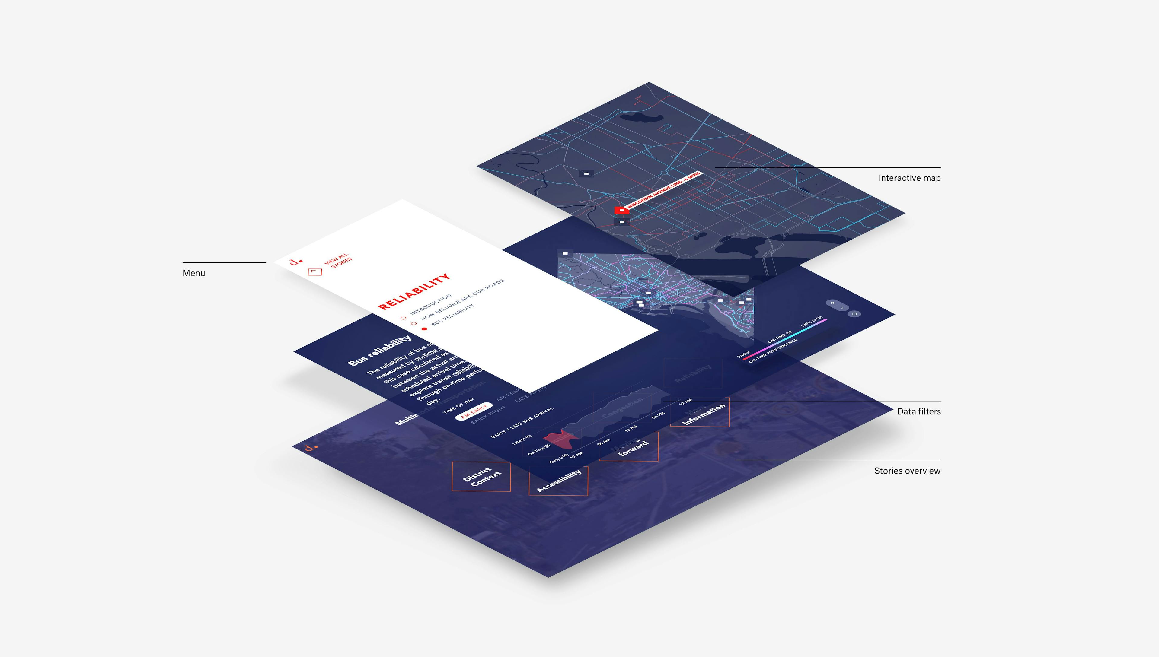
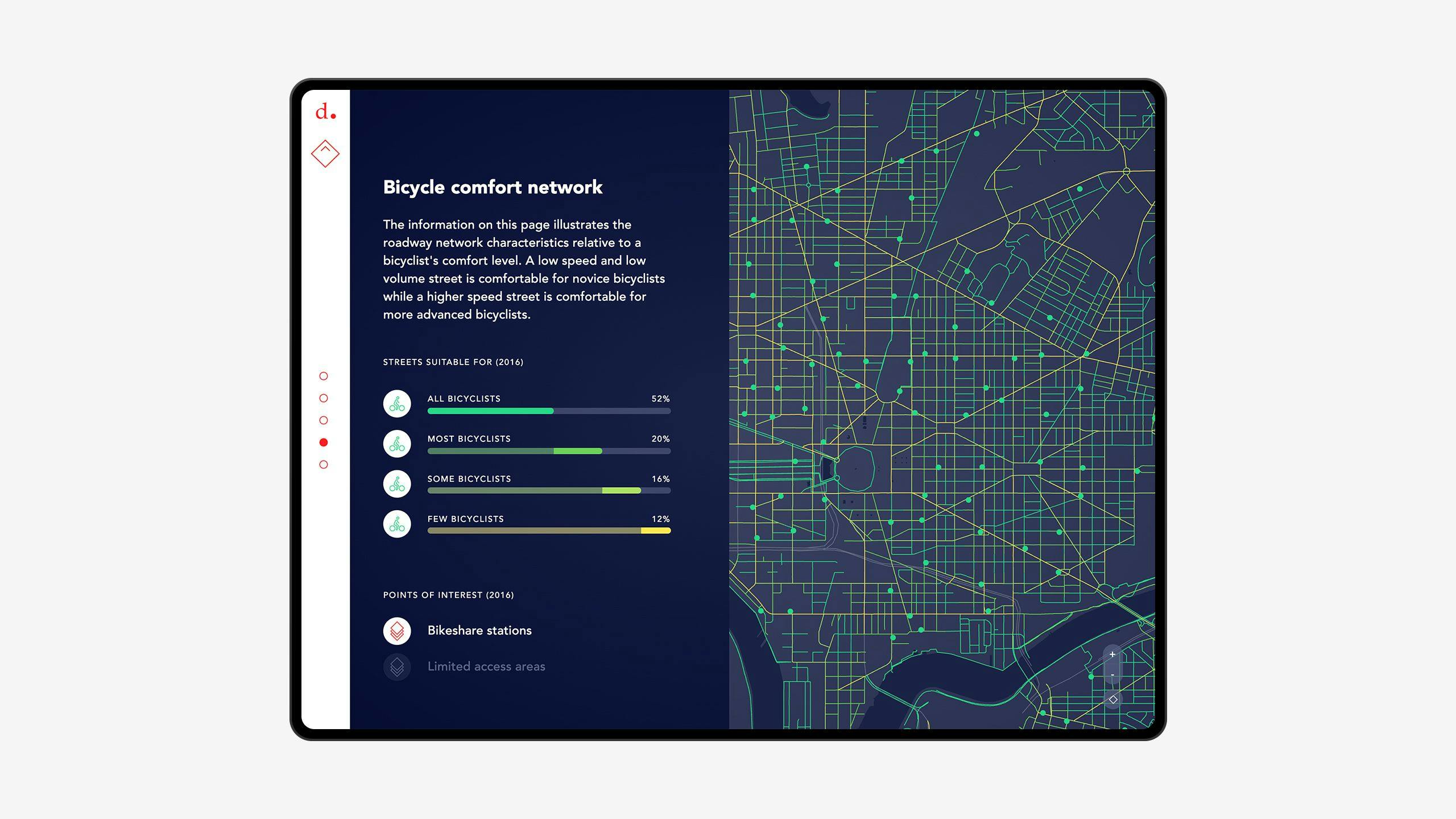
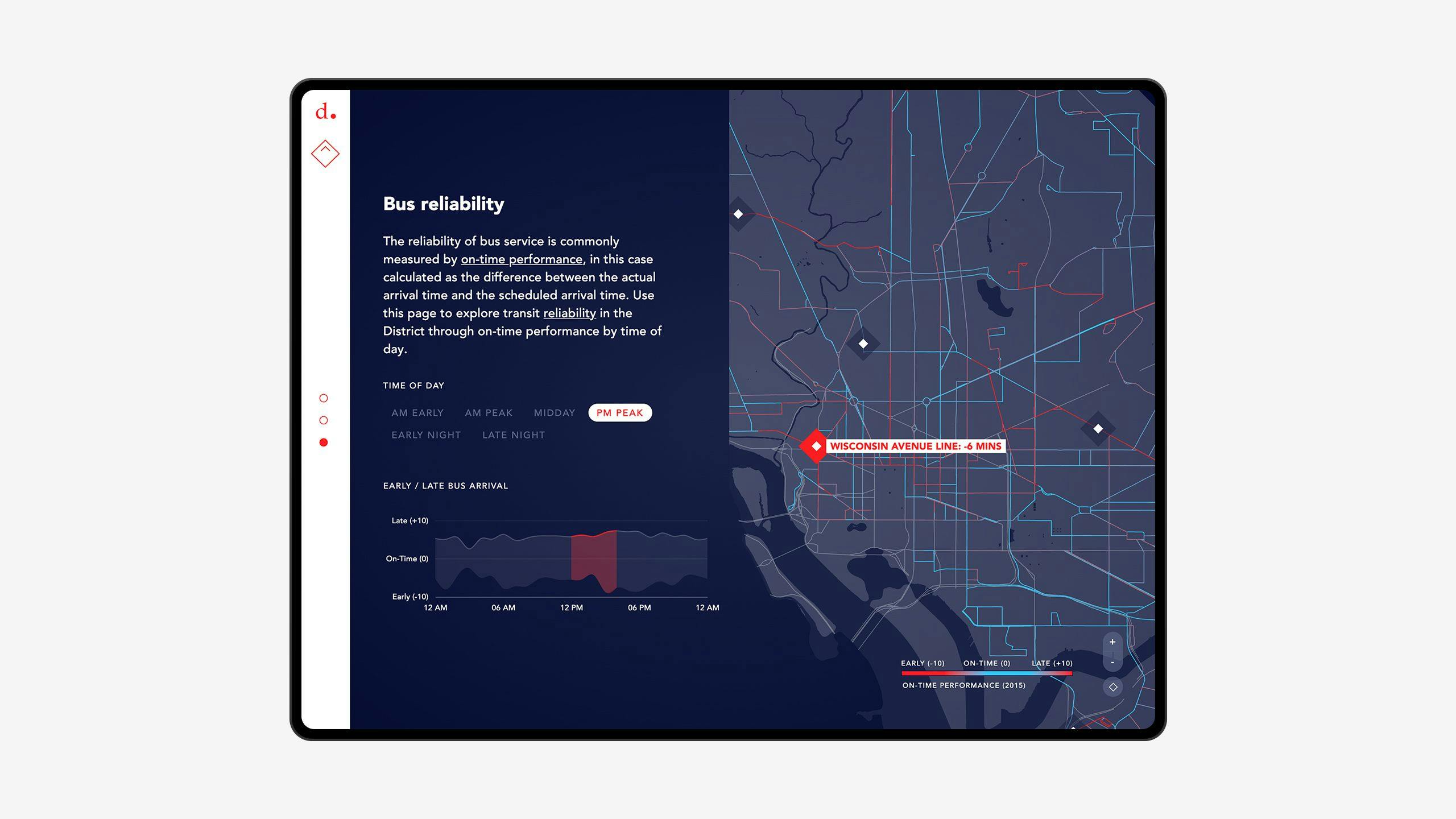
In subsequent views, a map of the district remains fixed on the right side of the page. Being a constant element on every page, different datasets and information are overlaid on the map as the user scrolls through the chapter.
Additional information, highlights, variables and map controls allow the user to dive further into the topic. The interplay between the map on the right and the controls on the left creates a dynamic, yet clear experience.
The overall minimalistic style, accentuated by the lines and shapes of the map, dictates the tone of every page. The clean, elegant look and feel drive the focus to the content, drawing the user into each topic. Throughout the website, four colors are used consistently to indicate different modes of transport, while red is used as a universal accent color.

Landingpages
Each section has a different landing page that strengthens the narrative and highlights the main findings, guiding users in the exploration.
Datavisualizations
The screen is split into two sections: the left side contains the overall narrative and specific visualizations, and the right side always shows the map. The text contains the most important insights on the topic and is complemented with visualizations that show specific breakdowns of the data. The charts are interactive, and the map is updated to show specific slices of the data. The map is a persistent element, always showing the complete picture through street-level data. Highlights on the map allow people to see specific points where the data is interesting. Users can zoom in on the visualizations and select several parameters to discover more details.
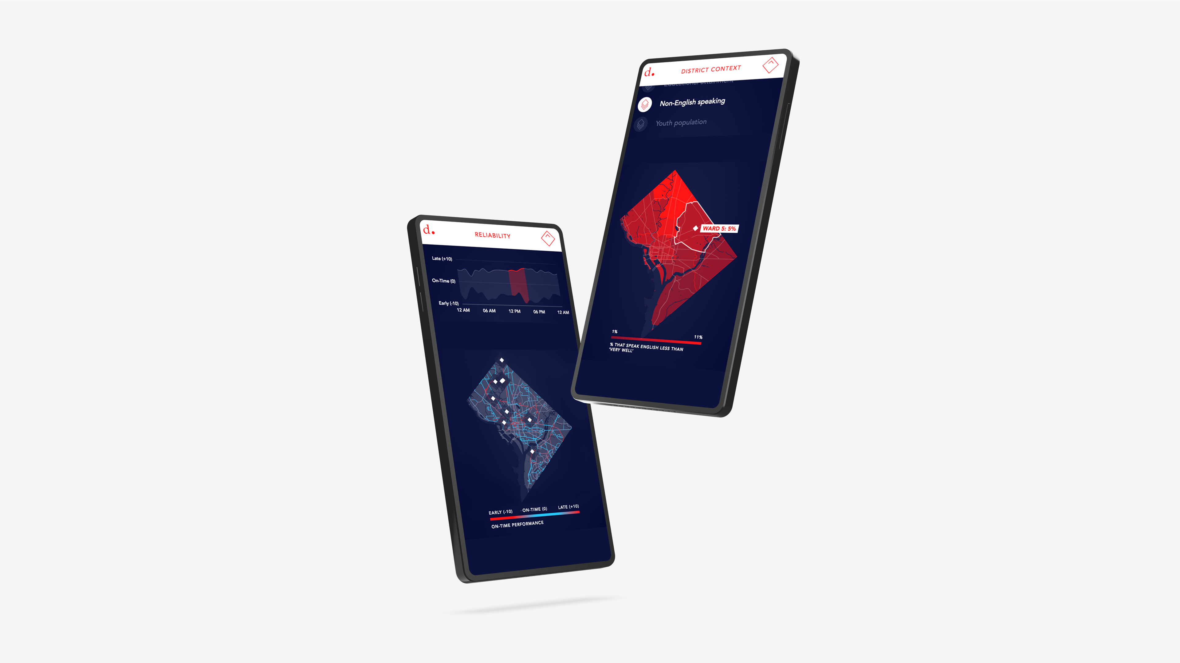
Mobileoptimized
Our component-based design and development workflow allowed us to easily adapt the design to a small screen layout.
Technology
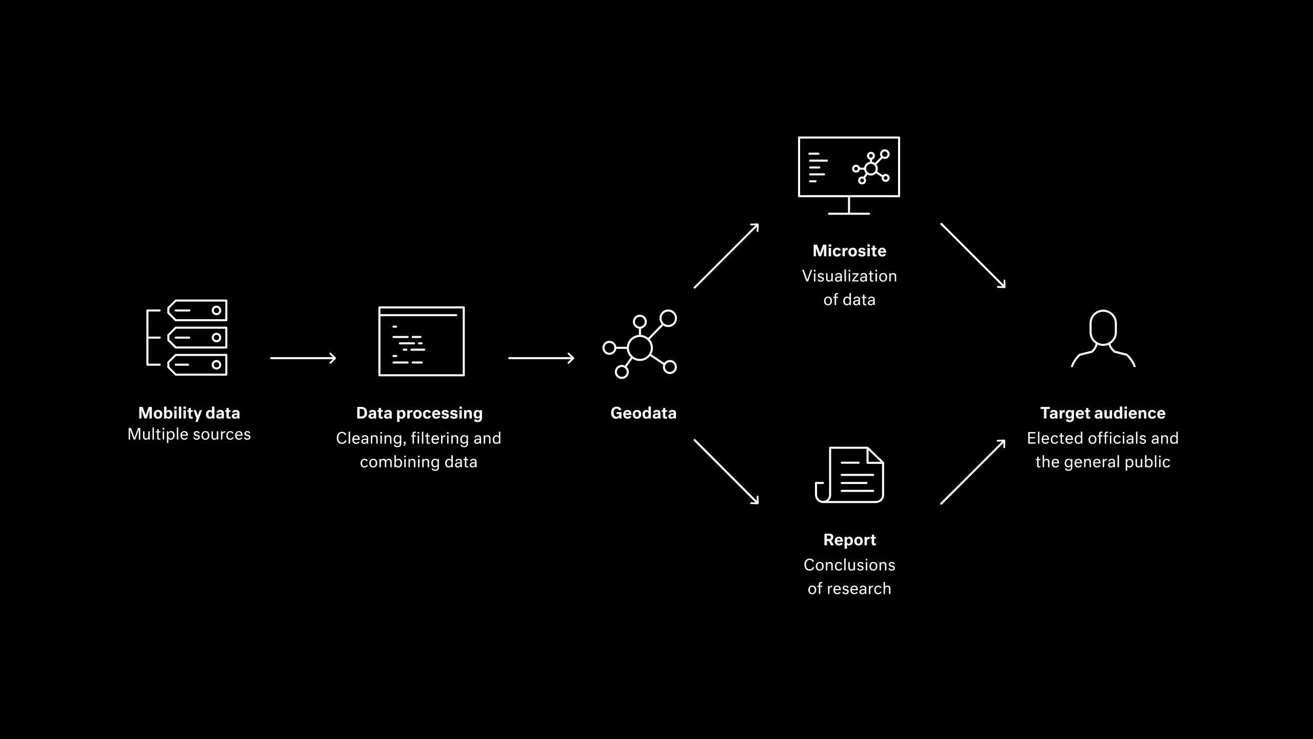
The data for this project, aggregated from several data sources, is loaded, filtered and finally visualized on custom-made maps in the microsite. The microsite allows in-depth exploration of the data based on selections made by the user.
For easier maintenance, we have automated the conversion from shapefiles to GeoJSON files as much as possible with scripts. These GeoJSON files are then converted to TopoJSON files to reduce the file size.
The reports are based on the same datasets and are available to download on the microsite. These reports are less exploratory, but offer conclusions made by DDOT.
Results
The interactive, data-rich design of District Mobility provides an innovative platform for sharing the state of mobility and DDOT’s progress towards reducing congestion on our roads.
Leif Dormsjo, Director, DDOT