Telling inspiring stories with data in print
Statistics
- Client
- WIRED
- Awards
- SPD Medal – Gold
- Deliverables
- Interactive data visualizations
- Print visualizations
The challenge
“WIRED magazine is where tomorrow is realized.” It is the essential source of information and ideas that make sense of a world in constant transformation. WIRED reaches more than 30 million people every month through print and various online channels.
Data has an important story to tell, but data alone can be difficult to interpret. Turning complex data into compelling visual stories helps people grasp valuable insights and plays an invaluable communication role. To support storytelling and to help uncover insights, we regularly design data visualizations for the popular and groundbreaking technology magazine.
Value delivered
Giving readers an instant understanding of complex data and telling the stories that lie hidden beneath the surface.
Phases and toolkit items used
BillGatesissue
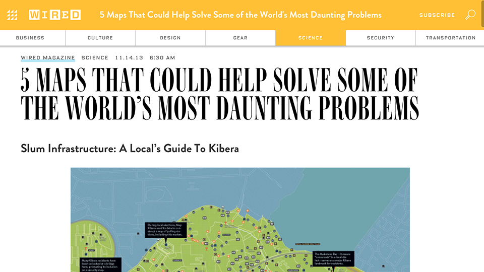
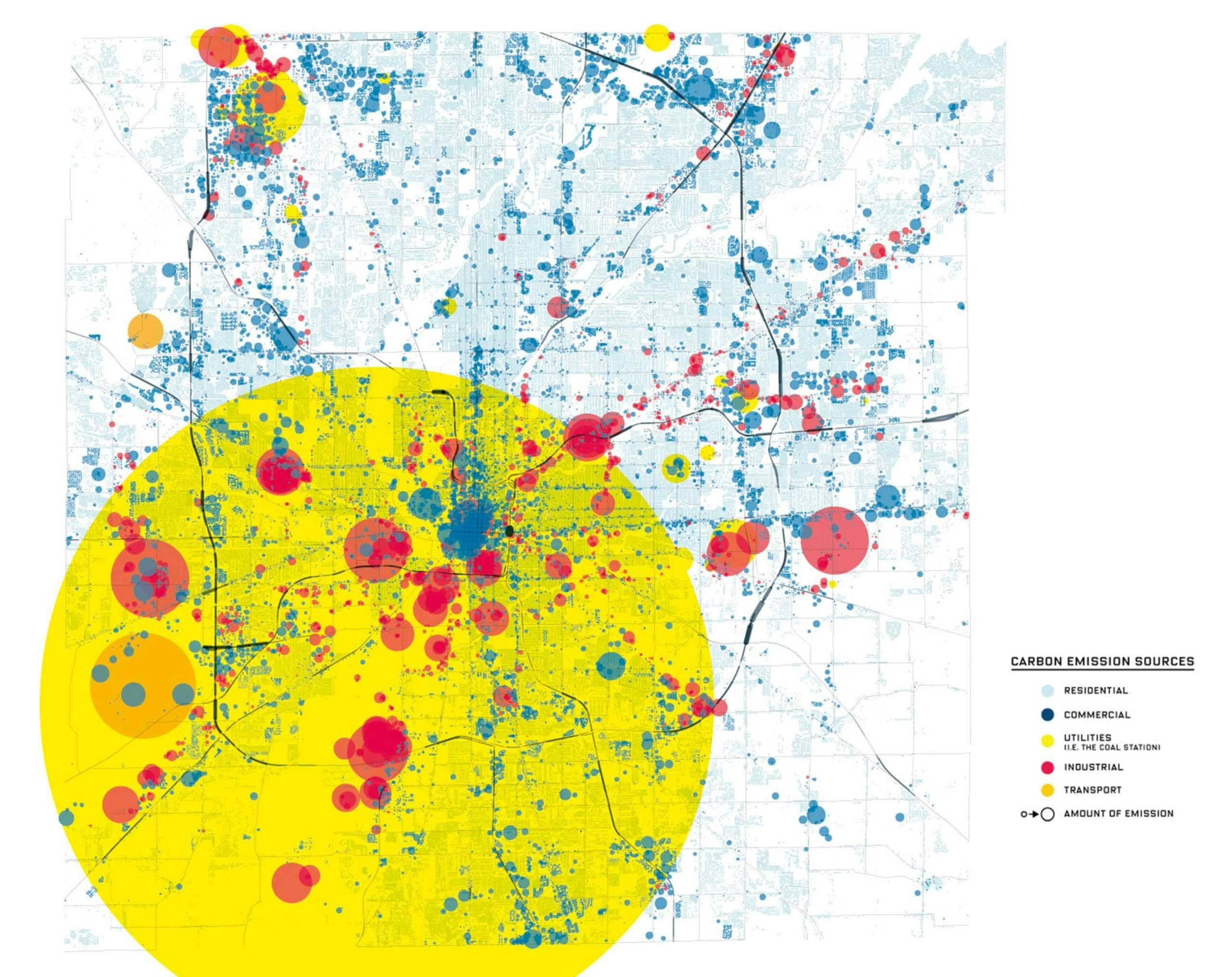
Bill Gates was invited to be the guest editor of WIRED’s December edition 2013. He included five maps that ‘could help solve the world’s most daunting problems’. Two of these, one concerning the performance of US hospitals, the other illustrating carbon emissions in the city of Indianapolis, were designed by us.
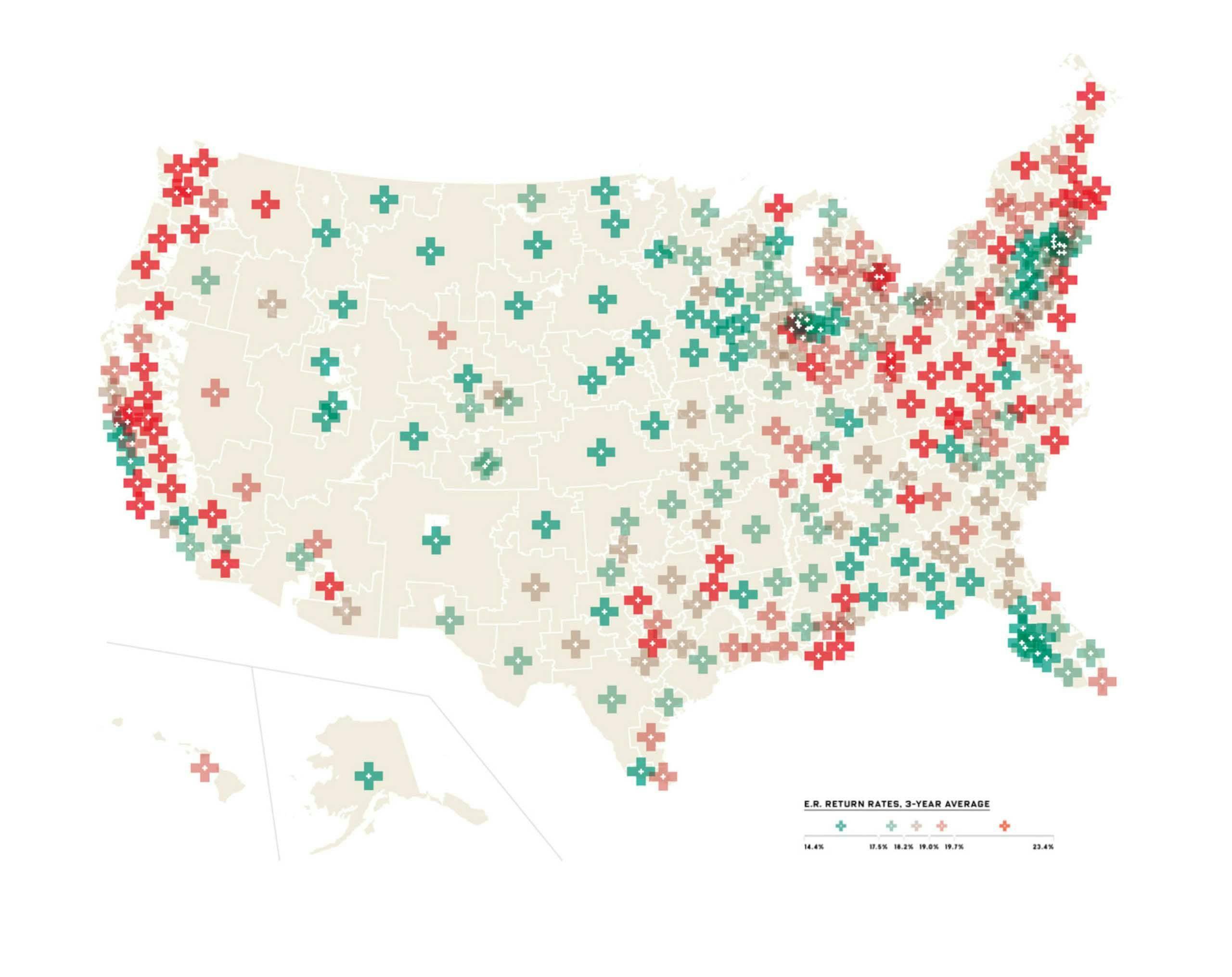
IntroductionbyBillGates
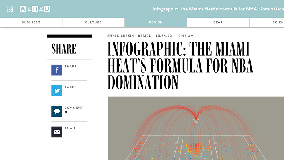
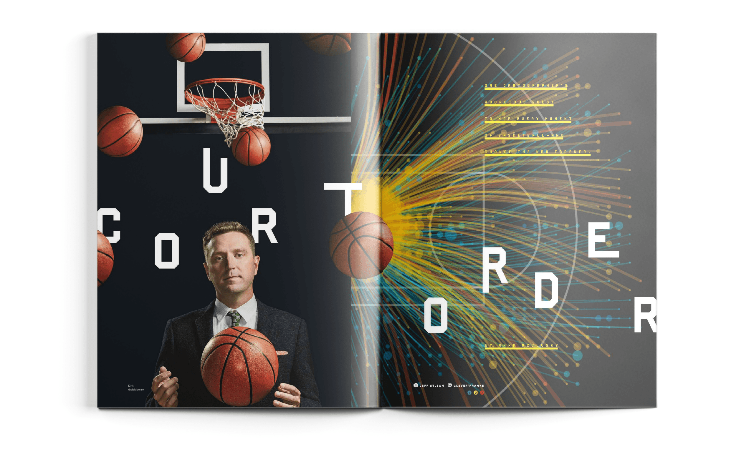
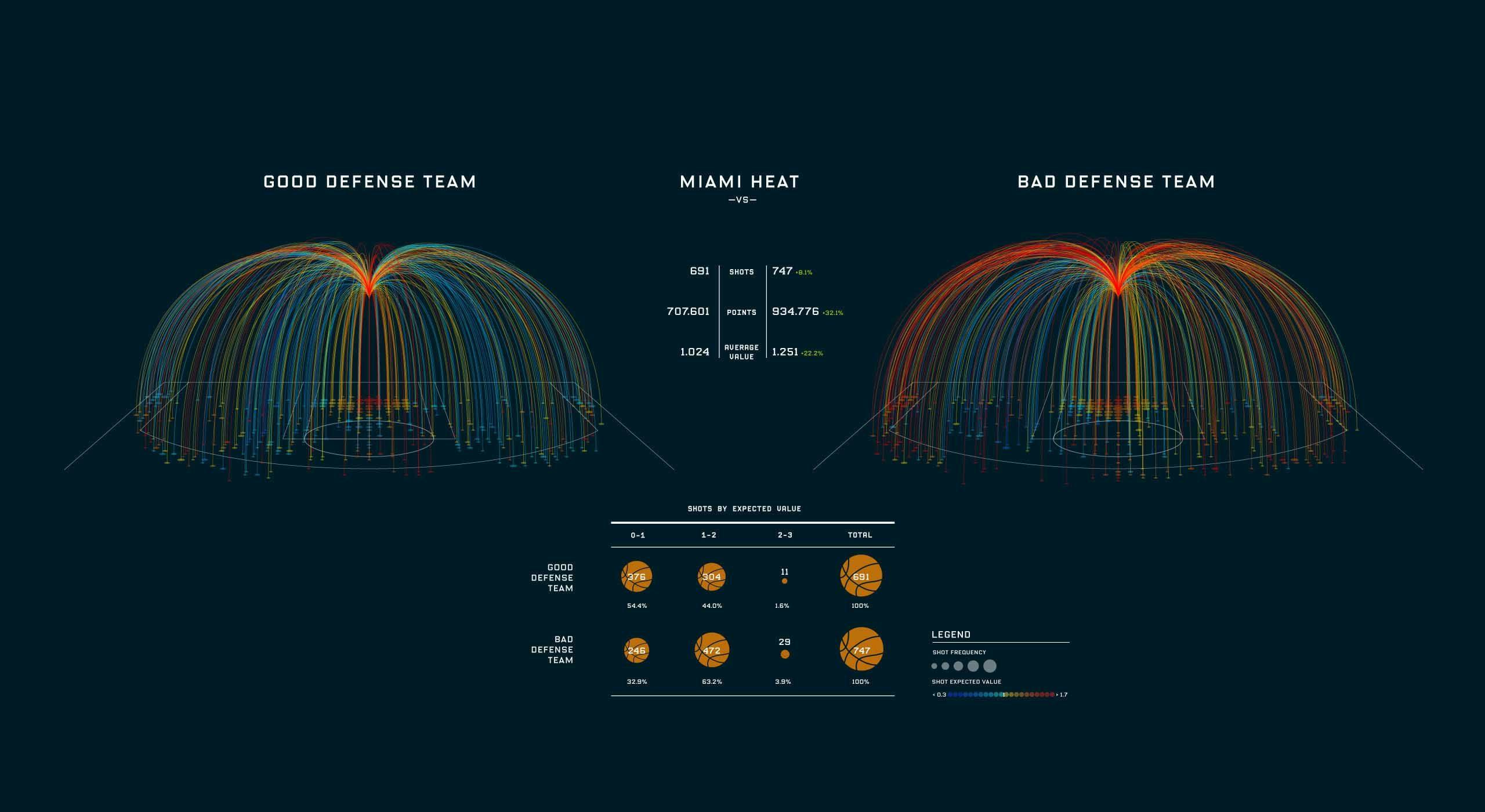
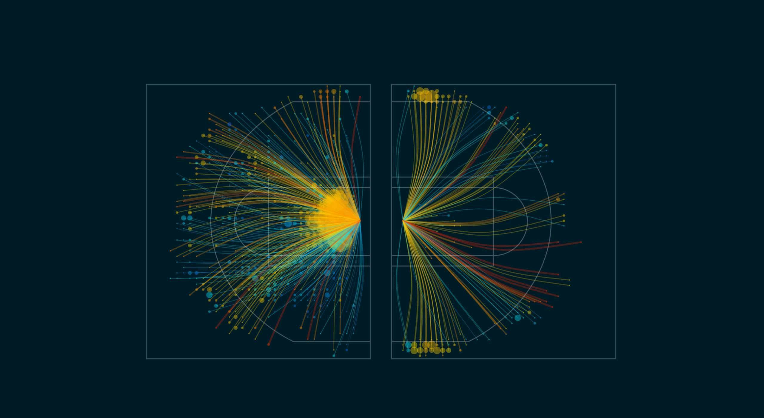
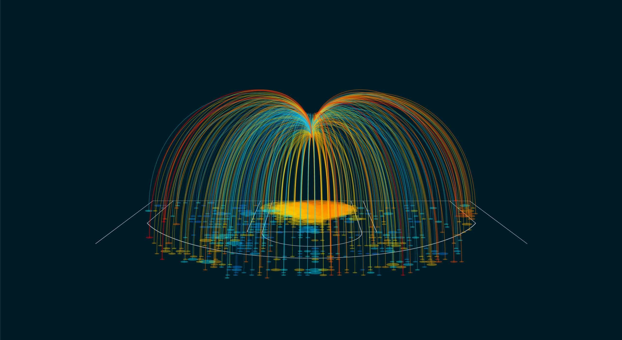
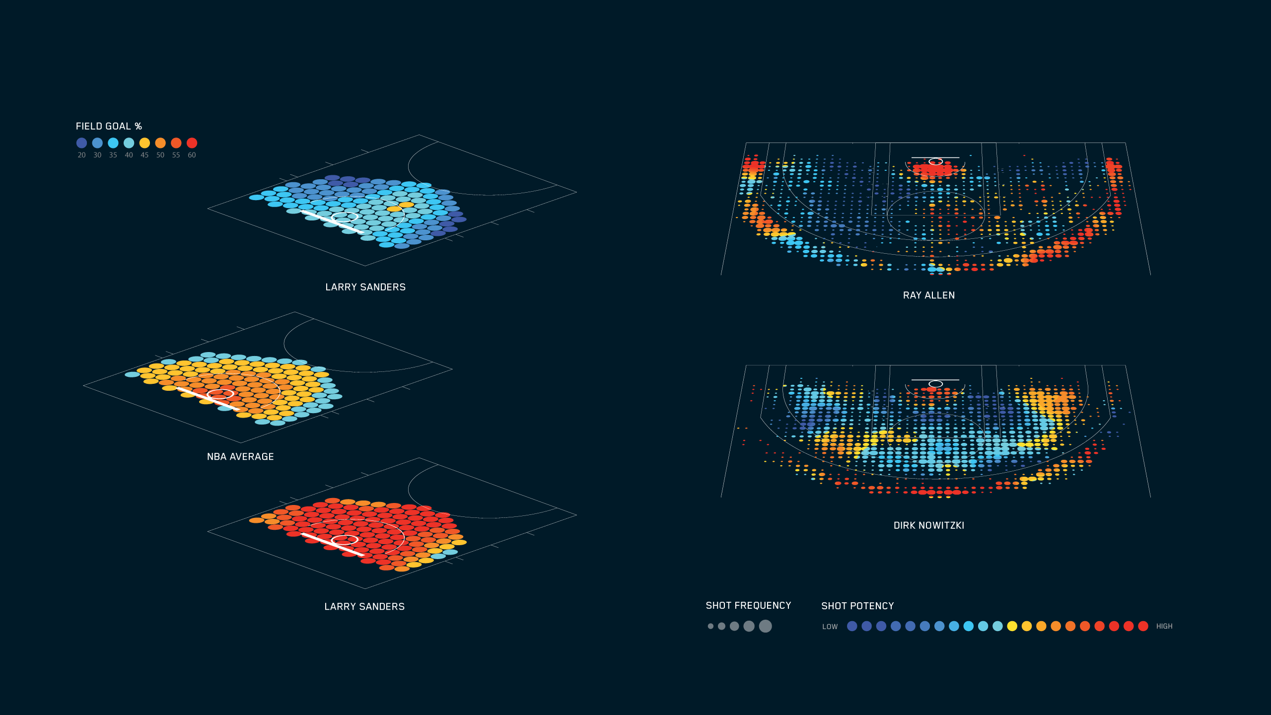
Basketball
With the new basketball season approaching, we created a visualization for WIRED about the basketball team Miami Heat. It visualizes how often players shoot from each position on the court, and how many points those shots delivered. Ever since the book ‘Moneyball’ was published in 2003, interest in the value of statistics in sports has been on the rise.
The result shows that while the number of shots doesn’t differ much, Miami Heat players are more efficient in taking their 3-point shots. This visualization was created using a dataset from Accenture.
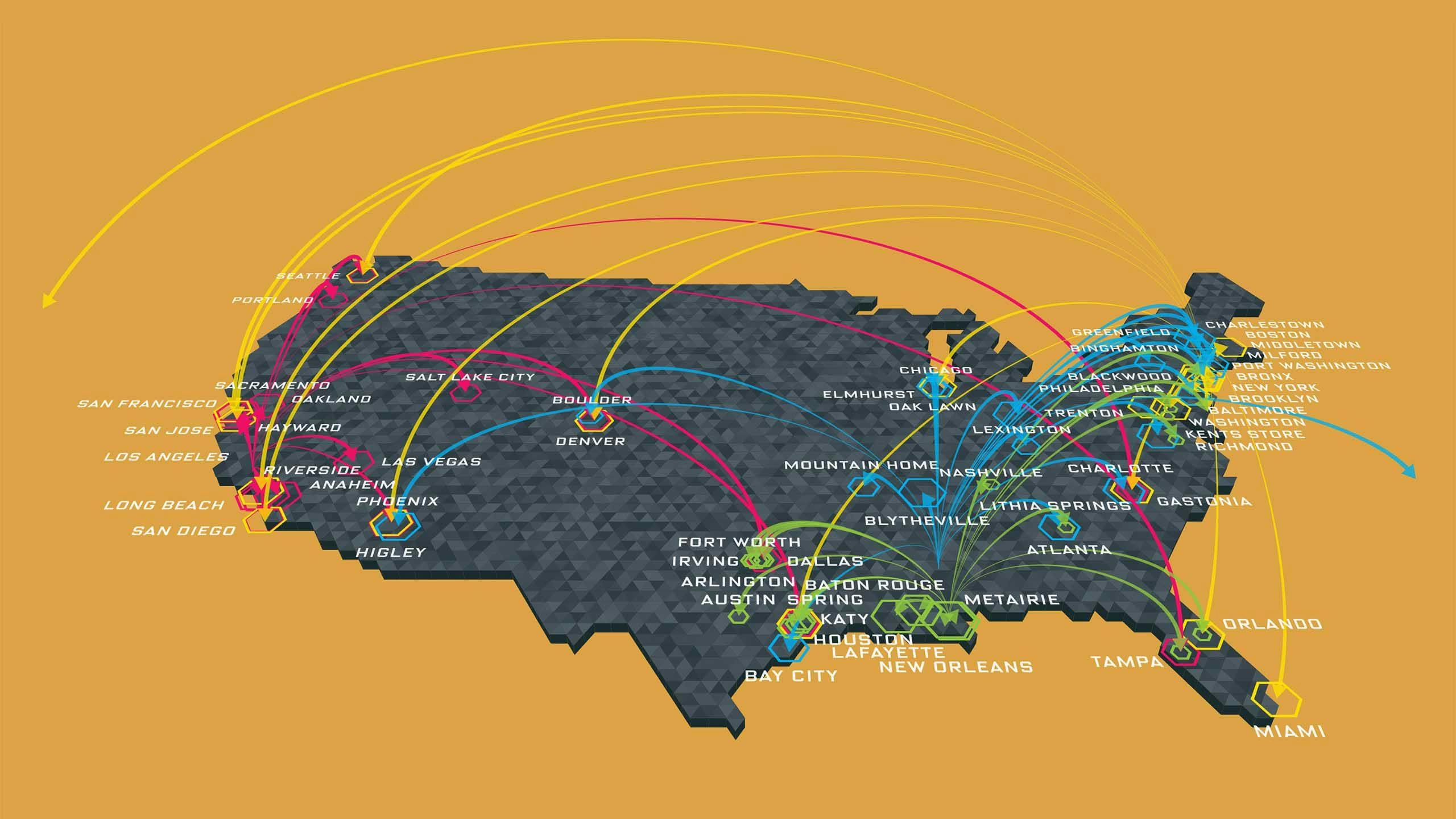
HipHopaudience
In the summer of 2015, 20 years after they dropped “36 Chambers”, Wu-Tang Clan released a limited-edition anniversary album. The legendary East Coast band’s fan base may reach far beyond Shaolin (that’s Staten Island), but hip hop has a lot of sub-genres — bounce, trap, TK — and most of them tend to stick closer to home.
To figure out which genres spread (and to where), Glenn McDonald, a data scientist at music intelligence service, The Echo Nest, used numbers from his corporate parent Spotify to quantify where the genre started and who’s listening.
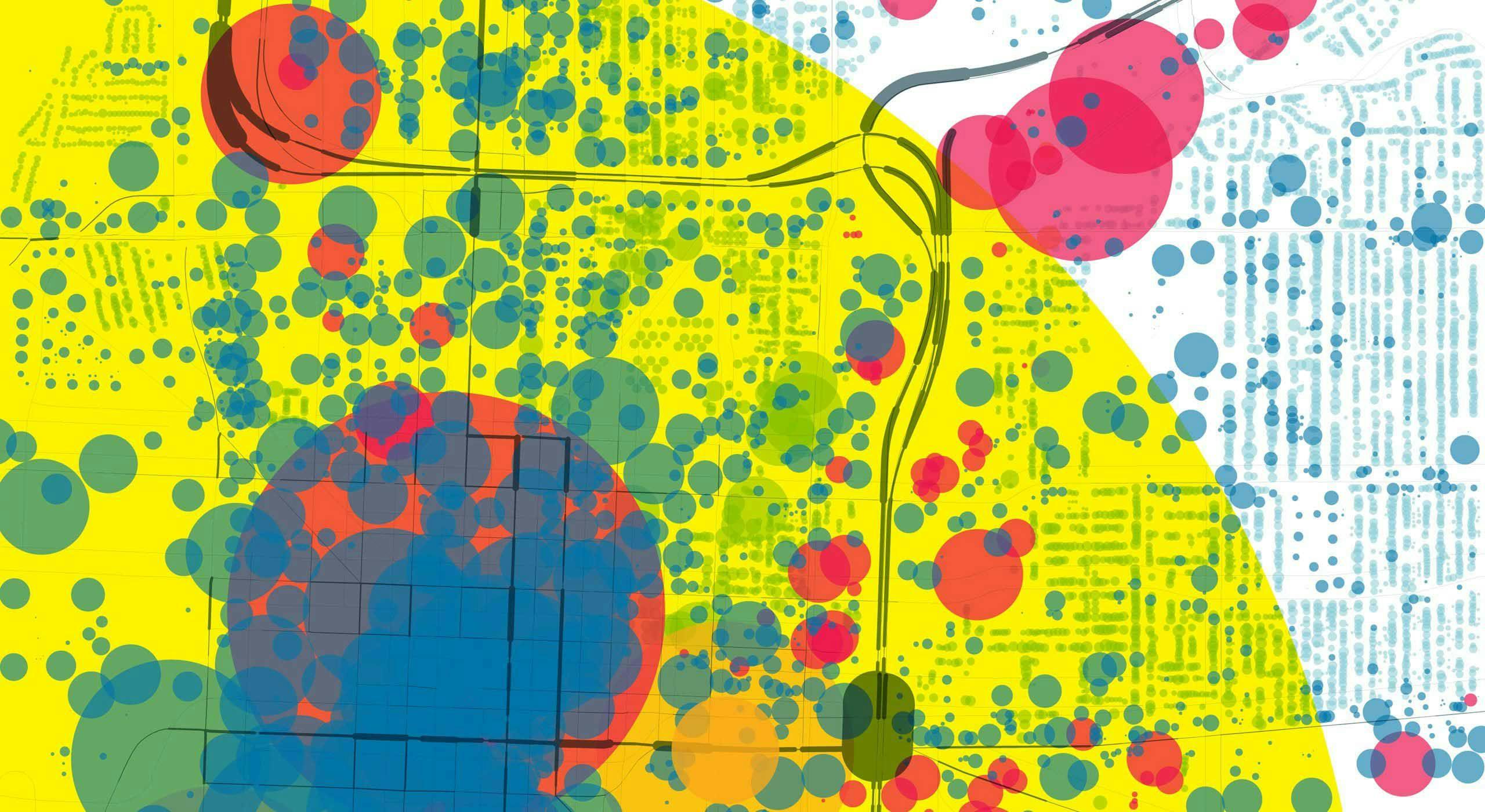
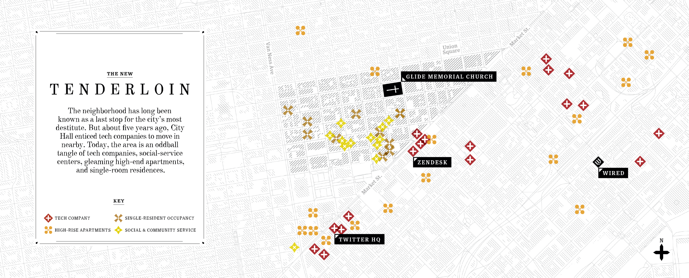
Tenderloin
The Tenderloin is a neighborhood in downtown San Francisco, California. The Tenderloin has historically resisted gentrification, maintaining a seedy character and reputation for crime. The neighborhood has long been known as the last stop for the city’s most destitute.
However, about five years ago, City Hall enticed tech companies to move in nearby. Today, the area is an oddball tangle of tech companies, social service centers, gleaming, high-end apartments, and single-room residences.
Results
I think we’ve all been impressed to learn what a great tool digital maps can be. Here is a look at some dynamic data-rich maps that help inform everything.
Bill Gates / Founder of the Bill and Melinda Gates Foundation