The official source of information on the COVID-19 pandemic in the Netherlands
Statistics
- Client
- Rijksoverheid
- Partners
- RIVM
- Standaard Platform
- Ruigrok-Netpanel
- Awards
- Red Dot Design Award (x2)
- Deliverables
- Dashboard
The challenge
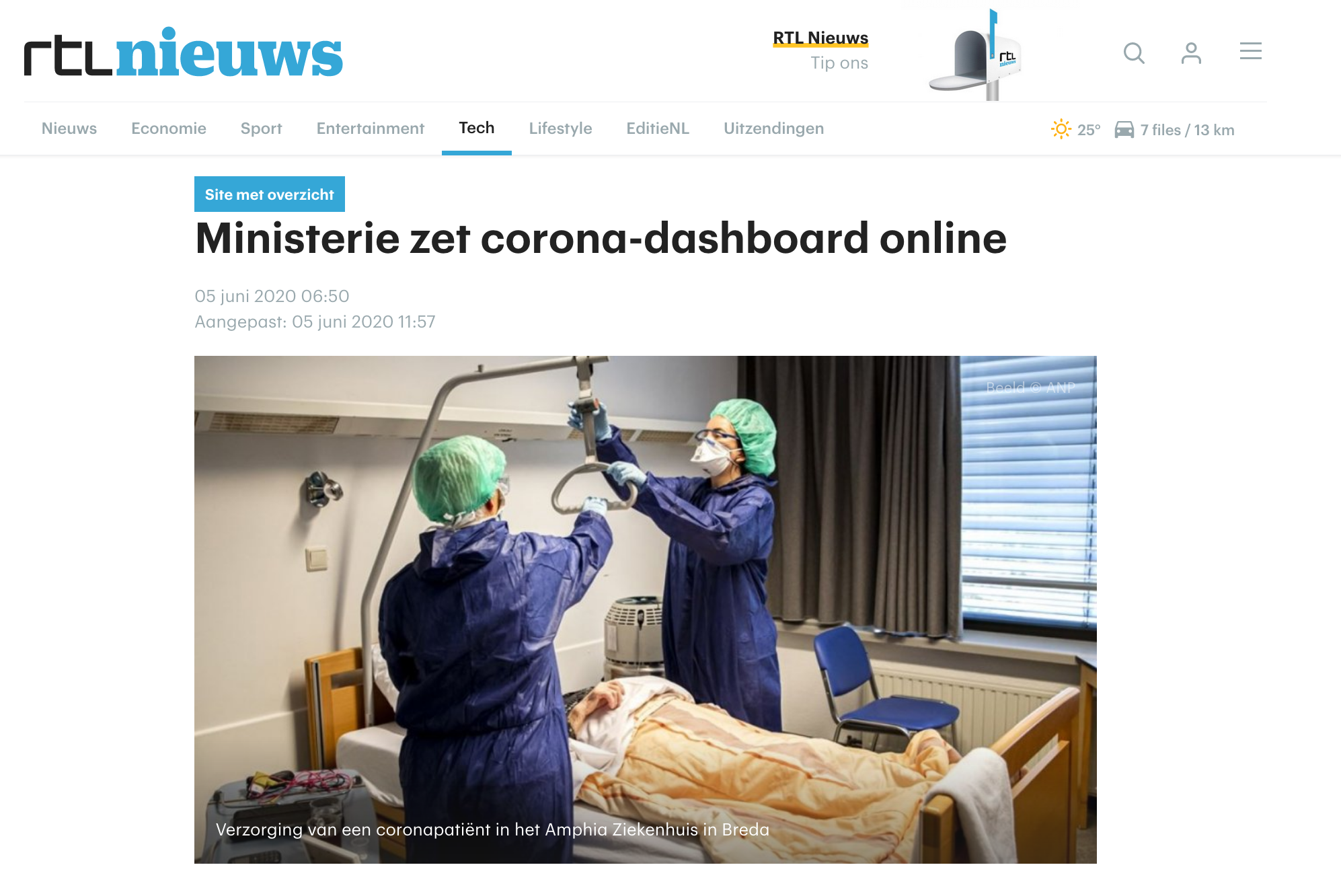
During the COVID-19 outbreak in 2020, the Dutch government deemed it essential to have a single point of information that provides daily insights into the evolution of the pandemic in the Netherlands.
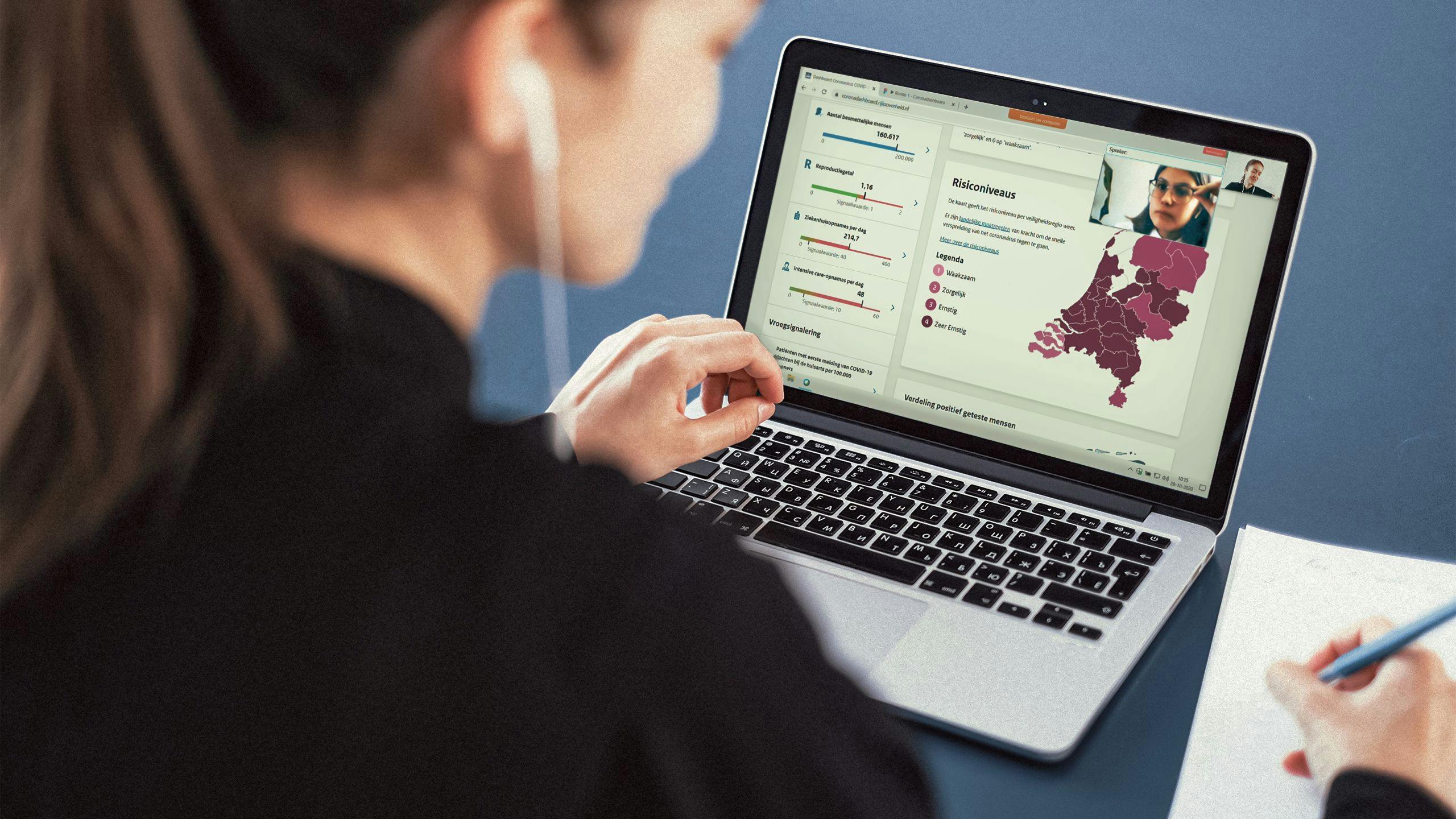
In May 2020, the Ministry of Health, Welfare, and Sport announced the introduction of an online dashboard that provides everyone in the Netherlands with the most up-to-date information about the current situation. CLEVER°FRANKE was asked by the Dutch Government to design and develop the official Corona Dashboard, which could not only go online within a few days, but also expand over time as more information about the pandemic became available.
Value delivered
The Corona Dashboard introduces a new form of daily interaction and communication between the government and the public, enabling a more open, data-driven government.
Background
It’s important to look forward as much as possible to steer even faster and more focused. Not only react, but also anticipate. That’s why we are working on a dashboard because it is just like driving: you want to know how fast you are driving, in which gear, and whether you can accelerate or need to brake.
Hugo de Jonge
Minister of Health, Welfare and Sport / 19 May 2020
After this announcement, C°F was asked to design and partially build the first version and get it online as soon as possible, expanding the dashboard over time by delivering a project team.
The C°F project team consisted of creative directors, strategists, project managers, user experience and testing experts, visual designers, data visualization experts, front-end developers, and dev-ops experts.
Phases and toolkit items used

Strategy
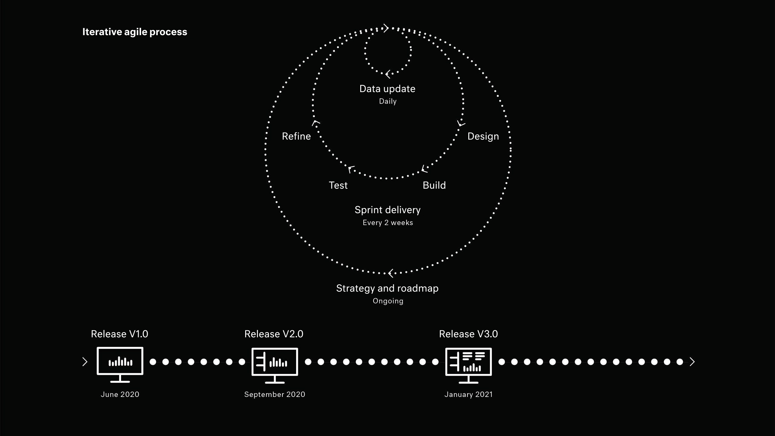
The platform was developed in consultation with many stakeholders and within a constantly evolving situation with varying data, insights, and measures. Without knowing what would happen next, we had to balance ad-hoc urgent changes and structured continuous development, coupled with concept and strategy focused on the dashboard’s long-term vision.
The iterative cycles consist of a daily release of new data every afternoon and a release of new features and improvements every two weeks. To keep the overall project goal and mission on point, we collaboratively updated the team vision and roadmap, which delivered three major releases with an updated design.
Throughout the process, we focused on telling a coherent, relevant, and understandable story to the public about a very complex subject. We wanted to enable all audiences to be able to read the data to build their understanding of this pandemic. To ensure the platform is adopted, we strived to find a balance between providing context to the data and explaining how to read it while staying as neutral as possible.
Solution
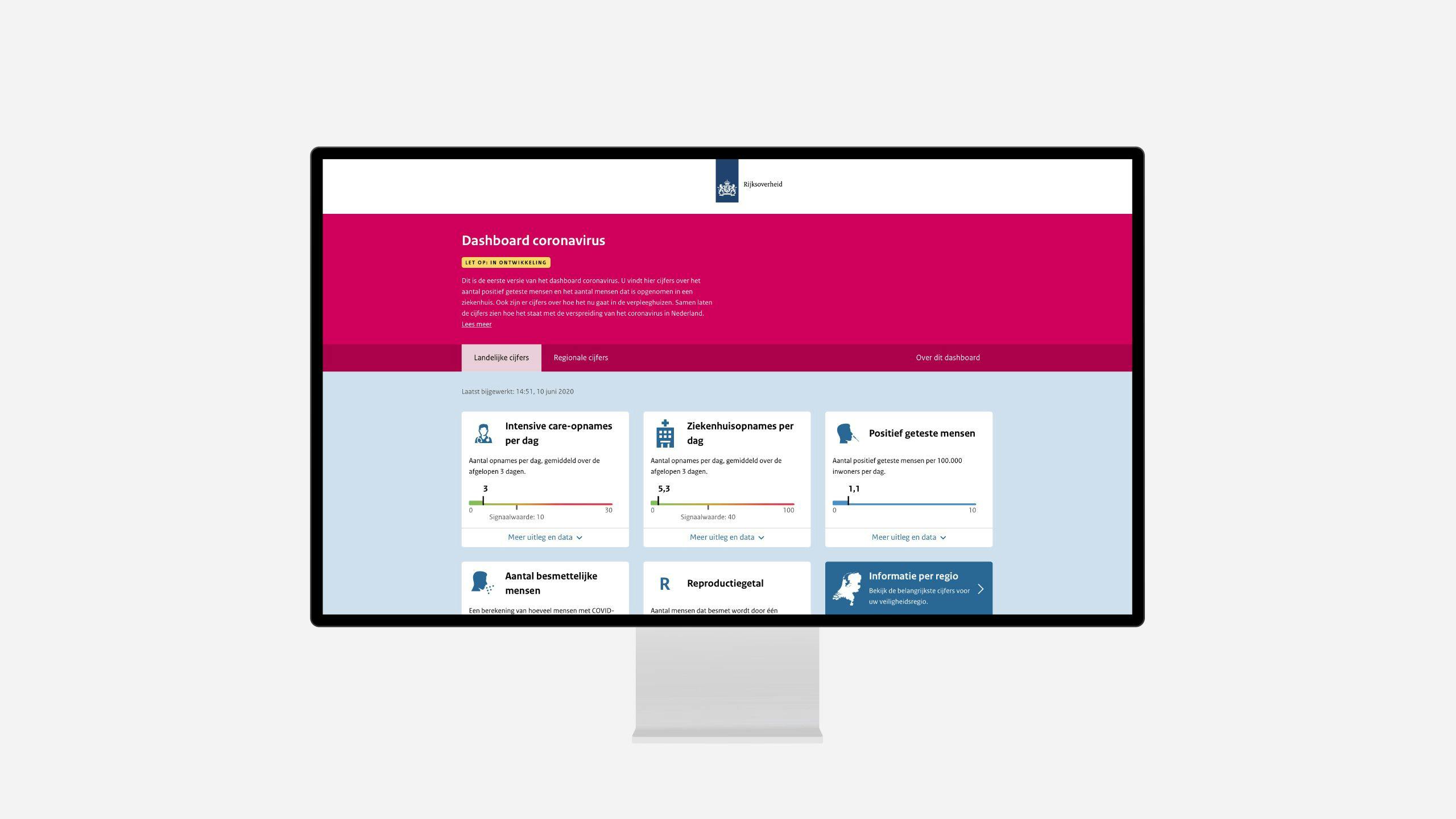
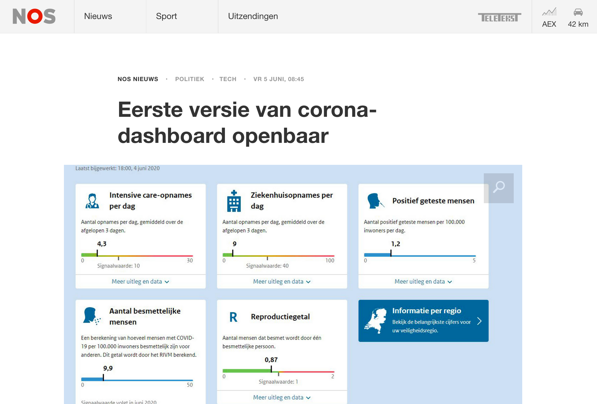
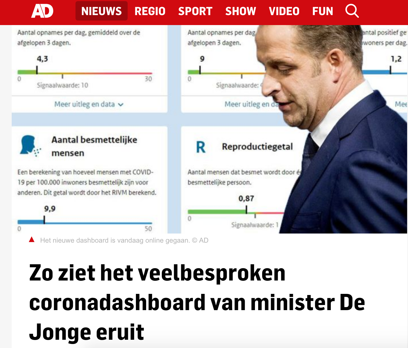
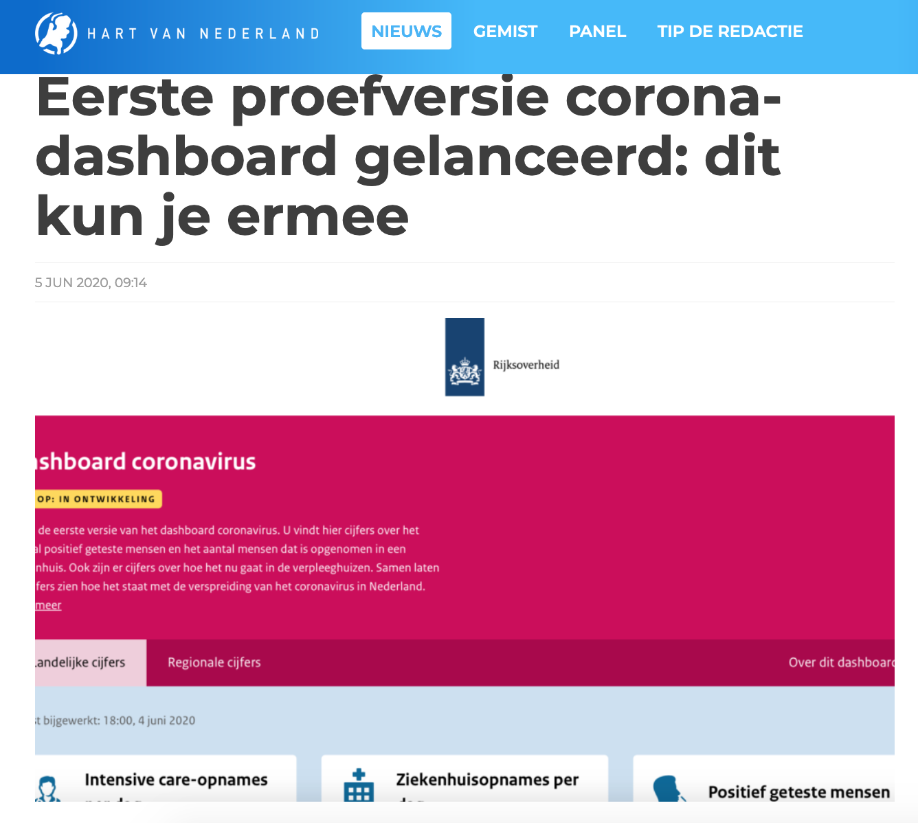
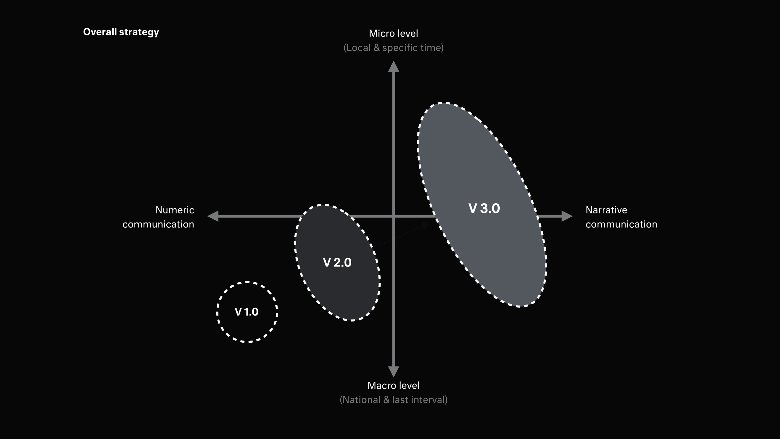
Version 1.0: Minimum viable product
The first goal was to publish the data as quickly as possible together with all the stakeholders and give visitors the needed context to interpret the data. To enable this, the team of Standard Platform made sure we had a development environment, and others took care of the data processing.
We focused on explaining to the audience what a dashboard is, what the different metrics meant, and what they could expect soon from the dashboard. Next to the presentation of values and metrics, we added several background pages that described the data source behind them.
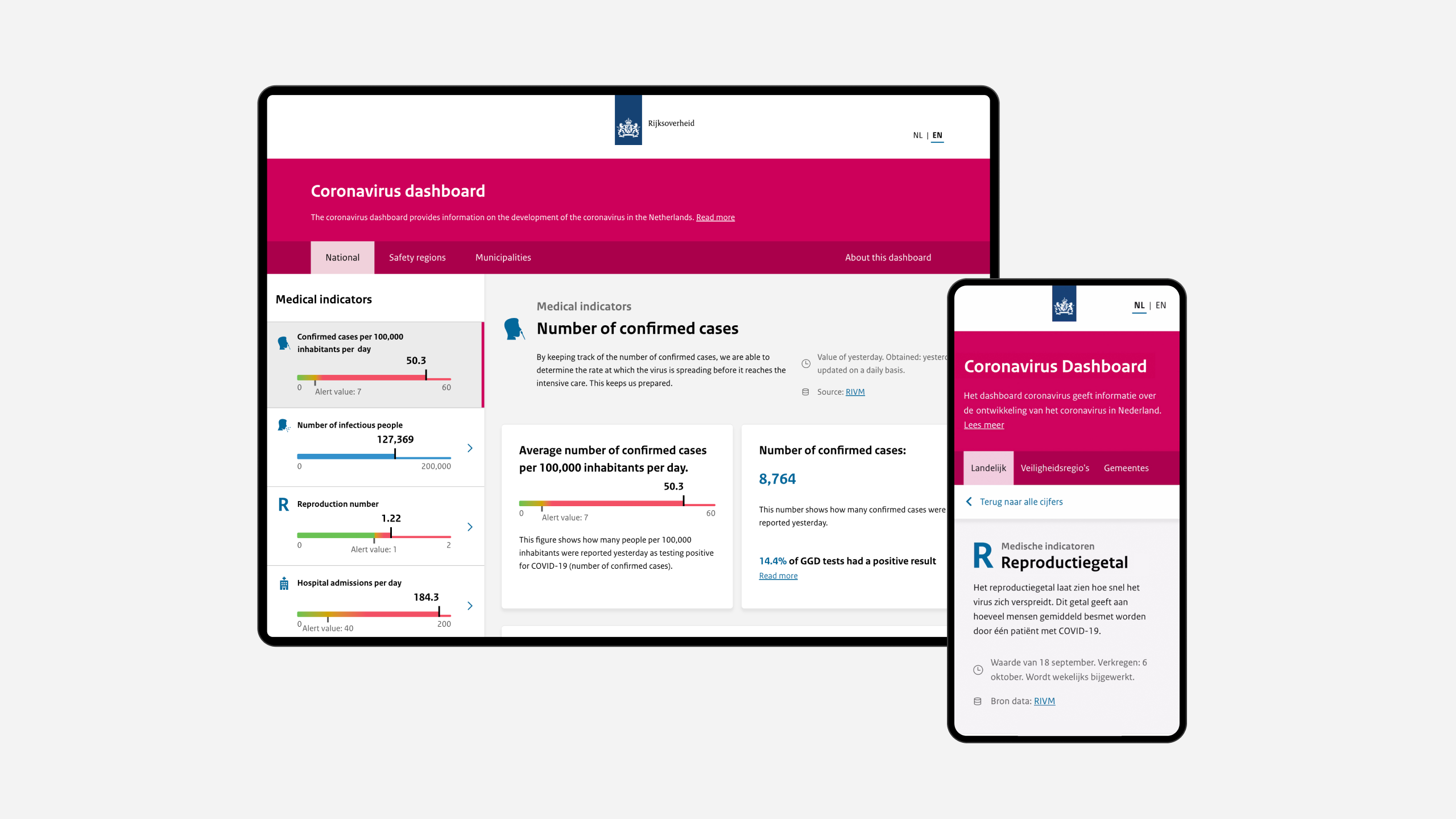
In the meantime, we ensured the website performed well, making it in line with the Dutch Government compliance rules (accessibility, hosting, and security), among which supporting legacy web browsers and being accessible on as many different devices (including e-readers).
We conducted the first user test, integrated the feedback, and made sure the website was as accessible as possible for everyone from the first day it launched. This resulted in a first version, accessible to everyone in the Netherlands within a week of the first contact between the government and C°F.
Version 2.0: Growth and guidance
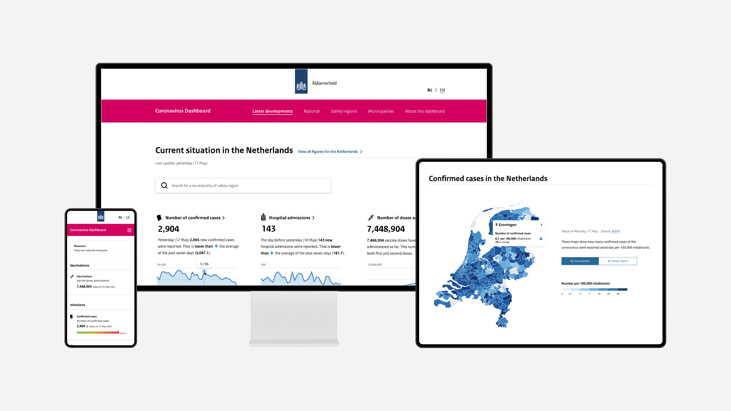
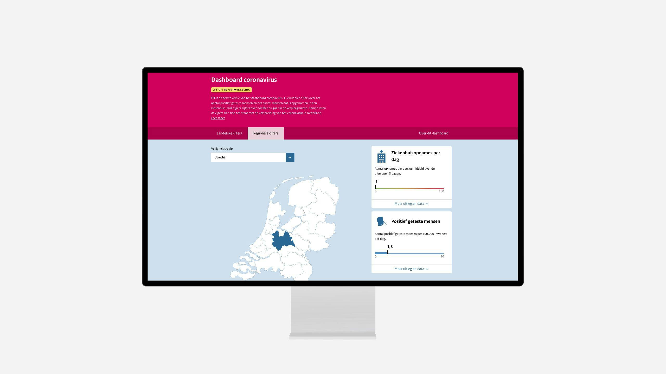
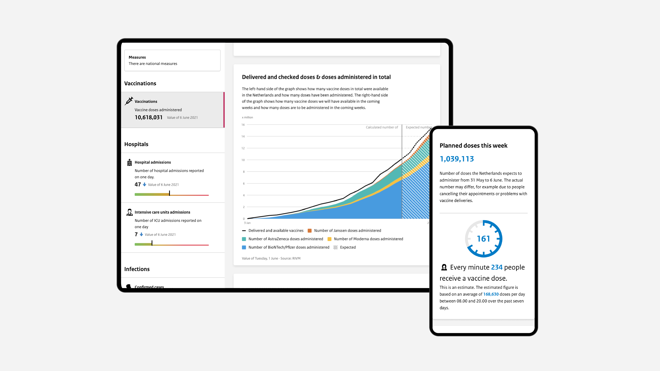
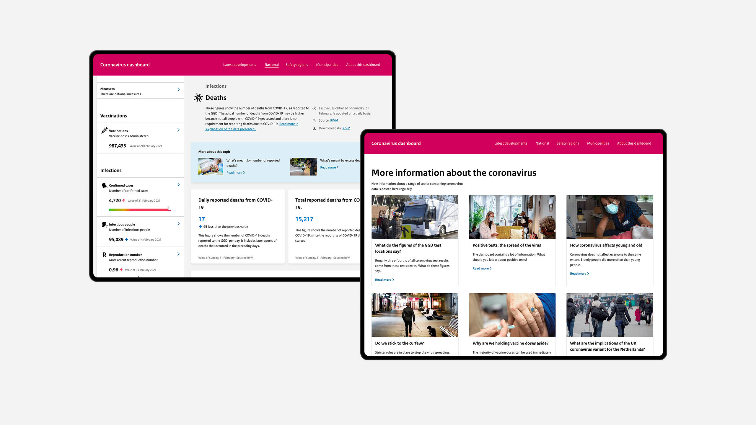
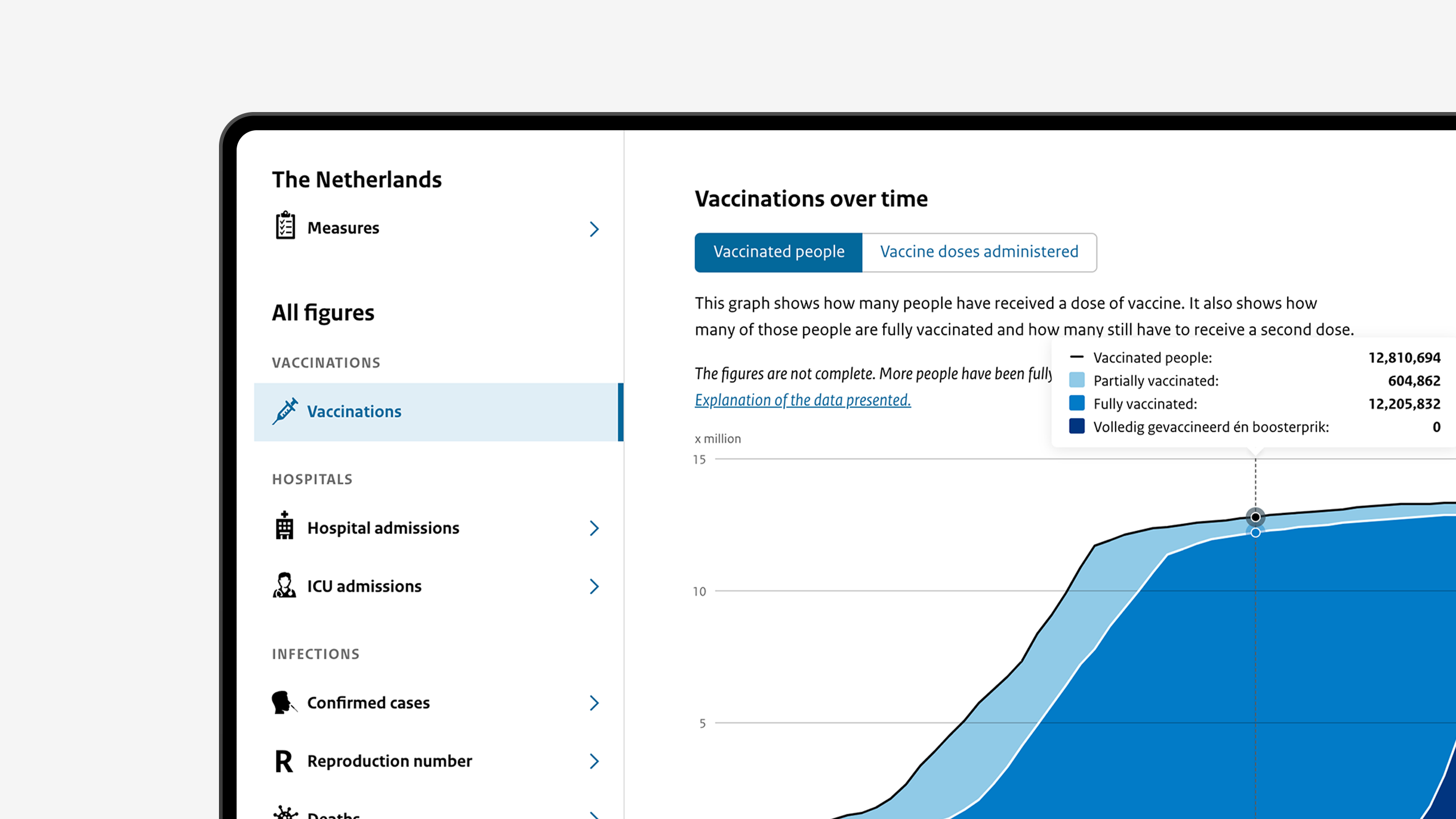
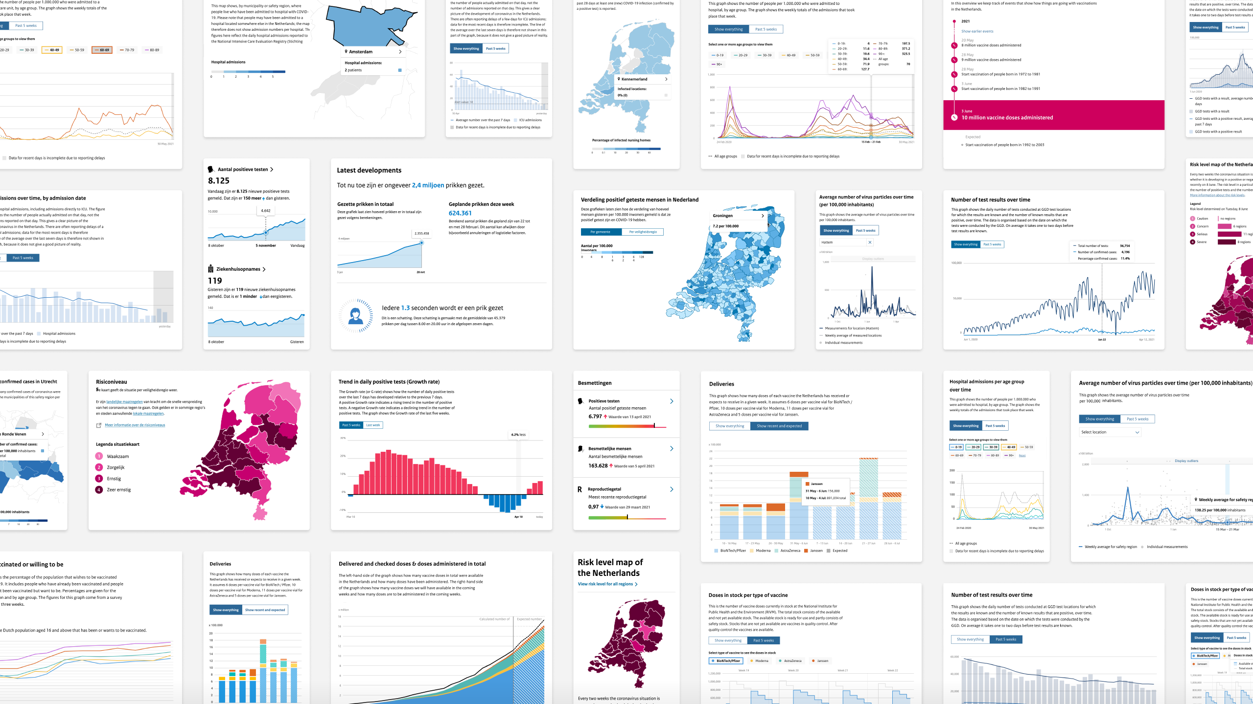
In September 2020, the second version of the dashboard was launched. We redesigned the basic information structure to integrate more data in the dashboard, provide more background information and more localized data.
The layout was changed to introduce a sidebar, making each metric an entry point to underlying data. This provided the opportunity to show several graphs and more details on the page. Through repeated user research, the texts were improved to be more understandable for a broad audience. We also added the option to select a specific safety region or municipality, providing access to both national and local data within the same structure.
Version 3.0: Depth and context
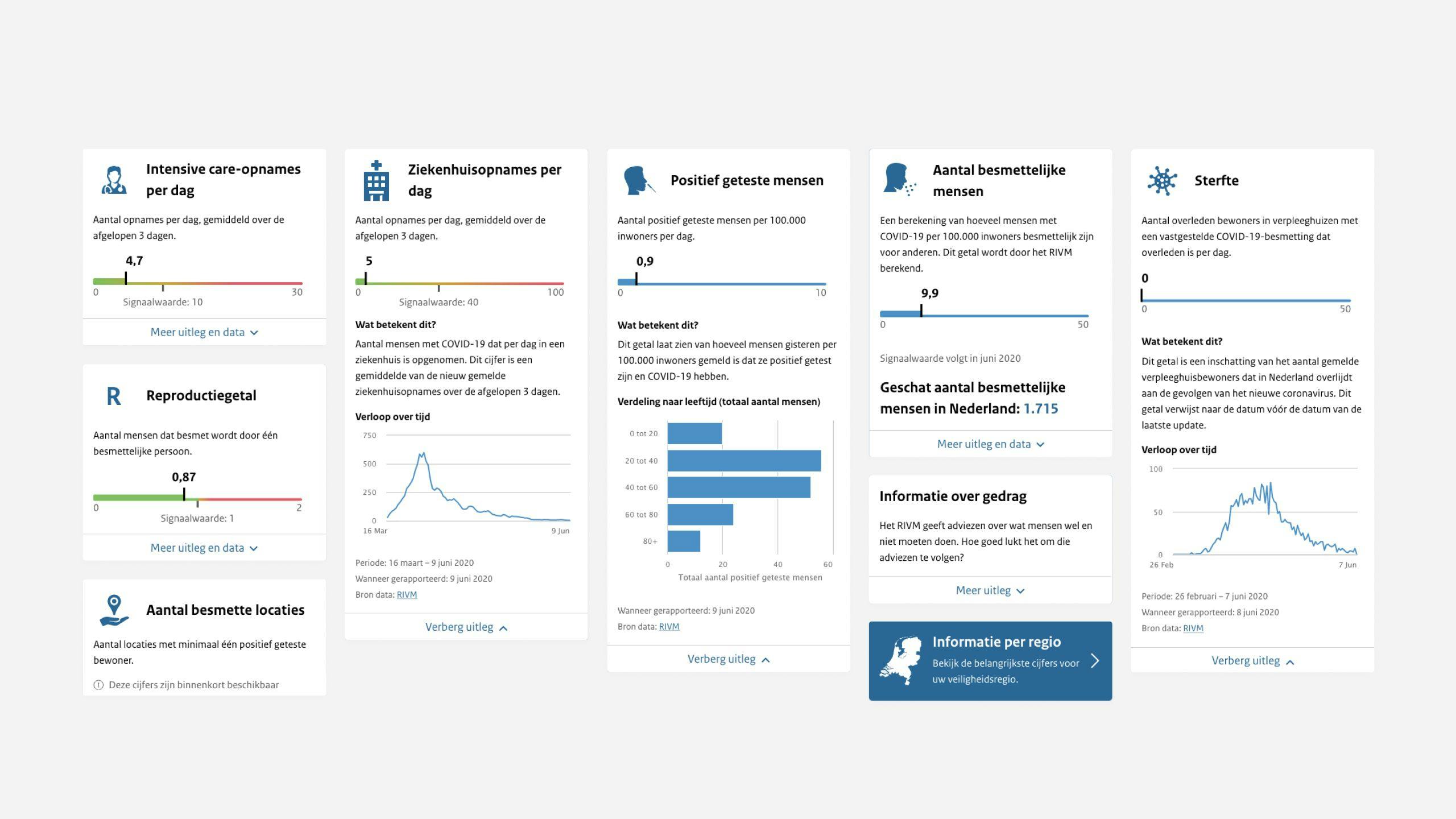
In January 2021, we launched a new page called ‘latest developments’ to make the dashboard more relevant for both citizens and the media. With this new home page, we show the most relevant metrics and indicators in the context of the pandemic’s situation in society.
The overall appearance was improved by adding more micro-interactions and details to existing charts.
In addition, a content management system was introduced to enable the editorial team to write content and manage the Corona dashboard autonomously. This enabled us to also include articles that described the current situation and gave background information and context to the metrics presented on the dashboard.
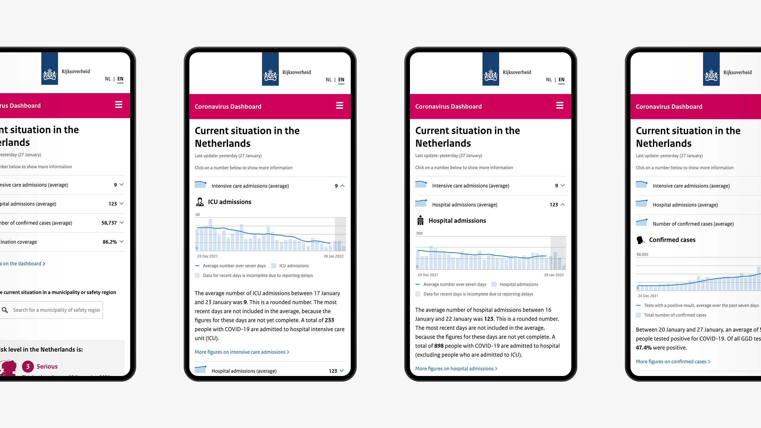
Version 4.0: Calmer user experience
In December 2021, the fourth and the last release we worked on for the Corona Dashboard aimed to further simplify the user experience. We made the design cleaner and more accessible on mobile devices. The new look is less complicated and calmer, with more focus on the content.
Opentocommunity
Providing insights on different levels
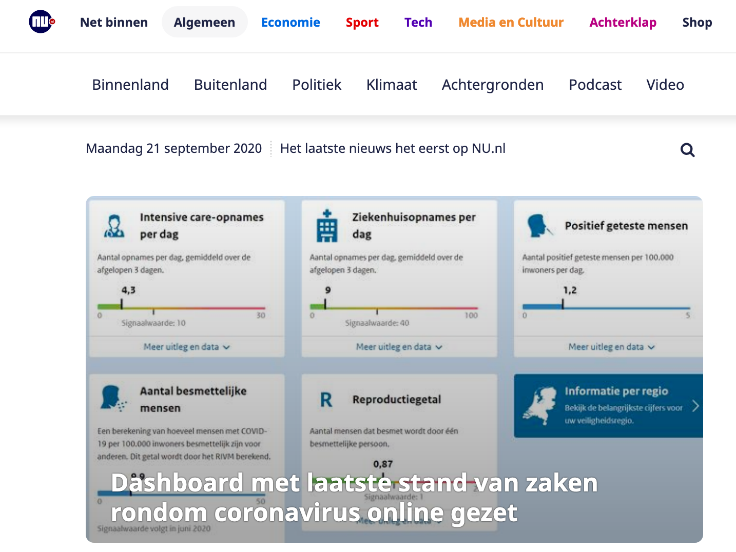
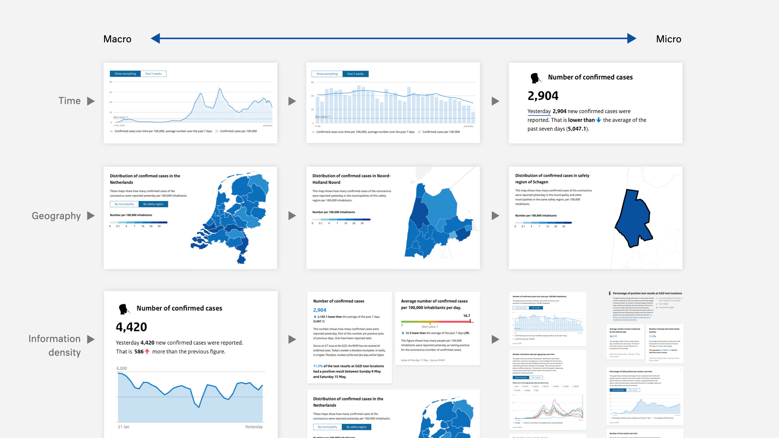
The dashboard provides different layers of information, so depending on the user’s interest, they can get a quick overview or dive into the numbers for more detail. Users can easily see the situation of the entire country, zoom in on the safety regions, and zoom in once more on the local municipalities that they are interested in.
Accessibility
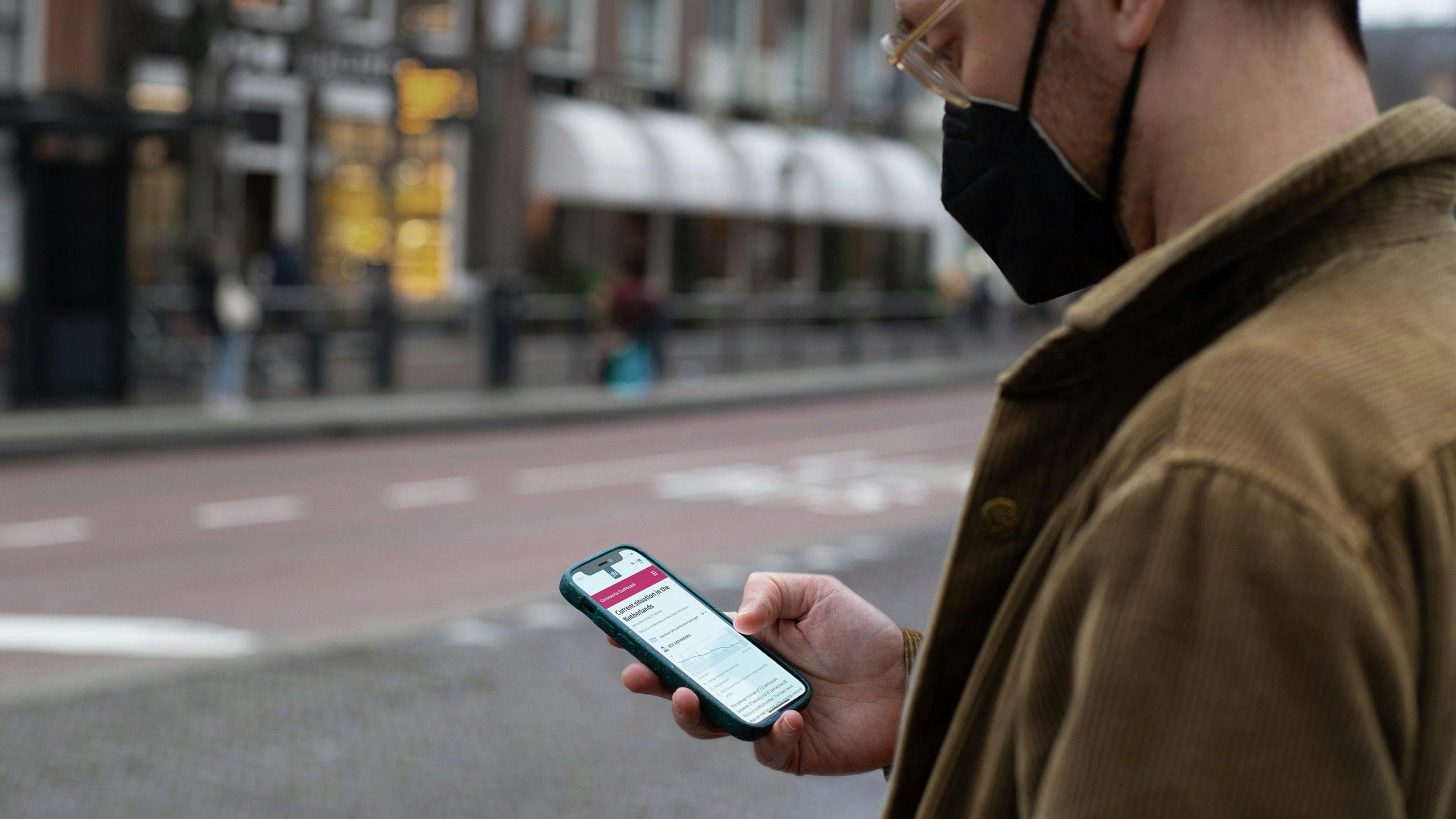
The dashboard is constantly optimized for various target audiences based on the government’s accessibility guidelines and the Web Content Accessibility Guidelines (WCAG).
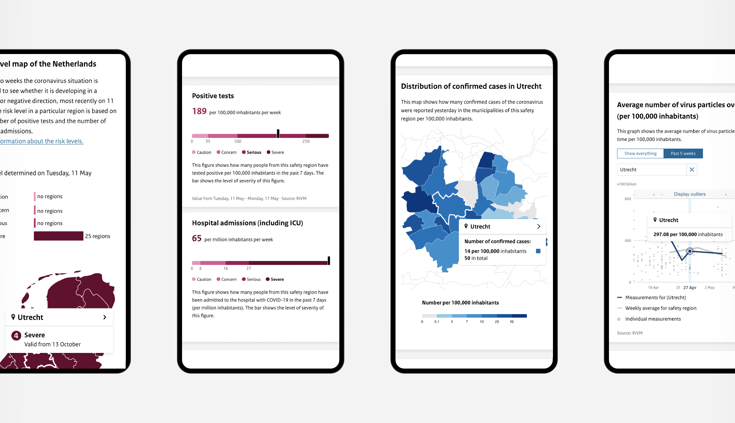
For example, high contrast colors and single hue color palettes on maps are used to improve the readability for color-blindness. We also provide several ‘skip links’, which are internal links on the page to skip navigation sections and quickly jump to the important content for users that navigate the website with screen readers.
Charts are fully accessible through a keyboard, including screen reader support for tooltips while stepping through time series. These also offer a full-screen mode which makes it easier to scrub through dense plots.
All pages are built statically. This ensures pages load quickly and still function even if JavaScript fails to load. This includes all the charts and visualizations.
Open source
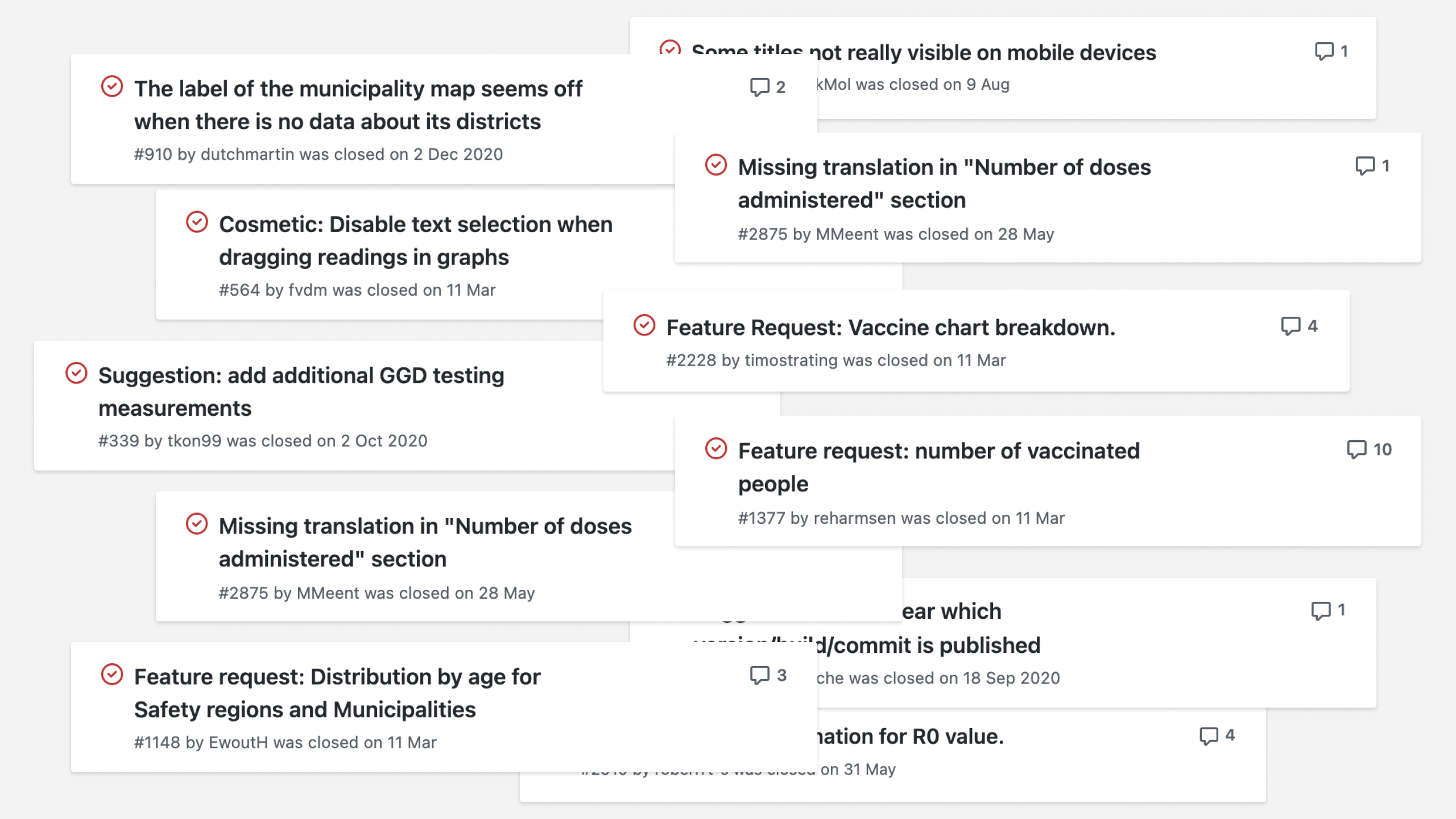
The Corona dashboard is open source since version 1.0. This transparency resulted in numerous citizens contributing to its quality by reporting issues, sharing ideas for new features, and making code change suggestions (e.g., bug fixes), a significant contribution to establishing trust and encouraging re-use or building upon code.
We are pleased to contribute to the government’s vision of ‘open-source, unless’ through this project and that this was a guiding principle for the project, even during a crisis.
User testing and expert panels
At first, through A/B tests, we got to understand the visitor’s first impression of the dashboard such as the colors used on an escalation map. As the project progressed, Ruigrok-Netpanel conducted qualitative usability tests that focused on general and detailed dashboard usage, both on mobile and desktop. By partly including open interviews, we obtained insights into what people expect from a dashboard and what type of information they still would like to receive. For example, the feedback we received led to the introduction of articles on the dashboard.
Multiple expert sessions were organized to reveal concerns and expectations from different perspectives. These sessions gave direction to the evolution of the dashboard and made sure the appropriate data sources were integrated and visualized.
Results
The Corona dashboard introduced a new form of interaction and communication between the government and the public through:
- daily updates on all essential COVID-19 information in the Netherlands;
- staggered levels of presenting information and data, helping audiences to understand this information in a guided experience;
- being as inclusive as possible: accessible for different audiences;
- compliant with international Web standards;
- open to and built with the support of the online community;
- quick iterative process and results (the first version was released within a minimal timeframe).
Together with the Ministry of Health, Welfare and Sport, and other partners we were able to contribute to a more open, data-driven government. Above all, we provided everyone with the most up-to-date information about the pandemic.
[The Corona dashboard] gives us...an increasingly clearer and more complete picture both nationally and regionally... So that we know whether we should intervene and where we should intervene... On coronadashboard.rijksoverheid.nl it can be followed accurately for everyone.
Hugo de Jonge
Minister of Health, Welfare and Sport / 24 June 2020