Discover the impact the Fed has had on the economy over the past 60 years
- Client
- The Wall Street Journal
- PIMCO
- Awards
- Awwwards – honorable mention
- Deliverables
- Microsite
The challenge
The Federal Reserve System (the Fed) is the central bank of the United States. Since 1951, it has gained increased power to manipulate the interest rate. CLEVER°FRANKE was approached by WSJ Custom Studios and PIMCO and asked to visualize the effect the Fed has had on economic markets by controlling rates and to highlight historical milestones over the last 60 years.
Value delivered
The microsite ‘Setting the Pace’ illustrates the importance of data in gaining an in-depth understanding of the financial market, sets the ground for future data-driven decision making and establishes PIMCO as a reliable thought leader in the industry.

Background
Once we received the necessary input from the client — datasets and historical milestones — we set out with the initial exploration phase. We defined our vision for the project: we sought to deliver visually appealing visualizations, which also had to be engaging and interactive.
Part of the design research focused on developing elegant and visually impactful transitions for key events.
Phases and toolkit items used
Solution
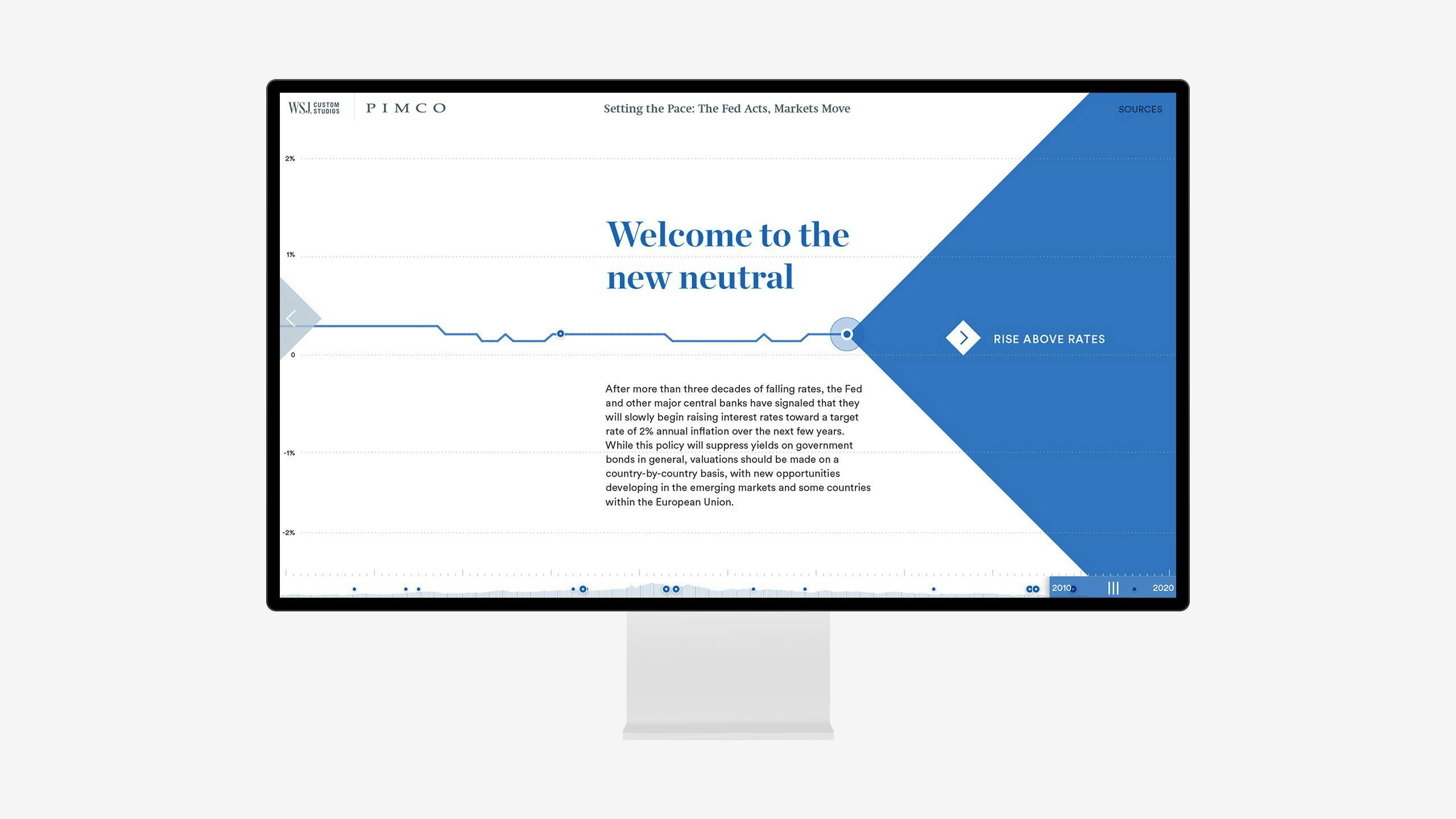
Interactivetimeline
The whole interactive experience is a journey through a line chart graph, where axes and gridlines are used to explore the story.
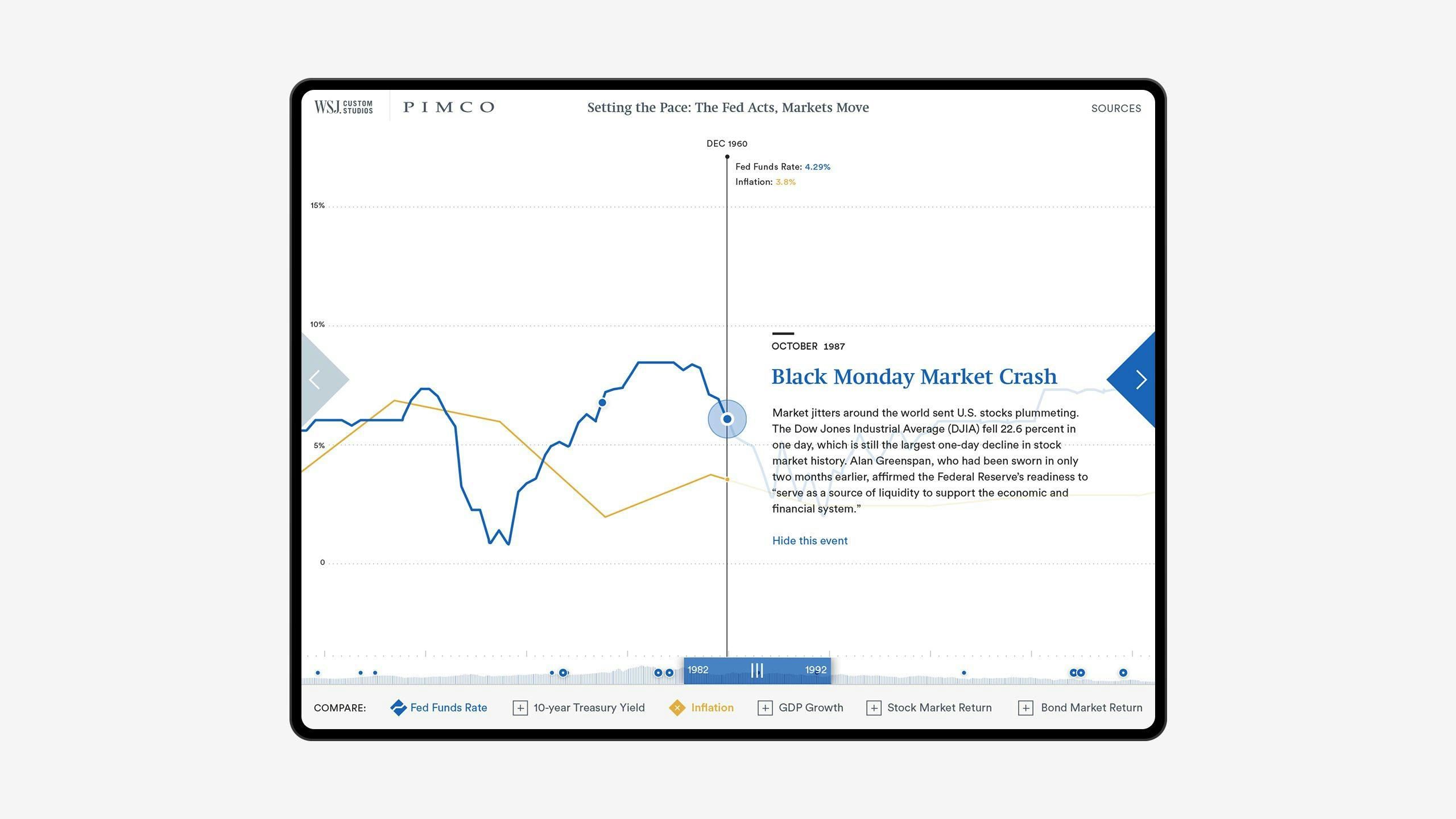
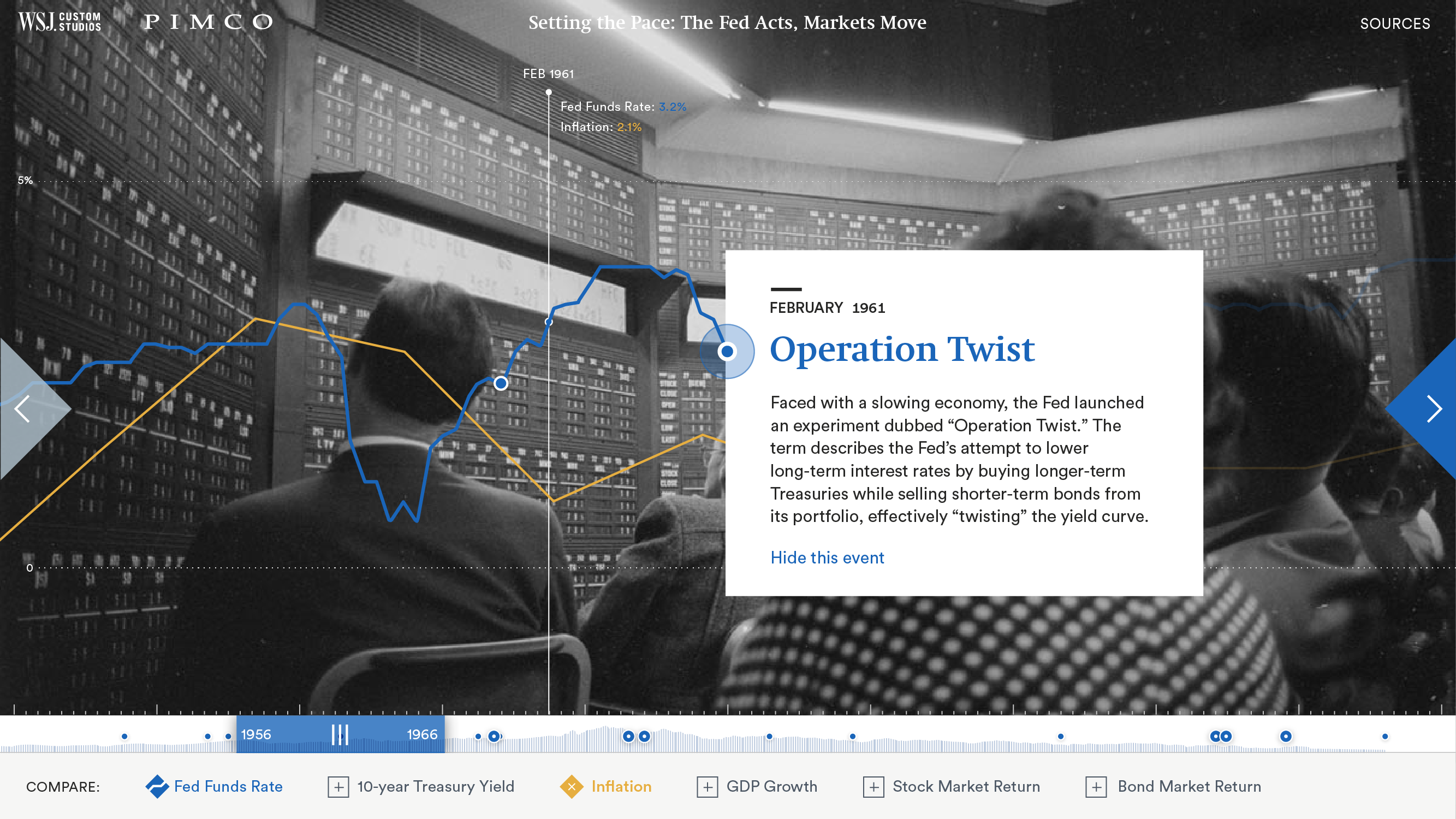
Because of the complex nature of the content, we developed two ways of how the user can gather information by exploring this interactive website.
Users can either go through the visualization by using a time scrubber at the bottom of the screen or the arrows. The narrative-driven visualization makes it very easy for the user to switch between the milestones and the more free-form exploration mode enabled by the time scrubber.
At any point, the various rates (e.g. GDP Growth vs. Inflation) can be compared and excluded or included in the visualization. When using arrows and viewing milestones, this information appears in the background.
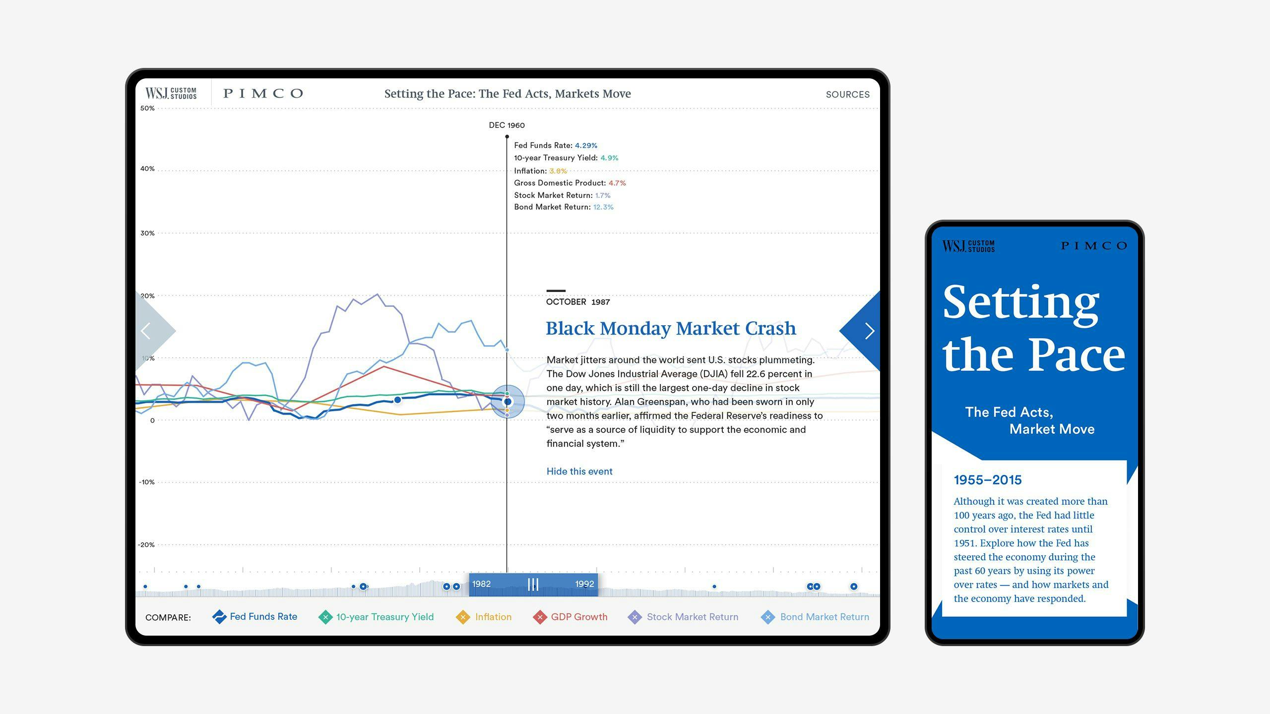
Mobiledisplay
The limitations that the screen size imposes and fewer interaction possibilities presented some challenges when creating a mobile-friendly version of a complex web-based data visualization.
The design approach we took for mobile focuses on delivering content in a more guided way, giving more prominence to the time-selector as it best fits mobile use patterns.
Results
To this date, the microsite remains online and up to date to serve as a repository on Fed and economic related data, as well as provide historical economic context. The editorial data visualization is a showcase for an interactive experience that combines journalism, data visualization, storytelling and user experience into a holistic concept.