Equipping the scientific community with a holistic design system for data storytelling
- Client
- Wellcome
- Deliverables
- Data design system
- Digital style guide
- Design rationale
The challenge
Wellcome is one of the largest global charitable foundations whose mission is to support science in solving urgent health challenges.
As Wellcome Data Labs, a new cross-disciplinary team at Wellcome, was getting started, their primary goal was to develop a unique and consistent visual style for data visualization. They asked CLEVER°FRANKE to find a way to integrate data visualizations in their internal and external communications.
Value delivered
Enriching a corporate identity with a unique visual language for data visualizations enables researchers to communicate scientific data in a convincing, consistent way, and in various formats.

Background
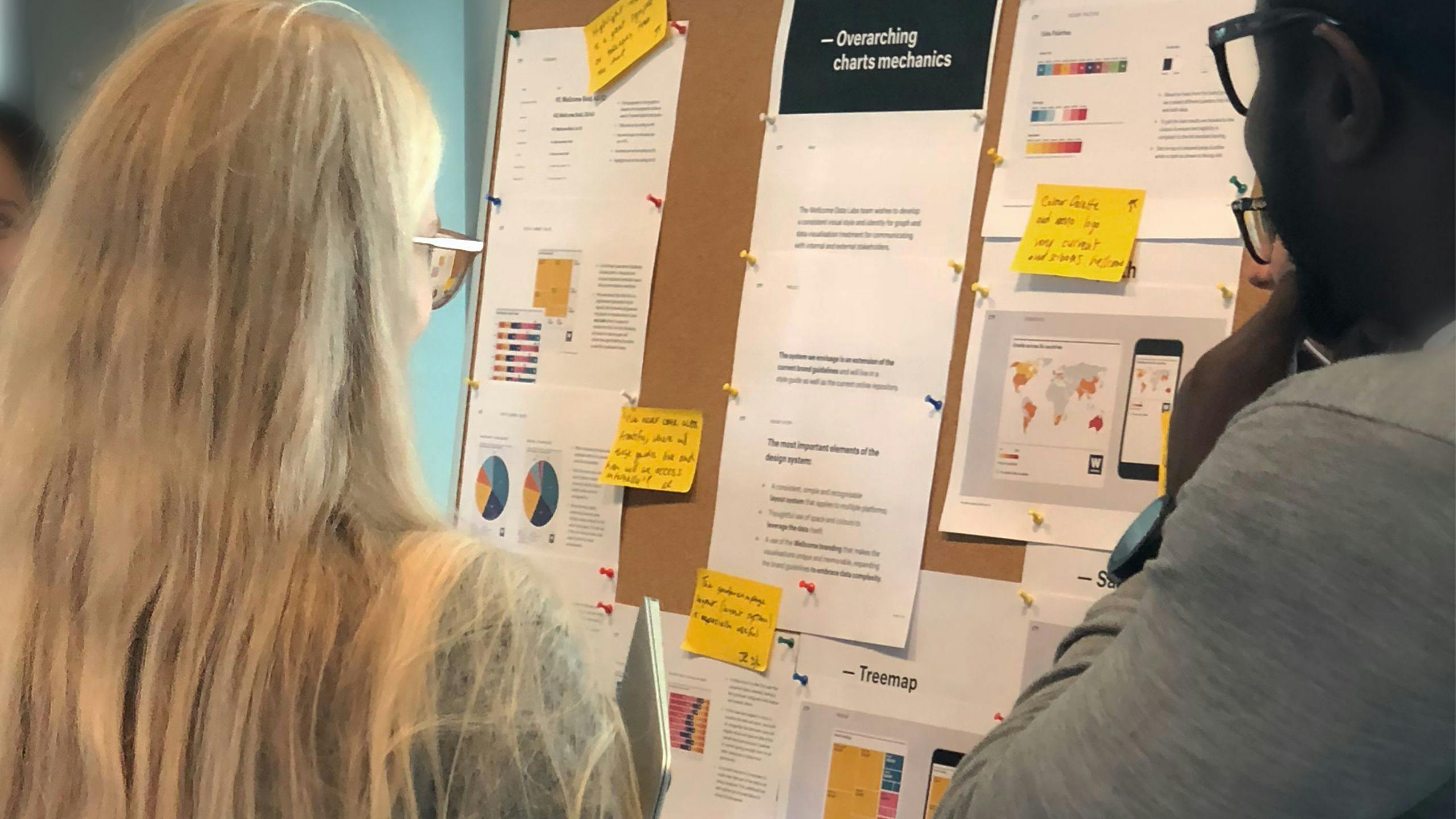
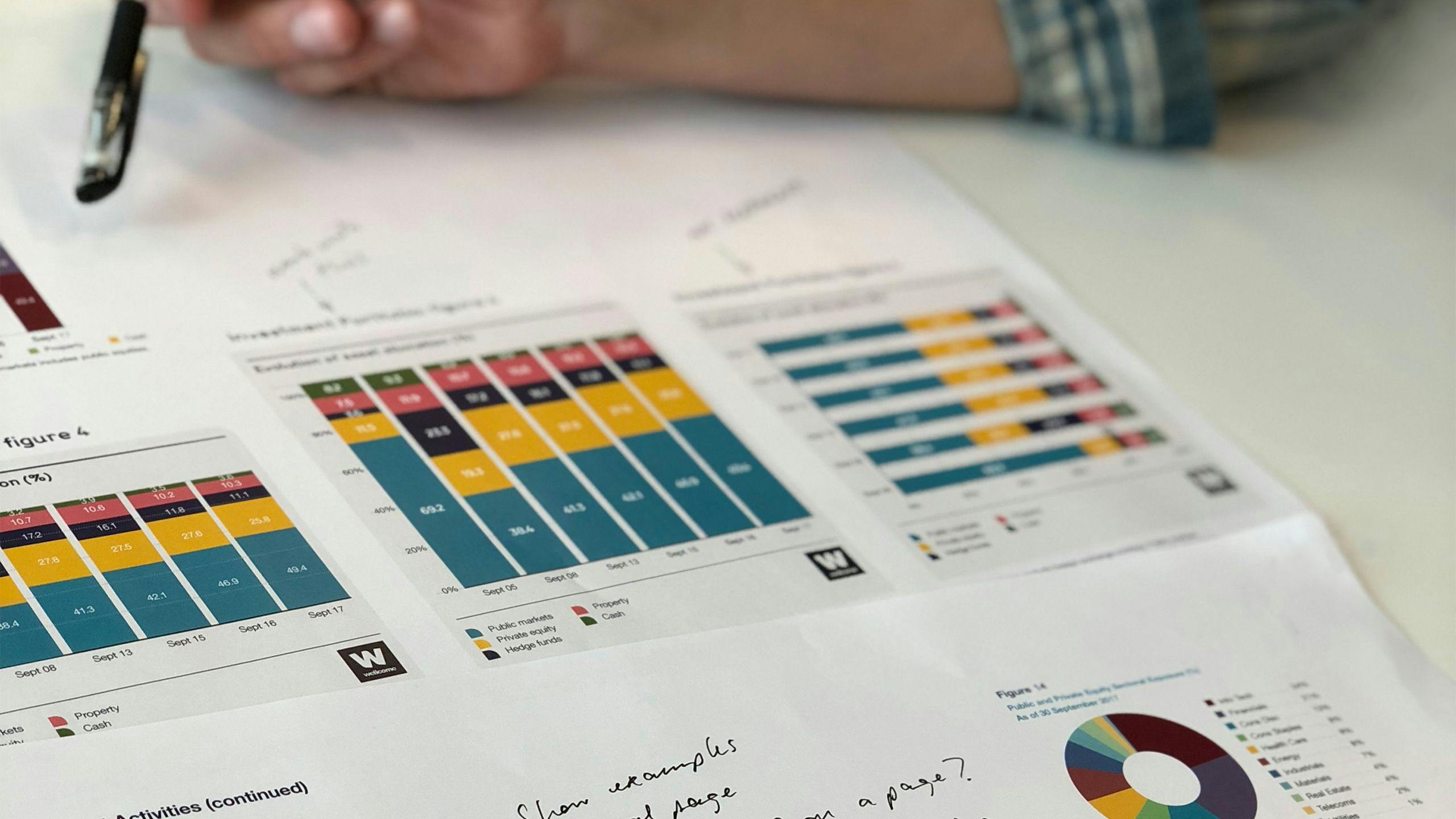
We set out by developing a benchmark based on our analysis of several online brand identities and their data visualization guidelines. Through multiple working sessions with different stakeholders within Wellcome, ranging from the branding to the data team, we ensured that the project goals were clear and received the necessary input to drive our concept forward.
As in their research, Wellcome expressed the highest standards regarding legibility, accessibility, flexibility and clarity. We were challenged to create a data design system that works across different media with different limitations. To aid clarity and comprehension of the insights, we aimed to combine texts, numbers and charts in all cases.
Phases and toolkit items used
Solution
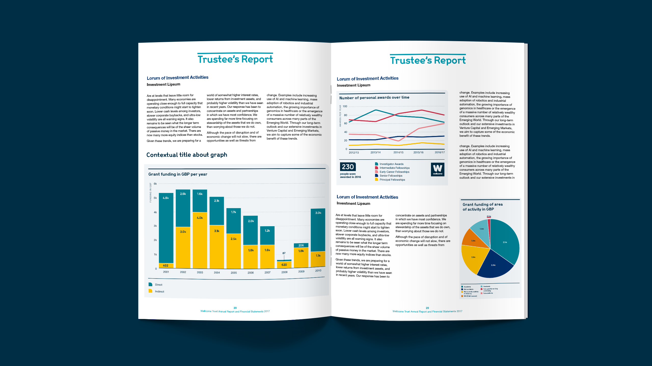
We created a unique and unified visual language for Wellcome's data visualizations and provided a digital style guide.
A new flexible and structured visualization identity empowers Wellcome to engage in effective data storytelling.
Concept
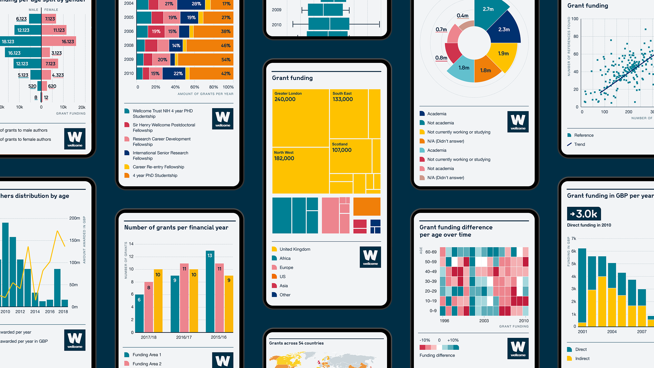
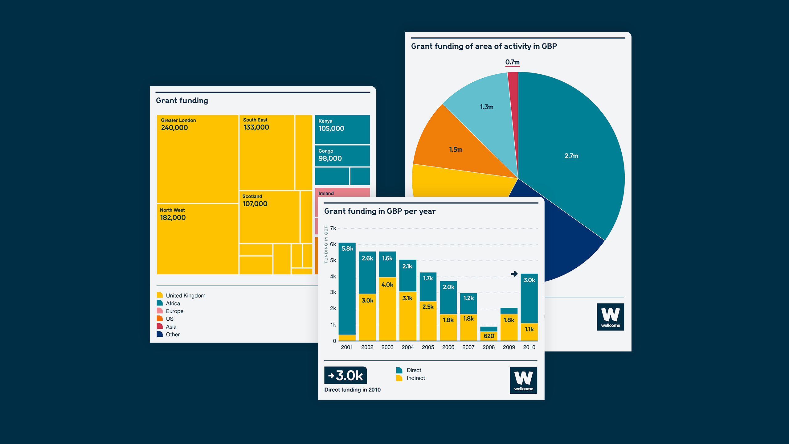
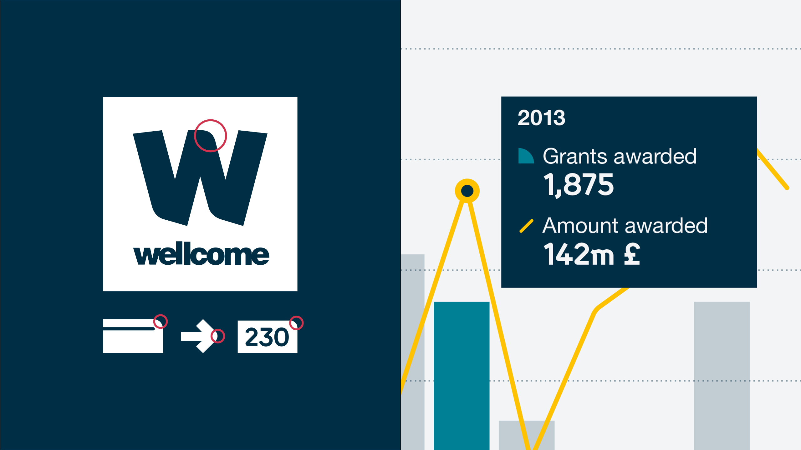
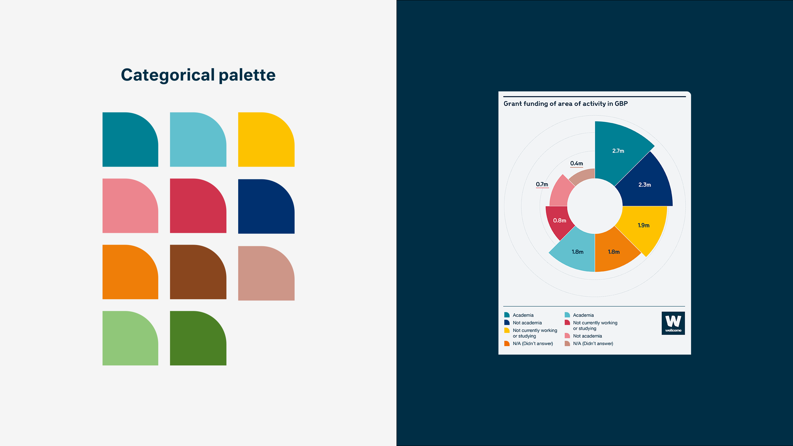
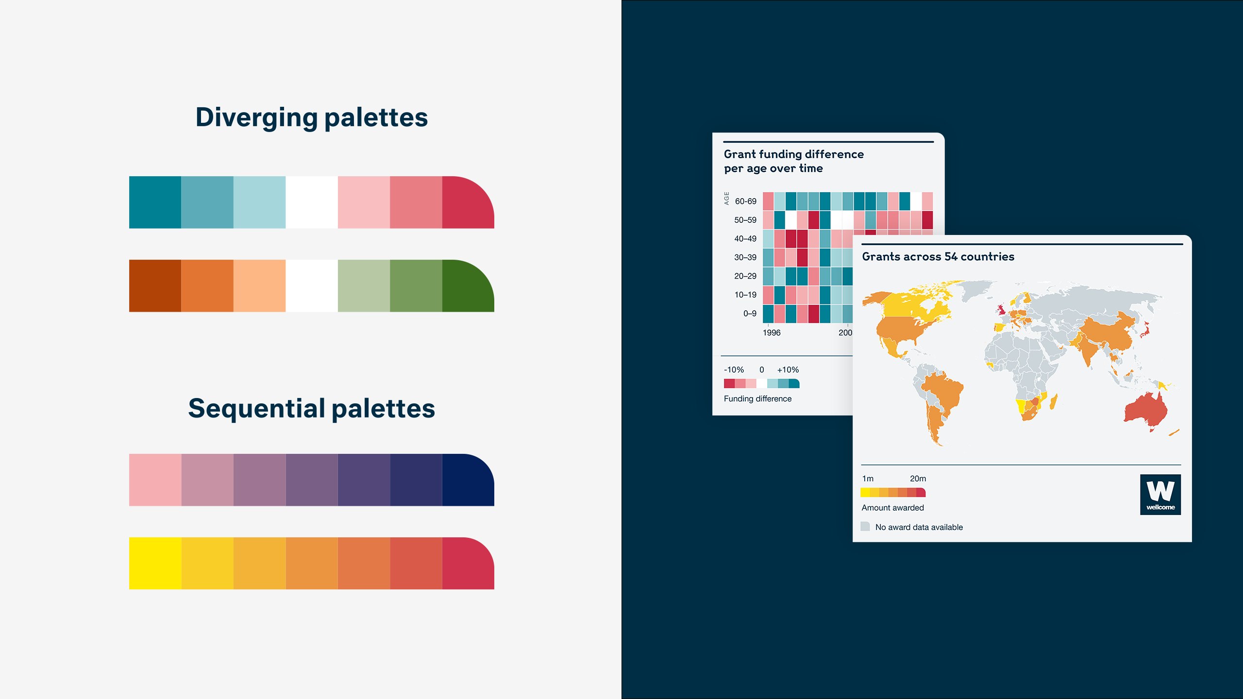
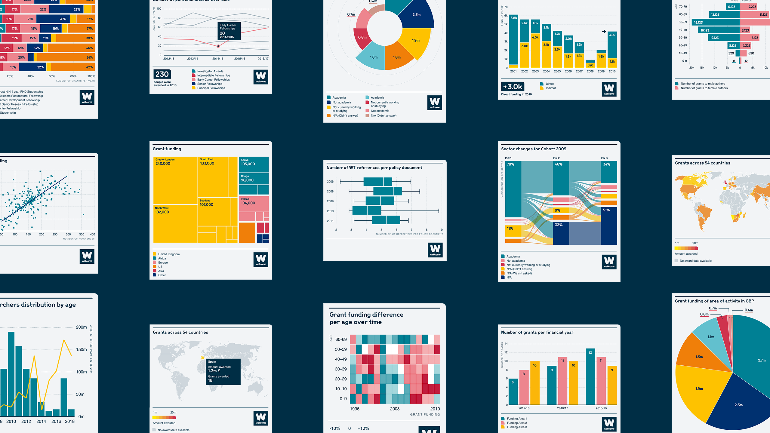
We developed a custom-made visual language for Wellcome’s data visualizations that fits their bold and colorful branding.
We defined the following core elements for our concept:
- Flexible system
- Data prominence
- Brand-inspired design elements
Visualcharacteristics
The boldness of Wellcome’s identity was translated into the visual style for the production of graphs. By maximizing the real estate for the data itself and through purposeful use of colors, we delivered a design system that fits the brand while emphasizing the data.
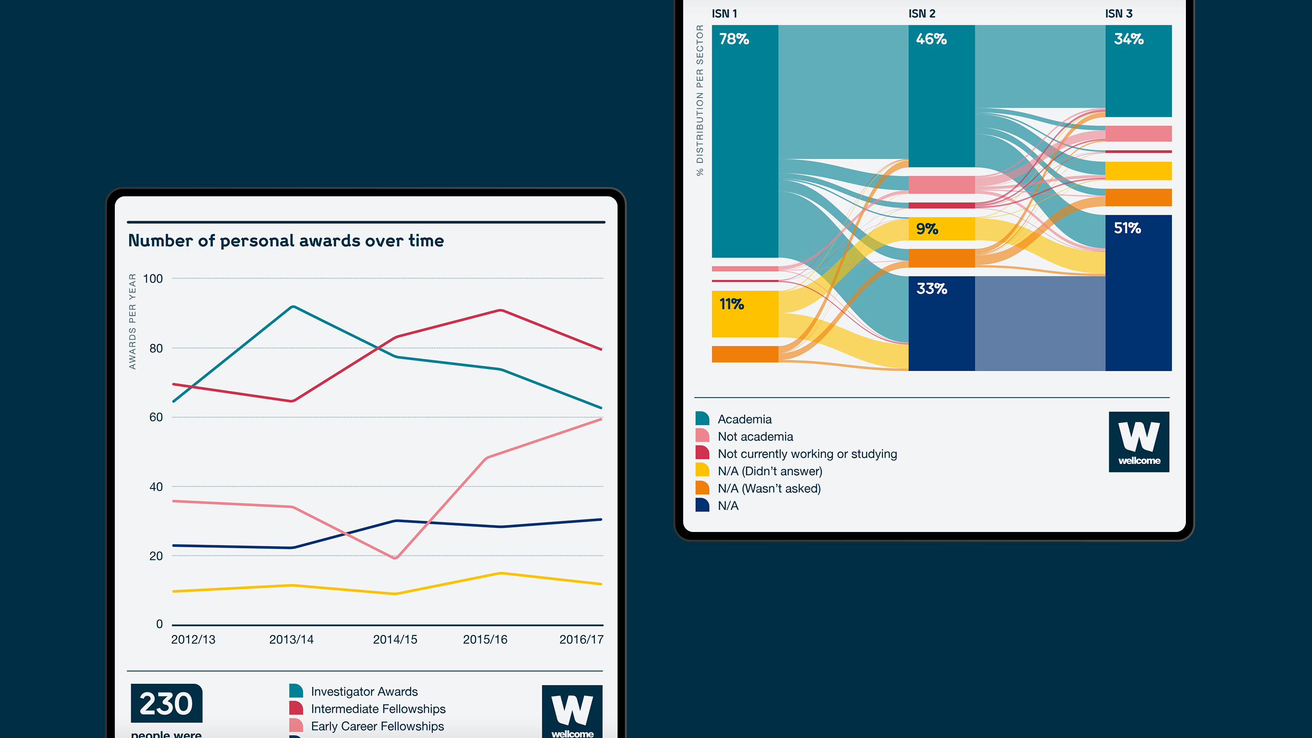
Interaction
A key aspect of the project was to create a design system that works both on static reports as well as interactive graphs.
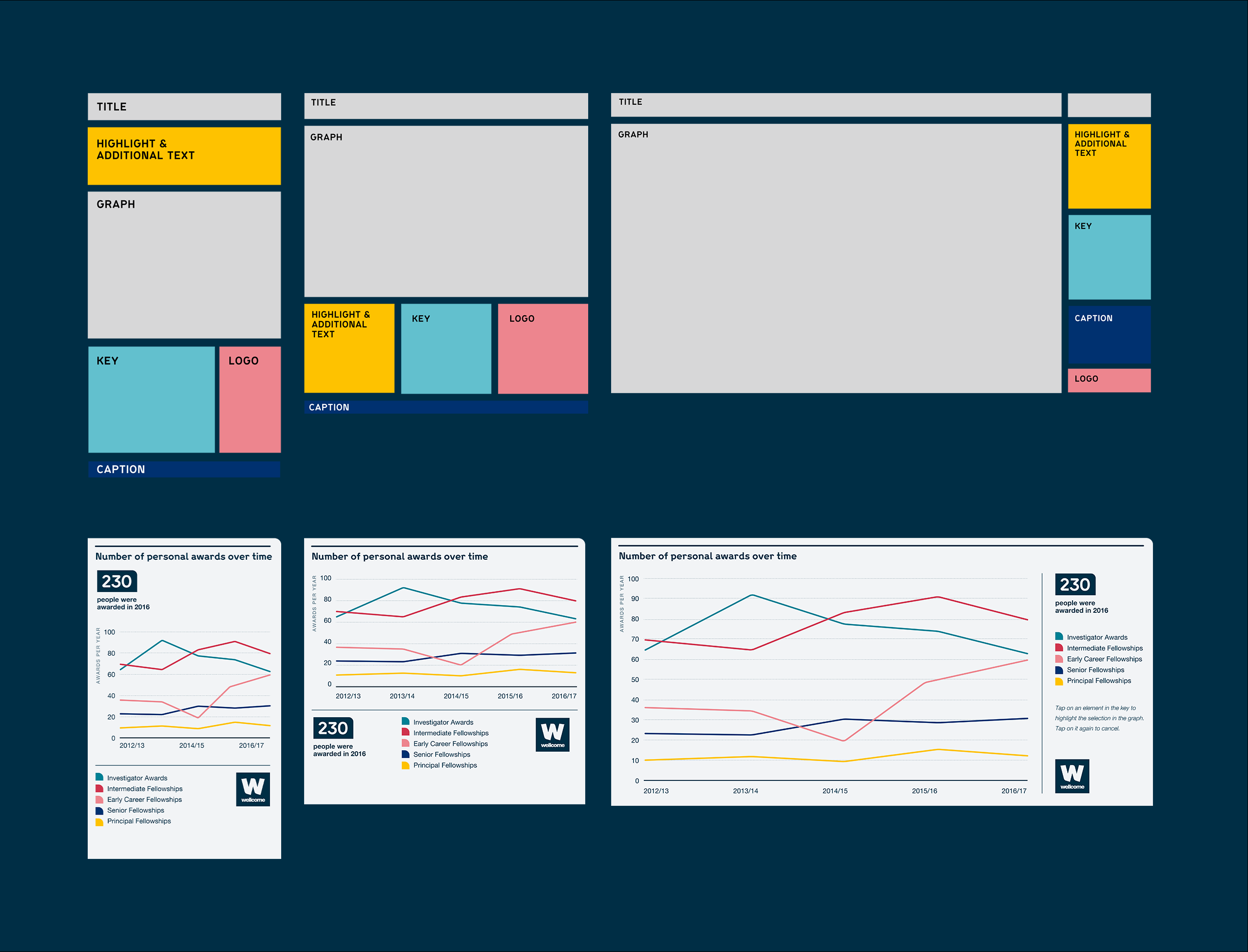
Modularlayoutsystem
Our approach consists of a modular and versatile design system that enables Wellcome to use the visualizations in a flexible way, across different media and sizes.

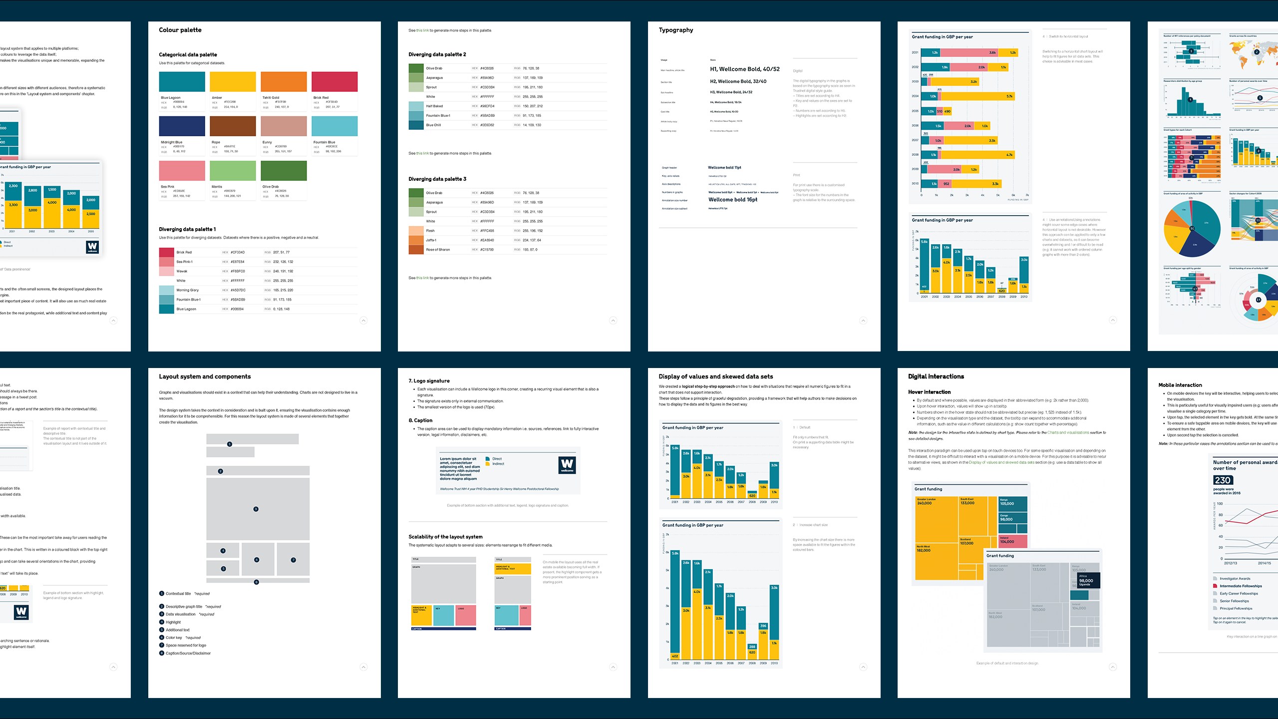
Styleguide
To guide Wellcome’s team in their future visualizations and ensure clarity and consistency in their data storytelling, we created a style guide. It enables the team to create their own data visualizations by providing all the design principles and rationale. The style guide is comprehensive, detailed and includes instructions for exceptions and special cases.
Results
Thanks for a great piece of work and being a delight to work with, the Wellcome teams have been really impressed. It’s a gift to have been involved with such a great piece of work from CLEVER°FRANKE.
Chris Trantom / Project Manager at Wellcome Trust