Visual tool to uncover trends in news articles
- Client
- Self-initiated project
- Partners
- Ai Applied
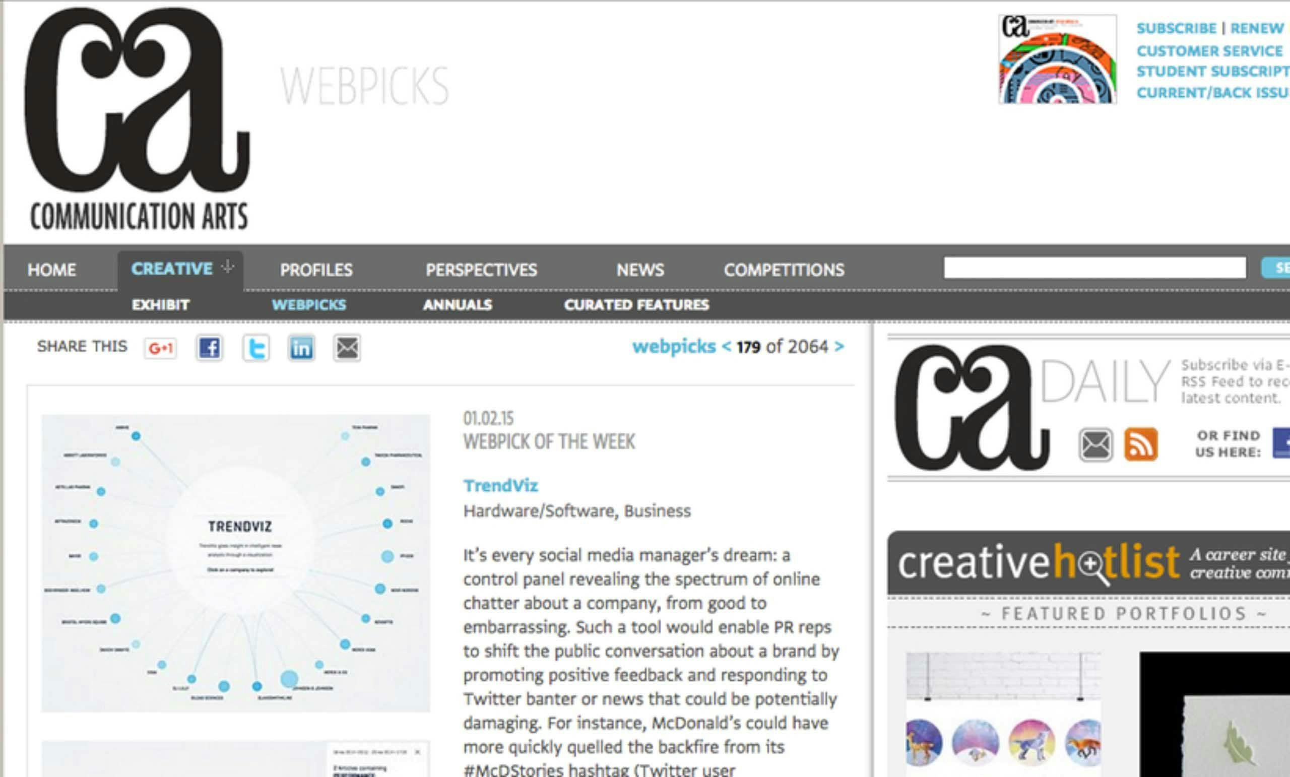
- Awards
- Red Dot Design Award
- Awwwards – honorable mention
- Deliverables
- Online data aggregation tool
The challenge
We enabled Trendviz to find better ways to use the power of AI, big data, and data visualization to keep track of how online news unfolds. The user needed to have the ability to have an overview within seconds and investigate the data intuitively. With Trendviz, we challenged ourselves to adequately show how different channels talk about brand, organization, market, or any other topic of interest and showcase trends over time.
Value delivered
Trendviz enables organizations to keep track of vast amounts of content within seconds and investigate the data. Trendviz allows them to create better PR and content strategies to impact online news sentiment.
Background

Realtime insights in online news articles offer many opportunities for businesses. To demonstrate the power of data visualization and Big Data technology in the field of content tracking, we created a new aggregation tool that intelligently filters news articles around the world to easily distill insights within seconds.
In order to acquire understanding from the fast-growing amounts of online content, the results of analyses needed to be presented in an interactive, intuitive way. Only with an intermediate visualization, can huge amounts of content be made insightful in a few seconds. Working together with AI Applied, we determined the best method to visualize data, in real-time in an intuitive, interactive dashboard.
Phases and toolkit items used
Solution
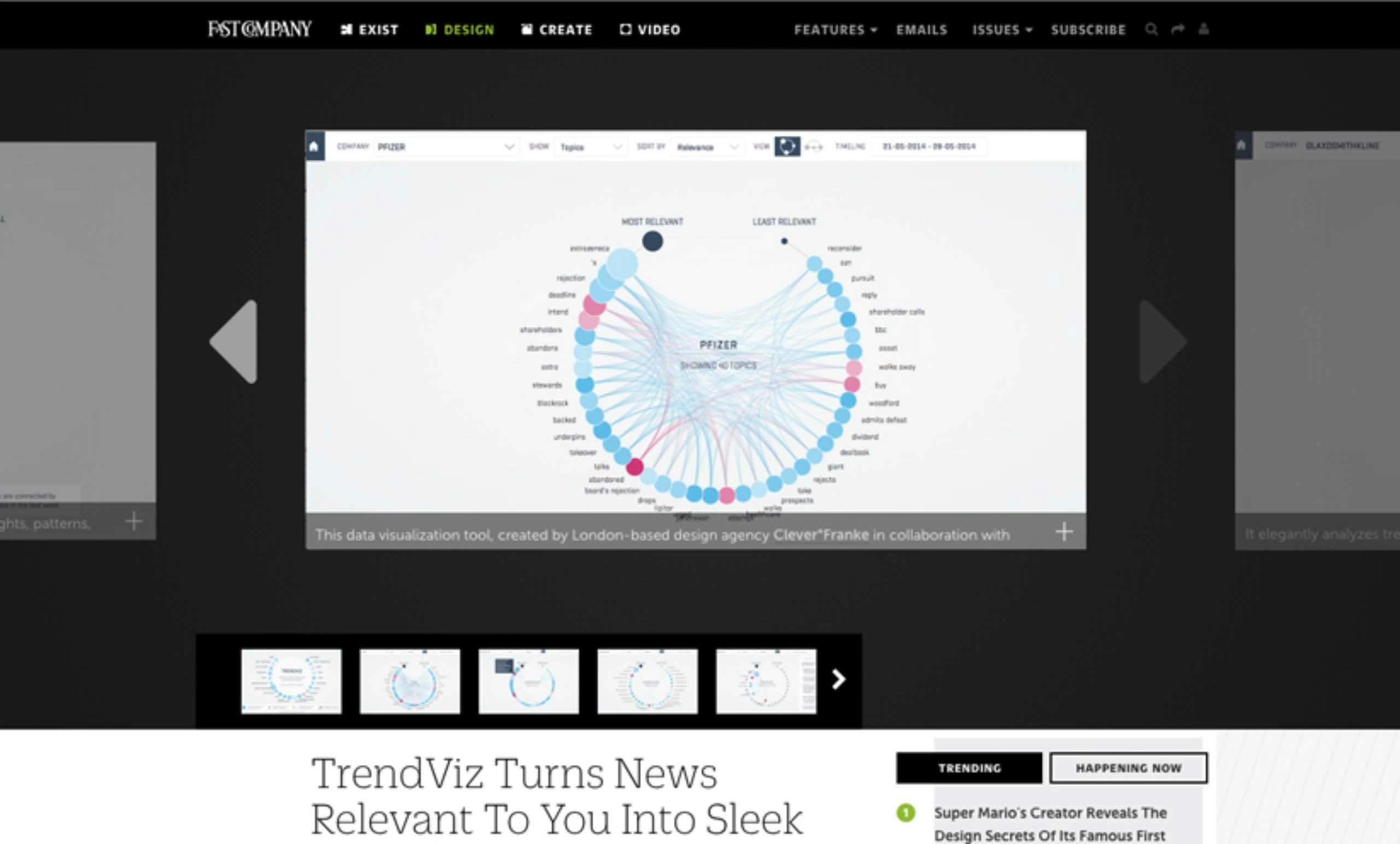
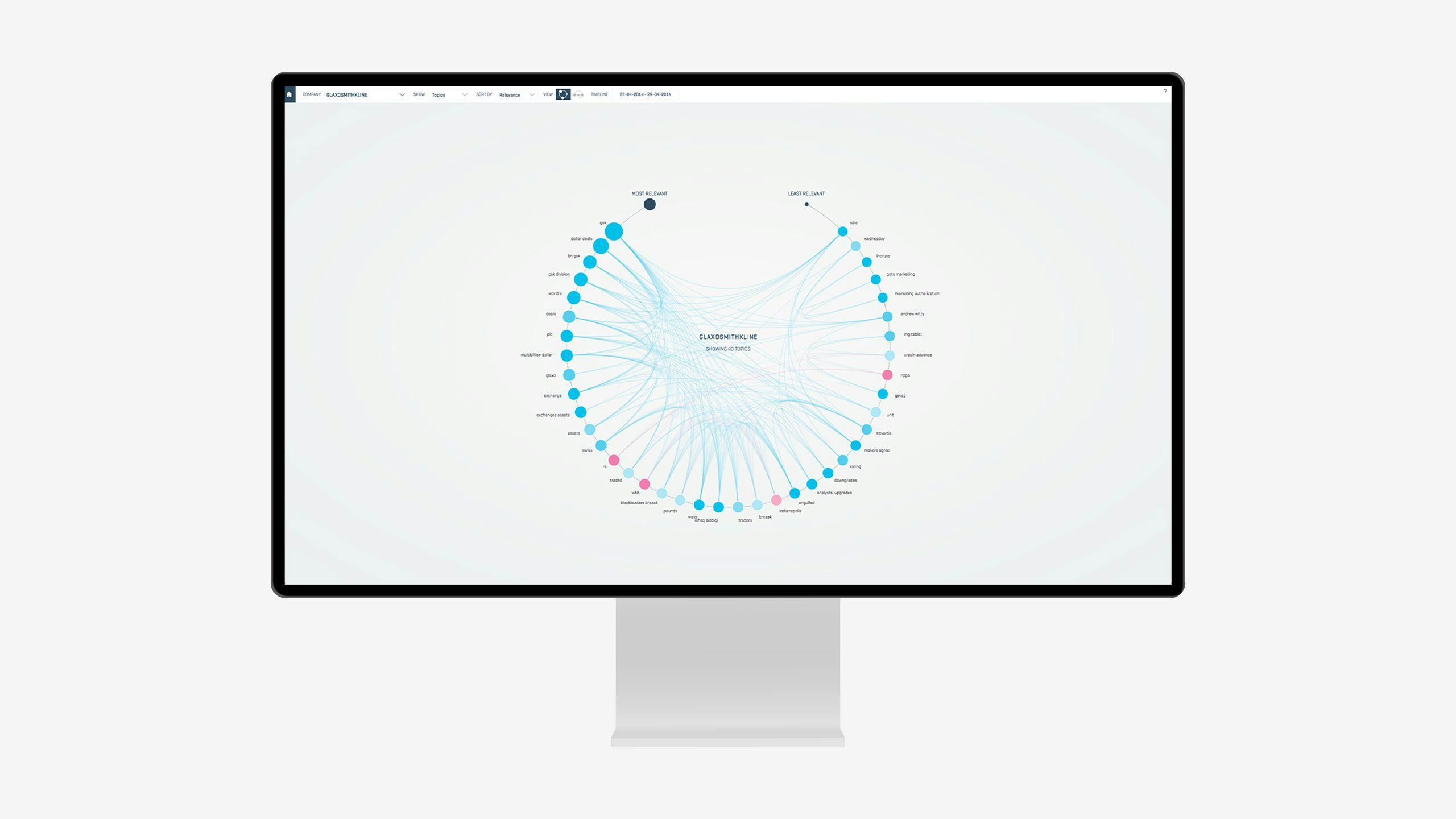
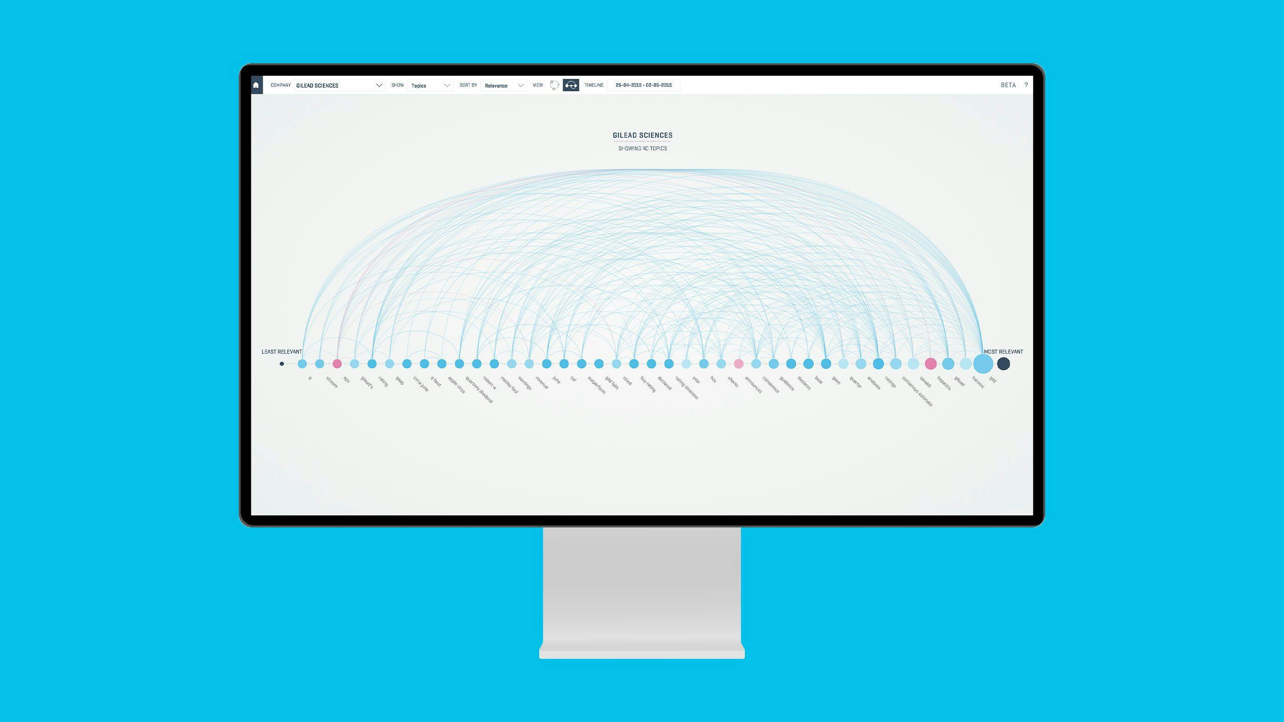
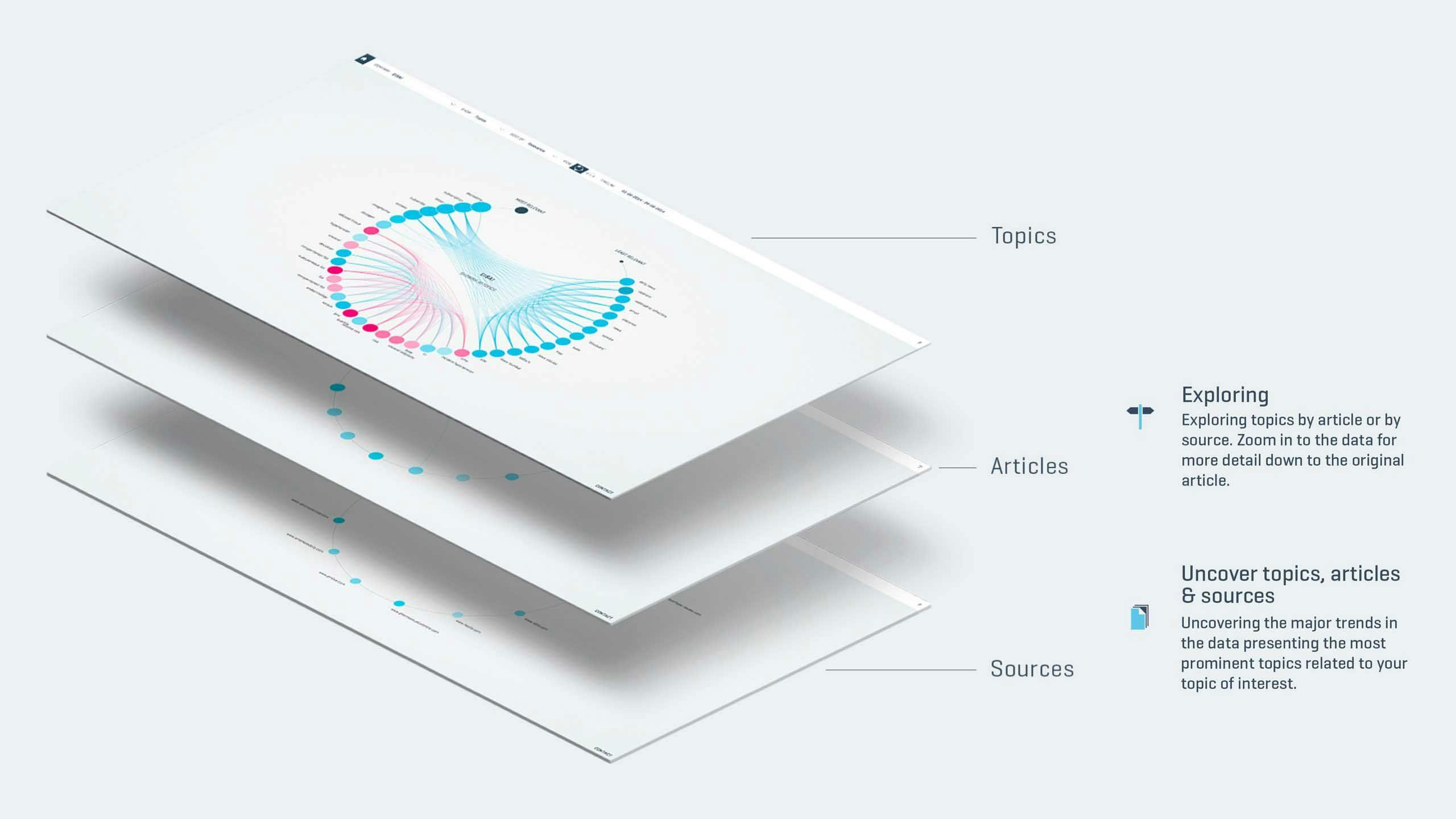
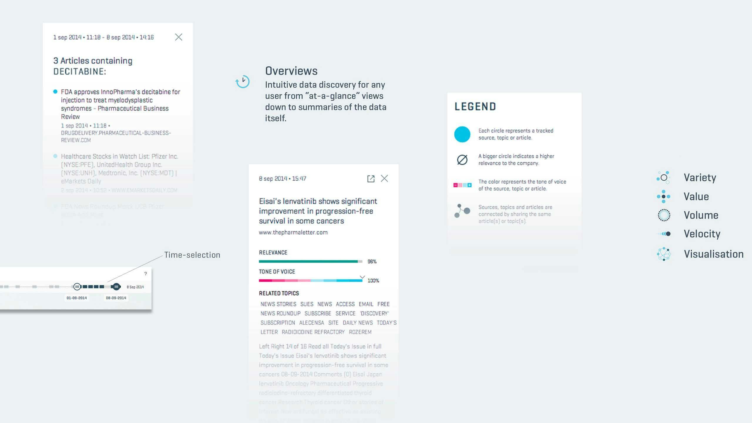
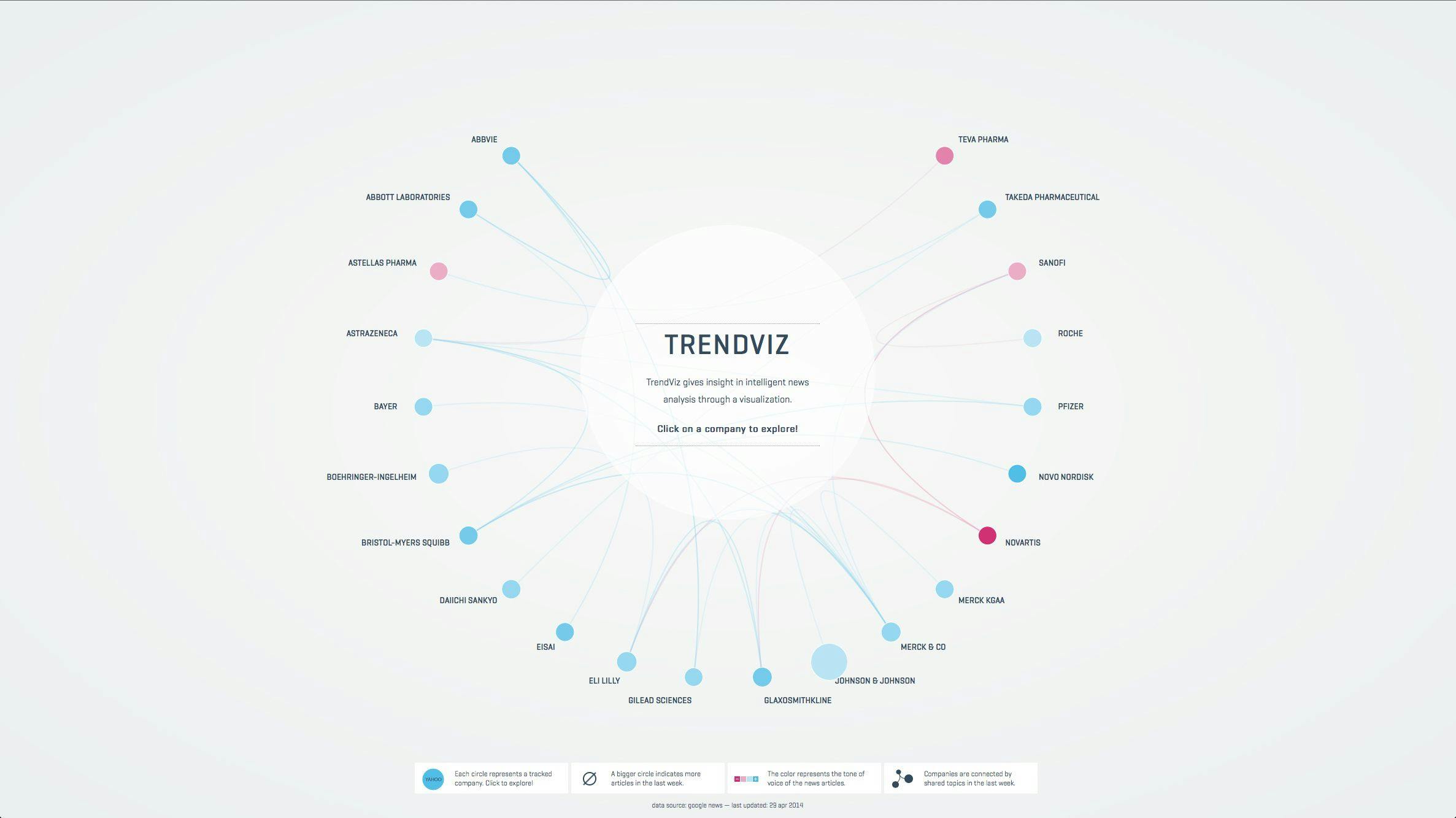
TrendViz provides an overview of important, trending topics in online news, defined by a set of keywords. These can be any term concerning brand, organization, market or any other topic of interest. TrendViz additionally allows the user to dive deeper into data, using a visualization-based, data discovery tool.
Interface
The application opens on a collection of custom keywords and how they have trended over time. The user can then drill down for a more detailed view depending on their interests or the topic they are investigating.
The design strikes a balance between typography, legibility, and the dynamic shapes of relationships connecting data in a ‘form follows function’ approach to highlight the results and insights.
Pagestructure
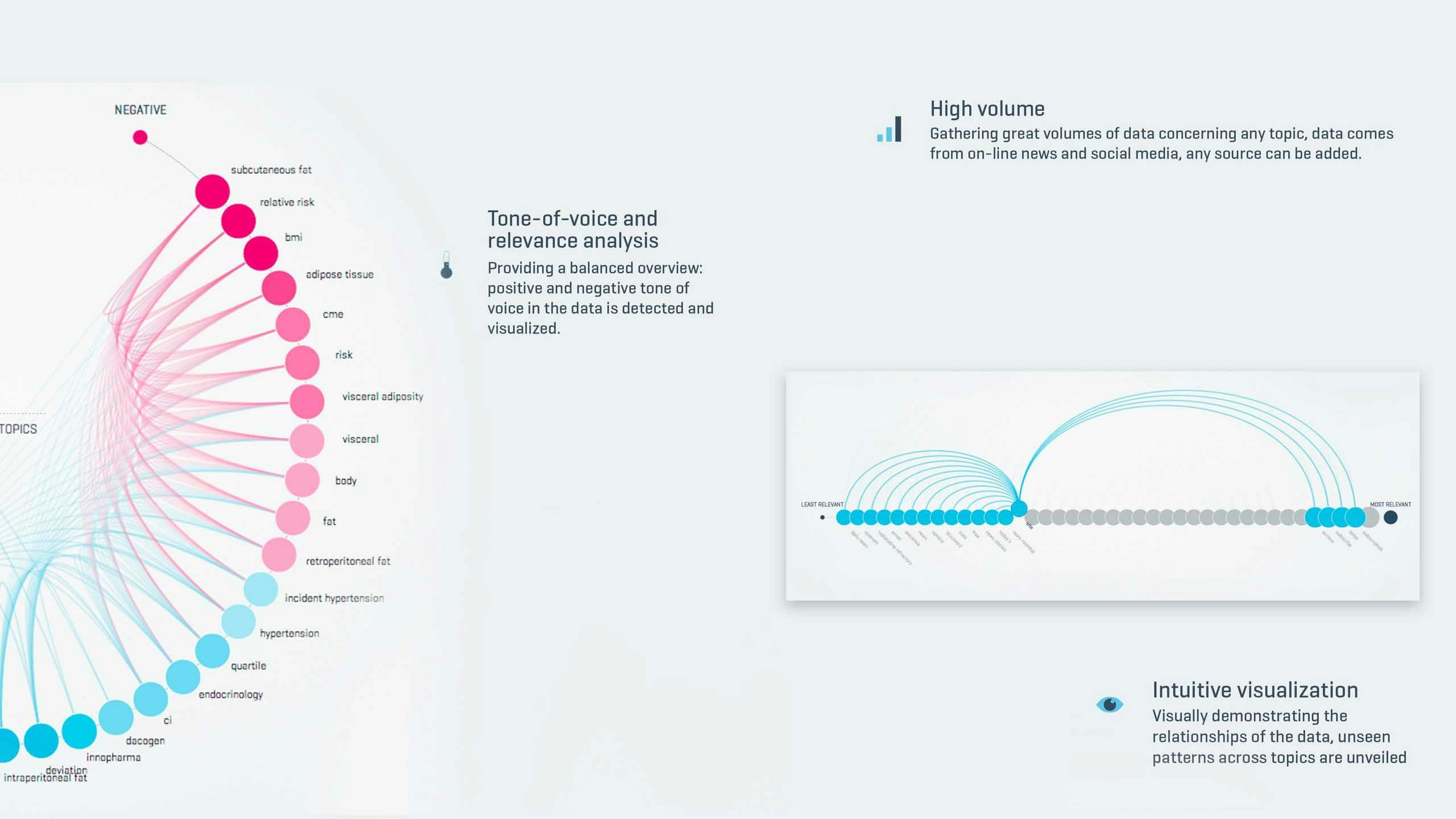
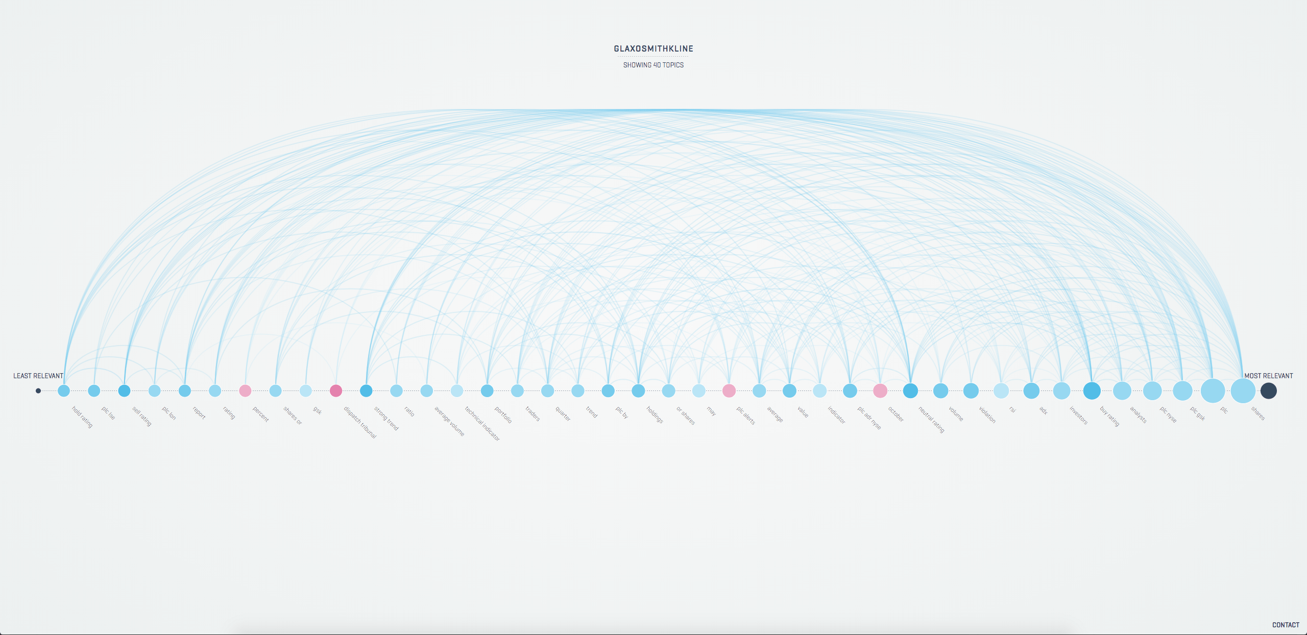
Trendviz has a layered page structure that allows users to sort content by relevance, topic, and source. The color of the circles gives an indication of the tone of voice in terms of how negative or positive an article sounds.
Datavisualizations
The form and shape of the visualizations is driven by the content and core principles of the algorithms behind TrendViz. Consistent visualizations reduce the complex multidimensional networks into comprehensible images.
Technology
We partnered with AI Applied to perform sentiment analysis on the collected content. All content elements are contextually rated in the scope of the current topic, as such, they are entirely specific to the topic at hand.
To generate visually appealing graphs, we used the D3 JavaScript library. Most notably, every graph within Trendviz can transition into any of the other graphs.
Results
TrendViz helps manage the massive influx of news articles. Powered by intelligent algorithms, it continuously tracks online news. As a result, patterns emerge in real-time, enabling the end user to take action and respond to the latest developments.
It helps to manage information overload by providing visual analysis of what is being discussed about a certain brand or topic, and how they relate.