A bold visual language that unites and celebrates
Statistics
- Client
- European Broadcasting Union
- Awards
- European Design Award – Gold (x2)
- European Design Award – Silver
- Red Dot Design Award
- The Lovie Awards (x2)
- Deliverables
- Visual identity
- Artwork
The challenge
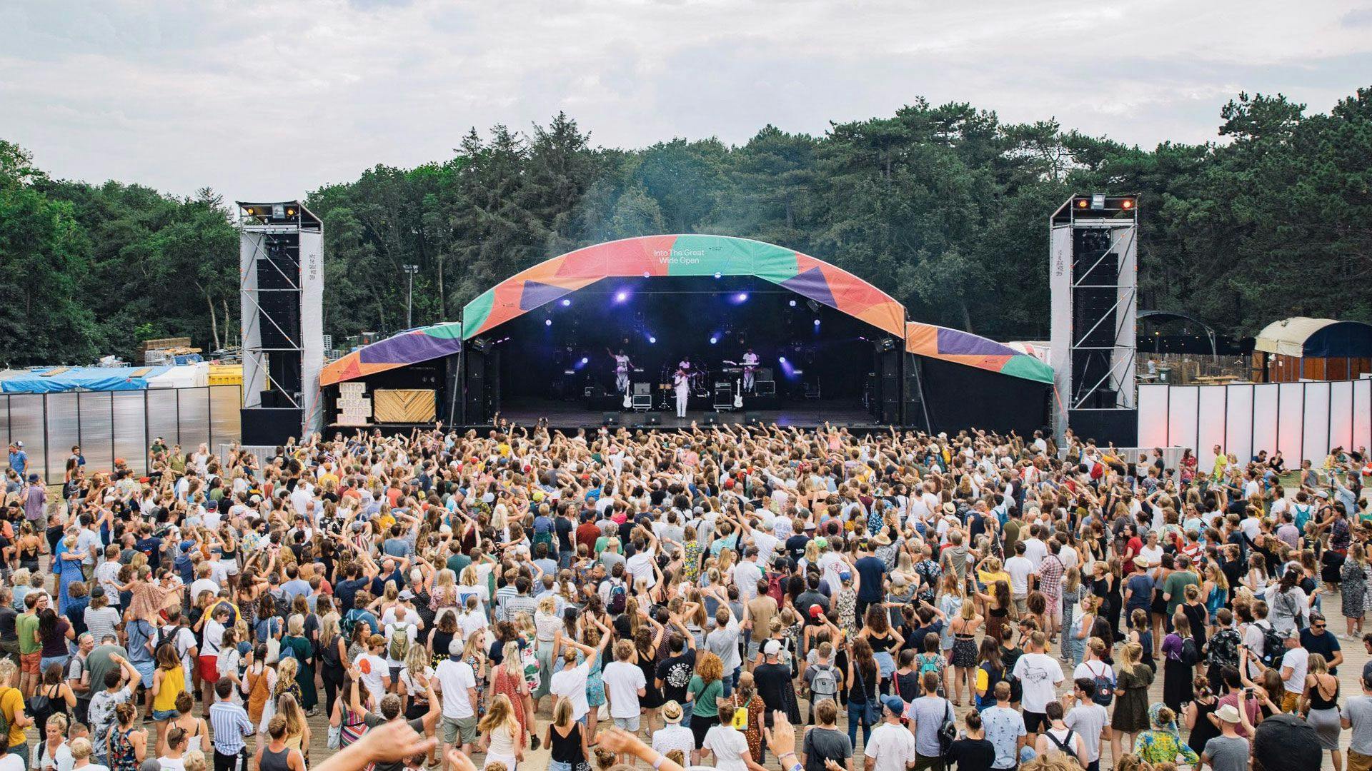
Music has the power to unite people across different countries. Festivals, concerts and shows bring a variety of audiences together and help them relate to each other both on a local and global level.
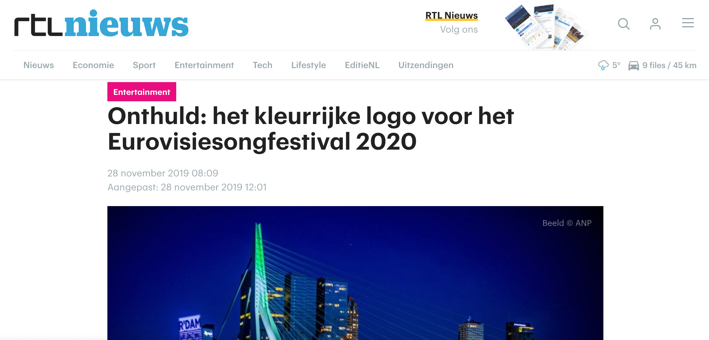
The Eurovision Song Contest is the world’s biggest and longest-running music show, being watched around the world by approximately 180 million people. It’s an annual international television contest, with participants representing primarily European countries. Following the victory of The Netherlands in the 2019 contest, the 65th song contest was planned to take place in Rotterdam.
CLEVER°FRANKE was asked to develop an identity for the 2020 edition and a logo for the 2021 edition that highlighted and enhanced the theme of the contest ‘Open Up’ in a distinctive way.
Value delivered
A data-driven visual language that celebrates the history of Eurovision and sets new standards for the TV entertainment industry.
Background
AboutEurovision
The Eurovision Song Contest started 10 years after the end of the Second World War, as a way of helping to unite Europe through music and creativity. It began with only 7 European countries and over the decades the competition embraced new cultures, talent, and technologies and today it welcomes 41 participating countries.
To emphasize this message, we decided to develop a data-driven visual identity that honors the history of the Song Contest in a contemporary way, while leaving room for future growth.
The contest has its own wordmark that is the standard every year. But every host country creates their own theme and symbol that gives each edition a unique visual appeal.
Twoeditions
Initially, the event was scheduled in 2020, but due to the Corona pandemic, it was postponed until 2021. Eventually, CLEVER°FRANKE was asked to create the visual identity and logo for 2020 and a variation on the logo for the 2021 edition.
Phases and toolkit items used
2020edition
Identityconcept
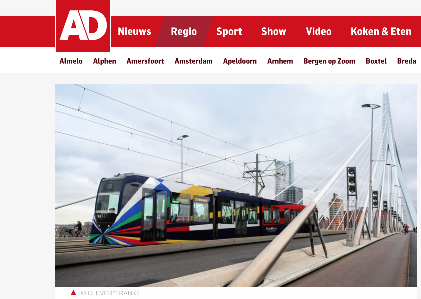
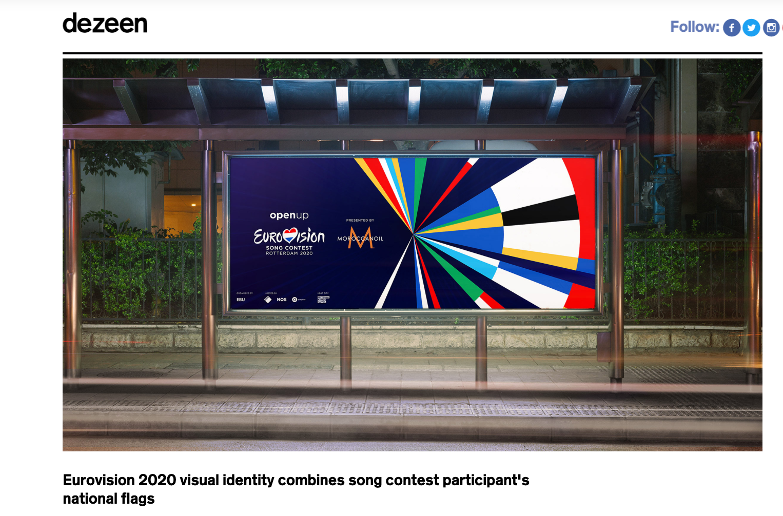
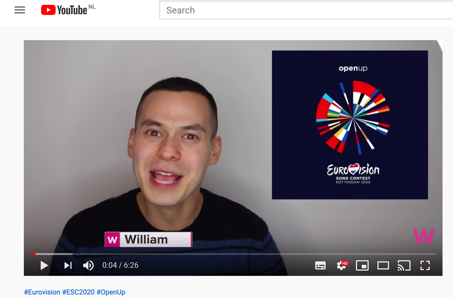
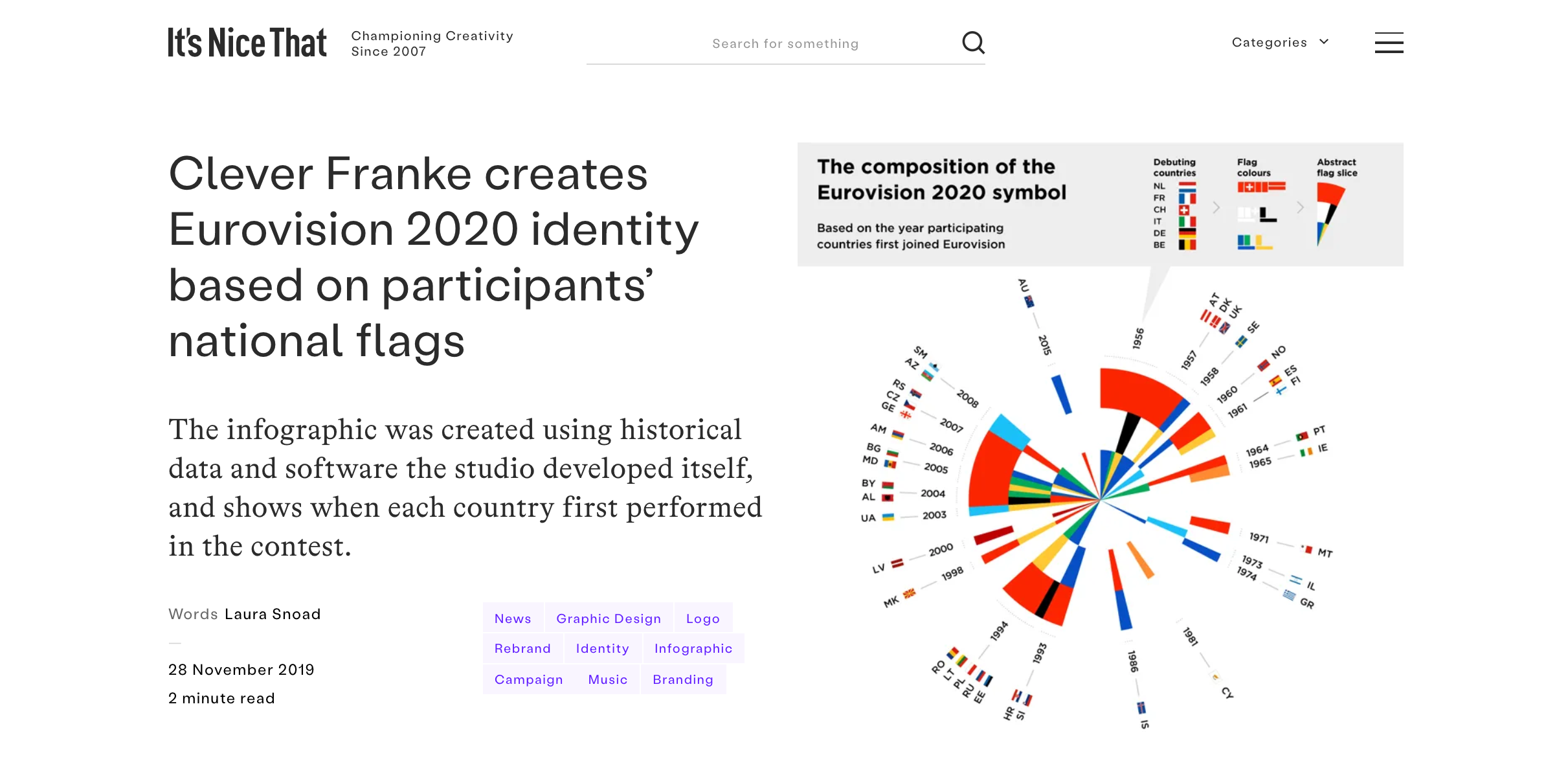
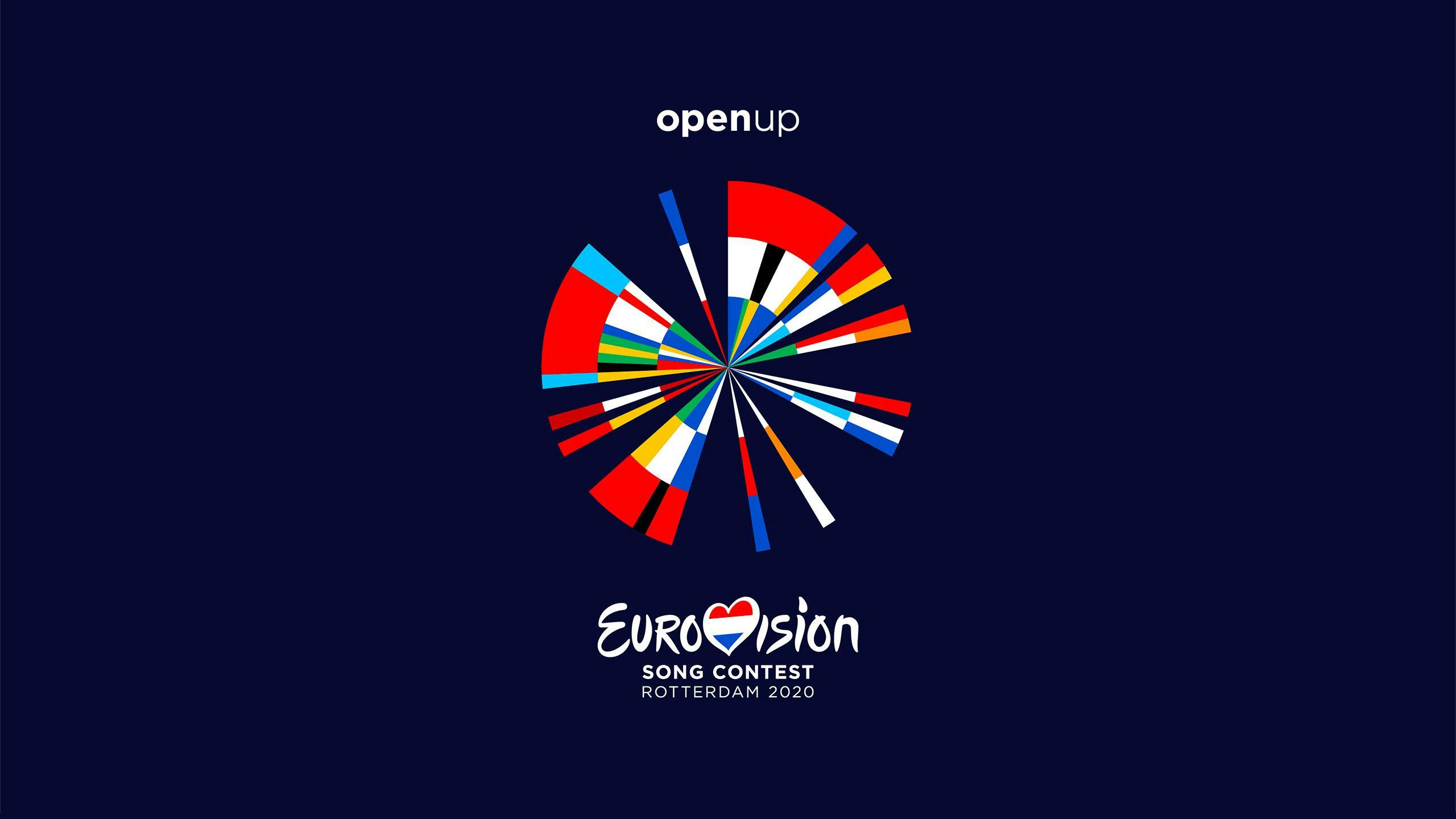
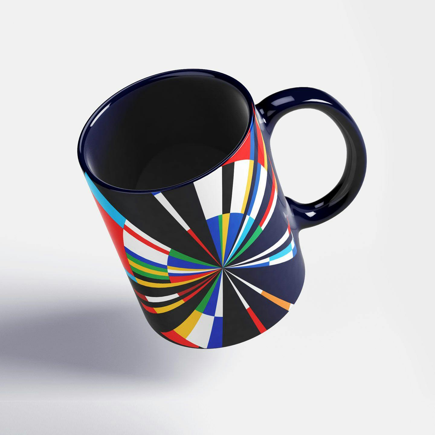
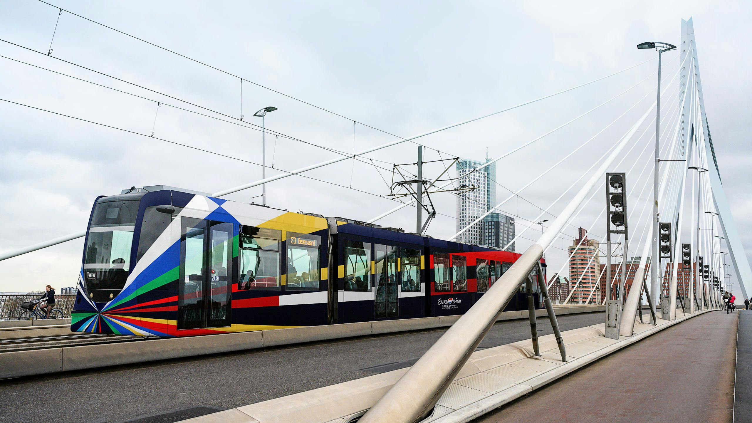
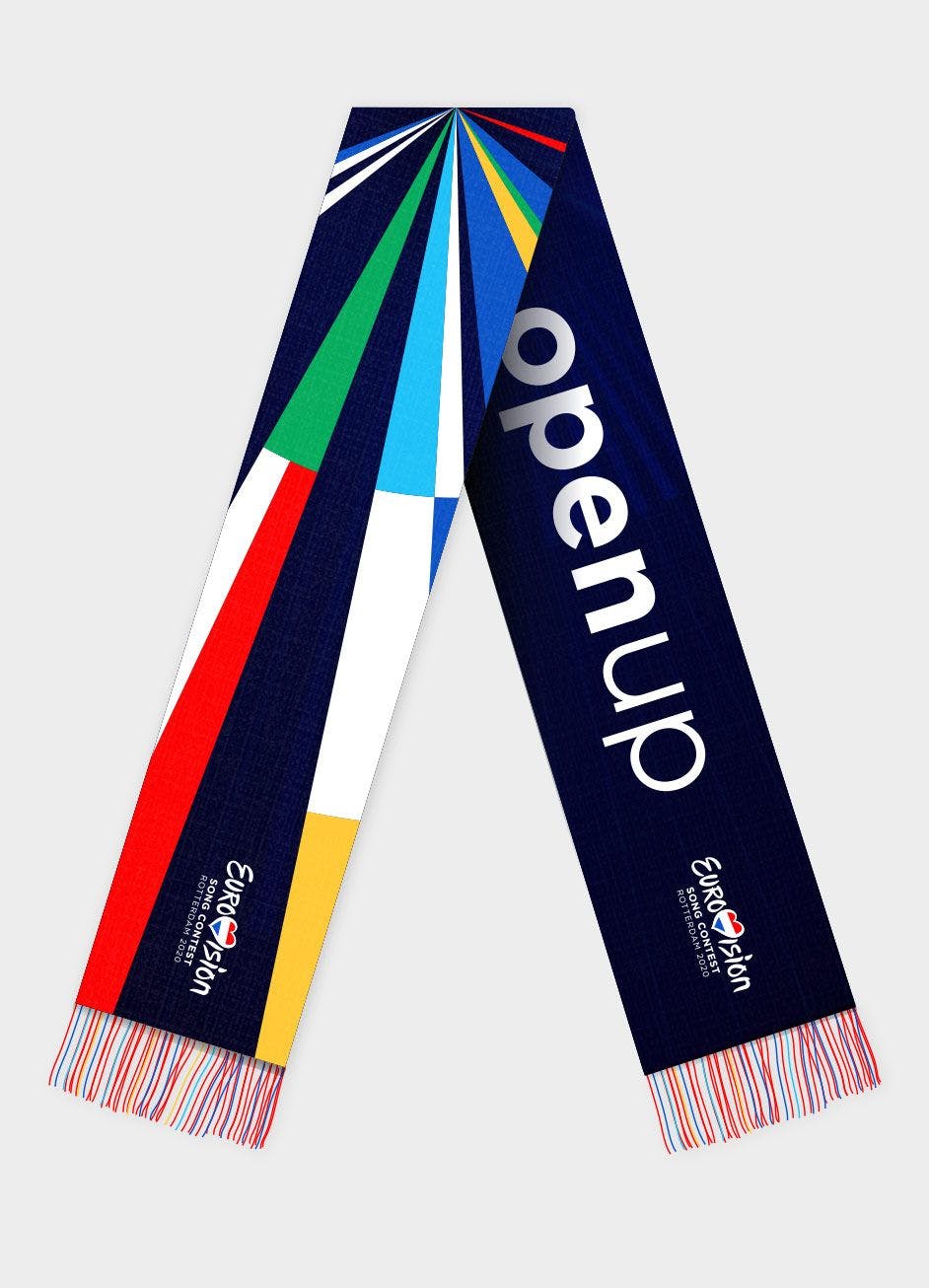
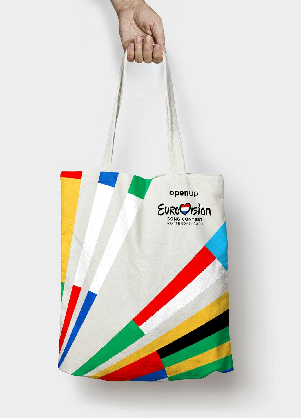
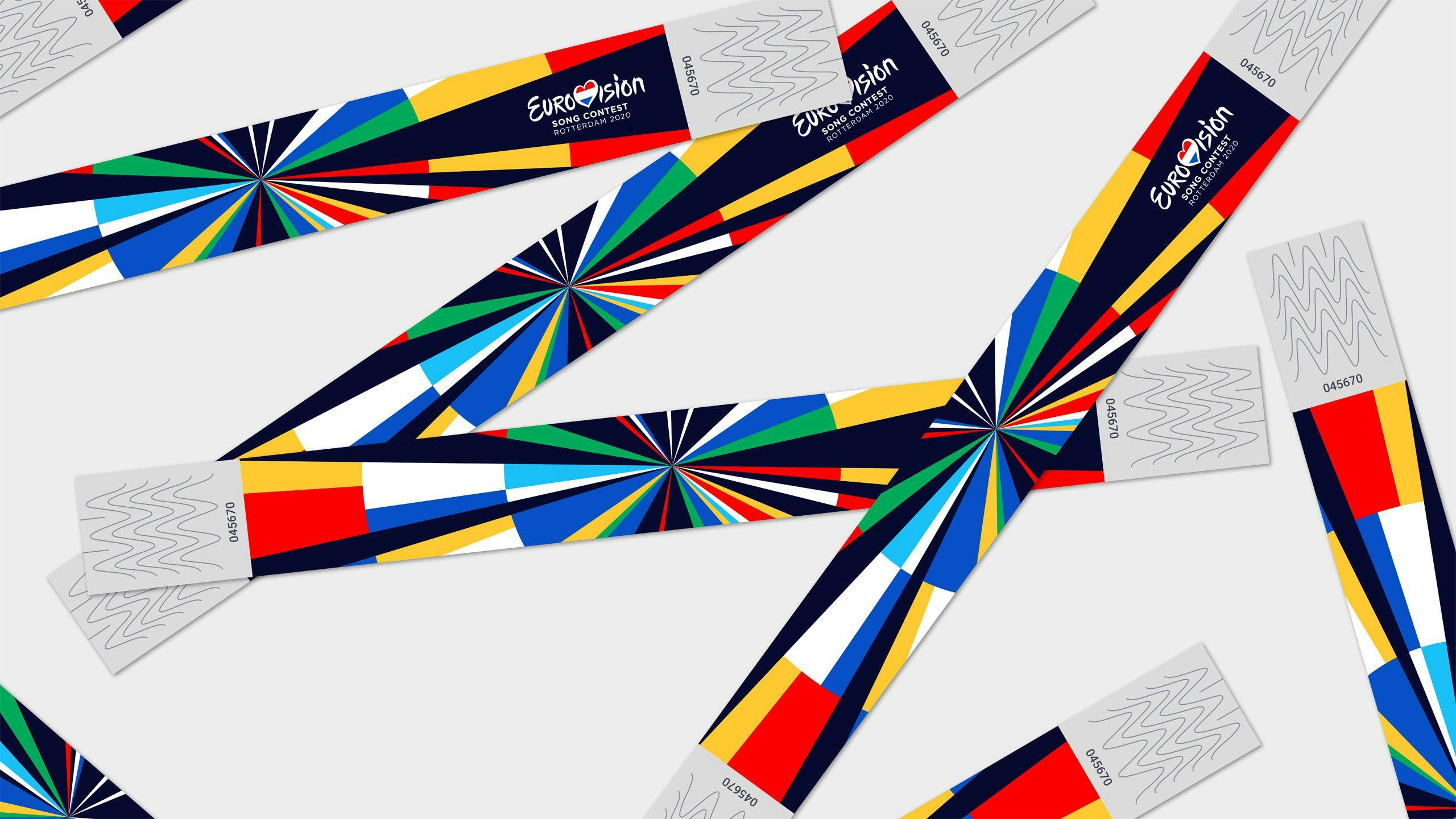
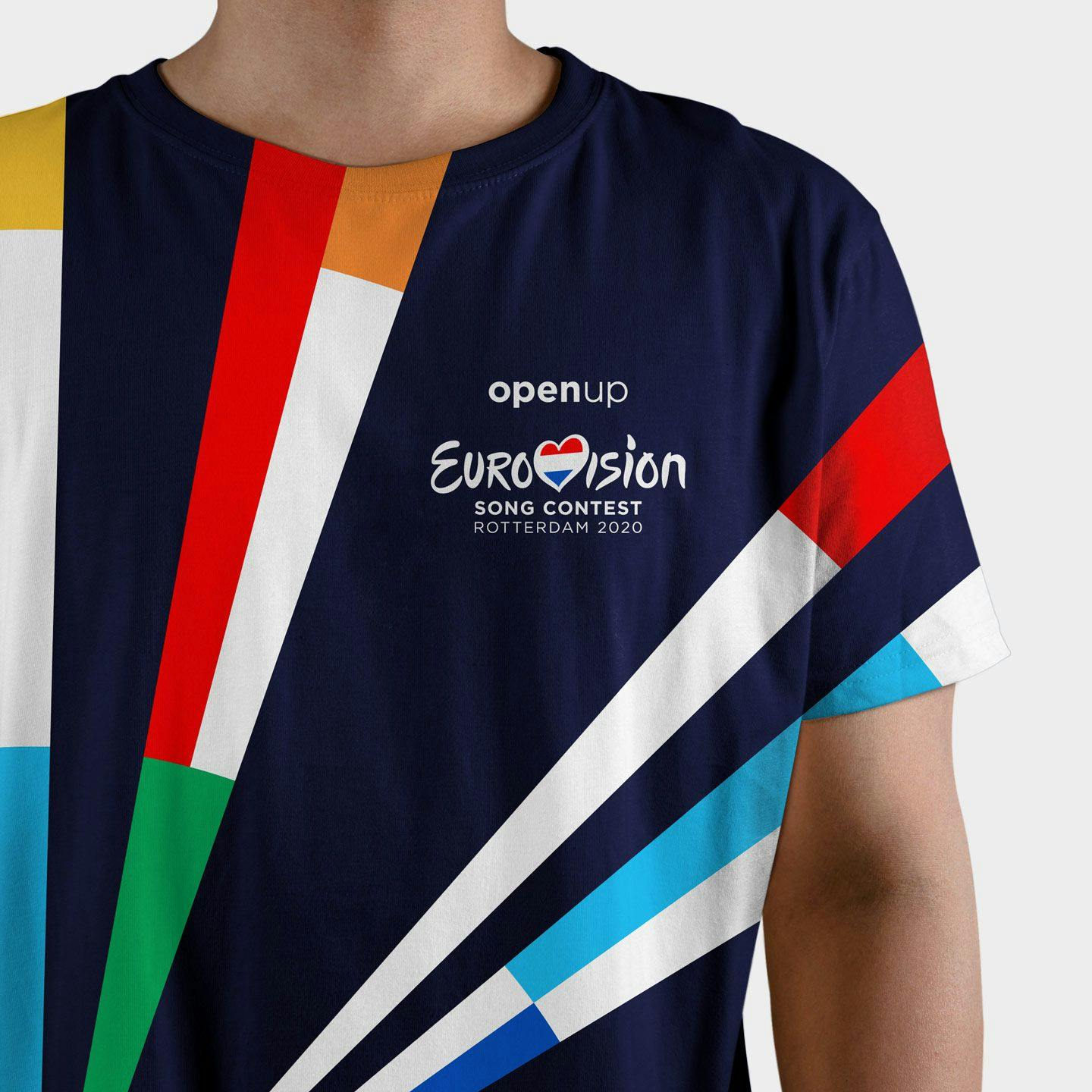
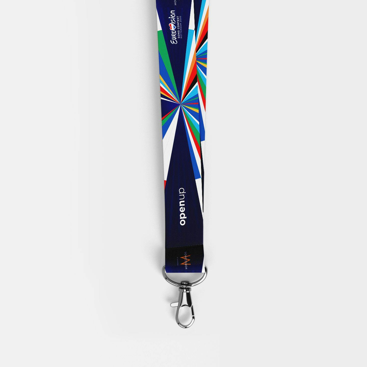
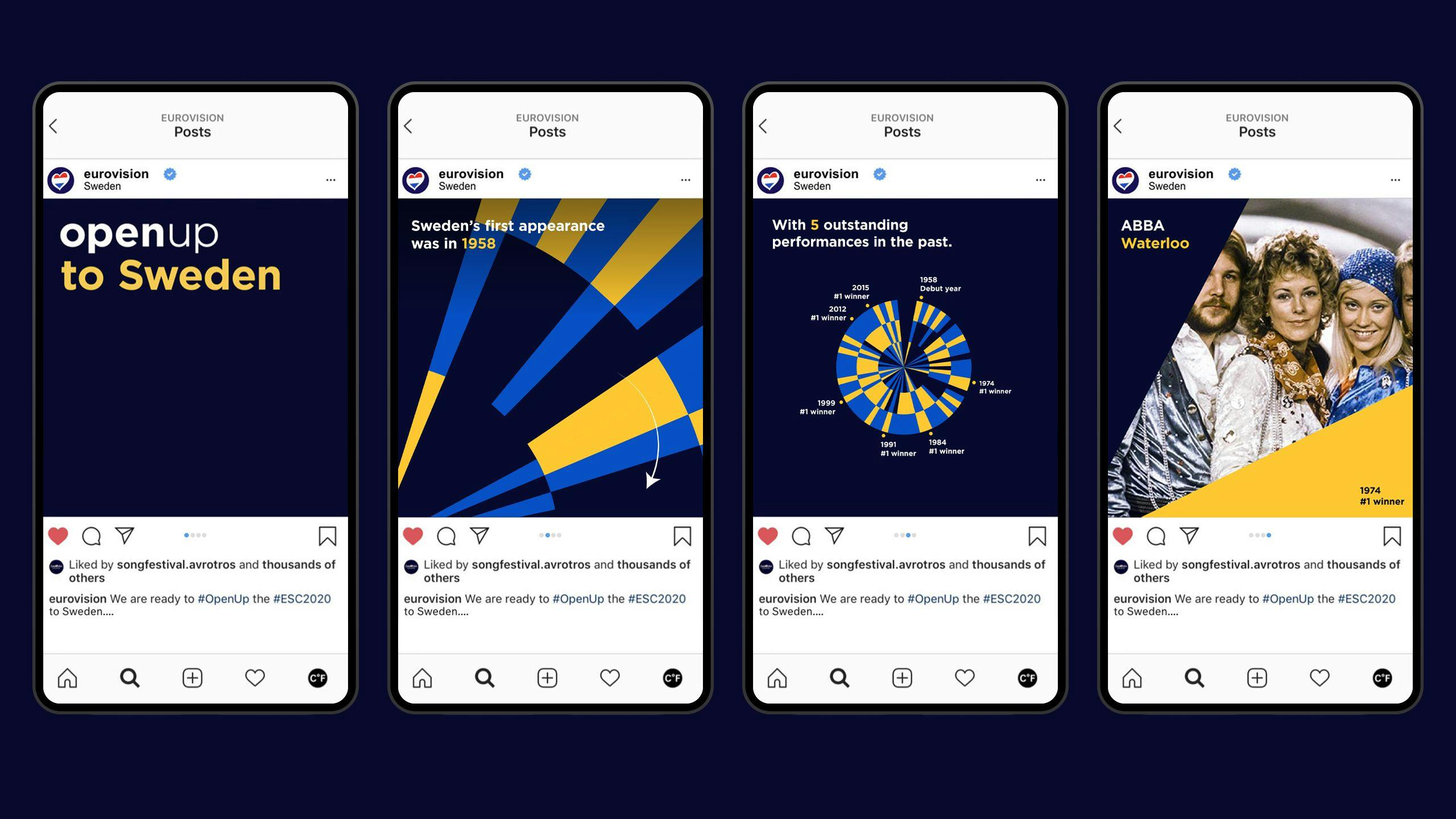
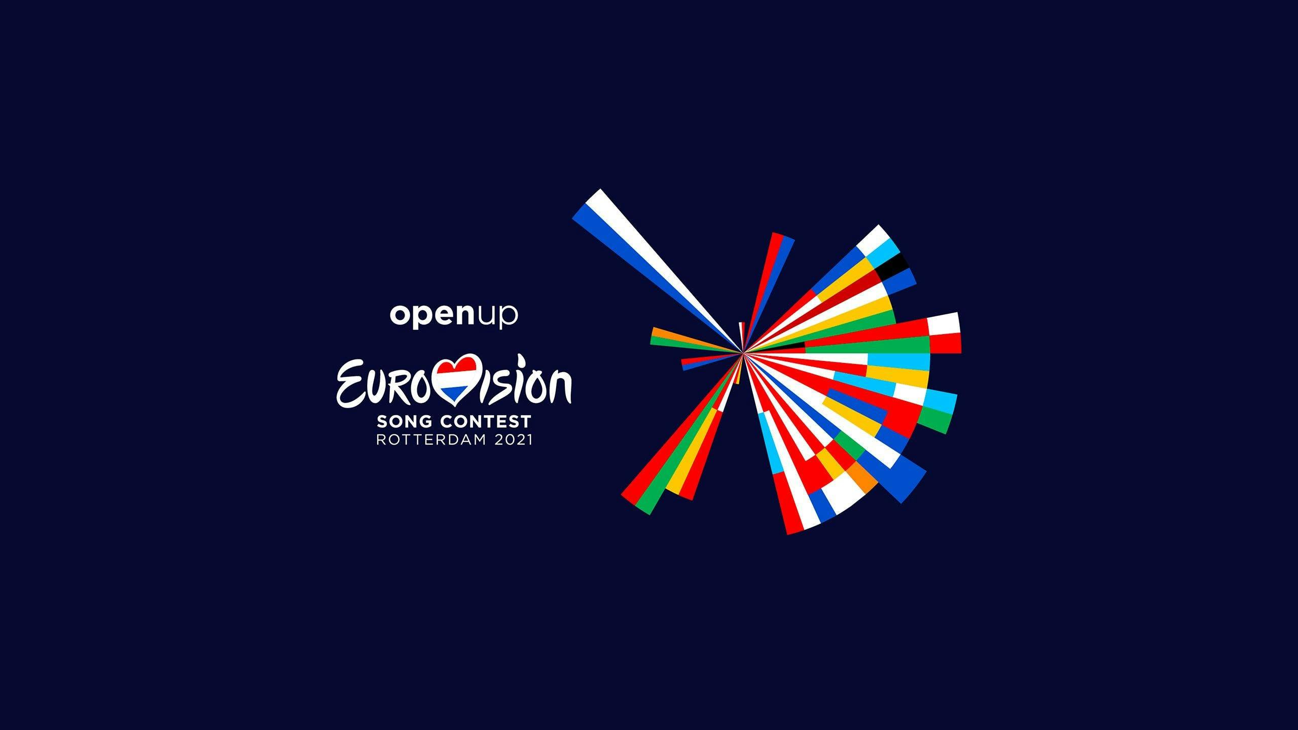
By using our custom-made software along with historical data, we designed an iconic identity that is an abstract representation of the flags of the countries participating in 2020. Adding the colors of the flags chronologically in order of the countries’ first Eurovision participation, the vignette vividly brings out the diverse, yet unified essence of the Eurovision Song Contest. The result is a flat, colorful design based on data.
Identityapplication
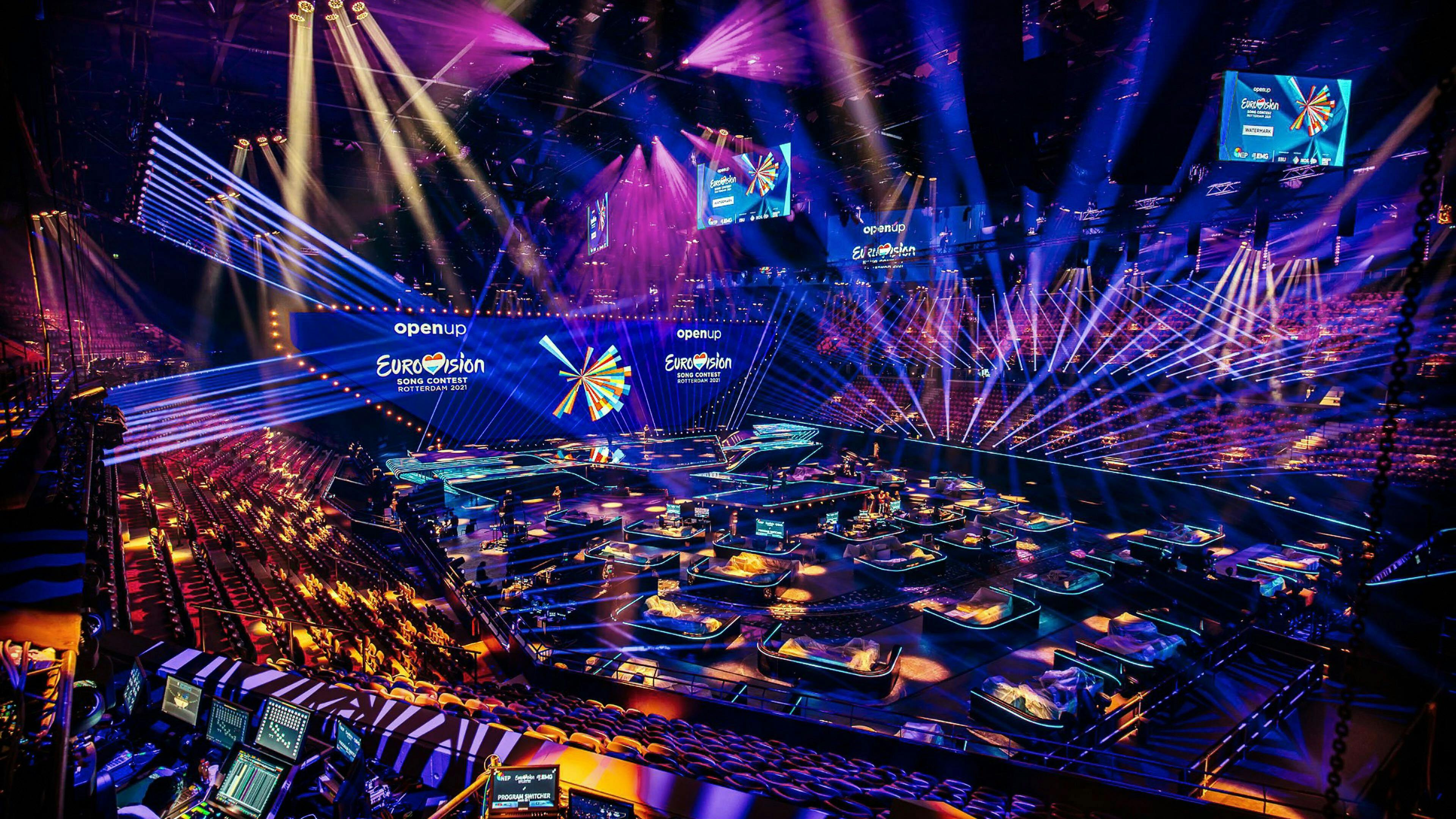
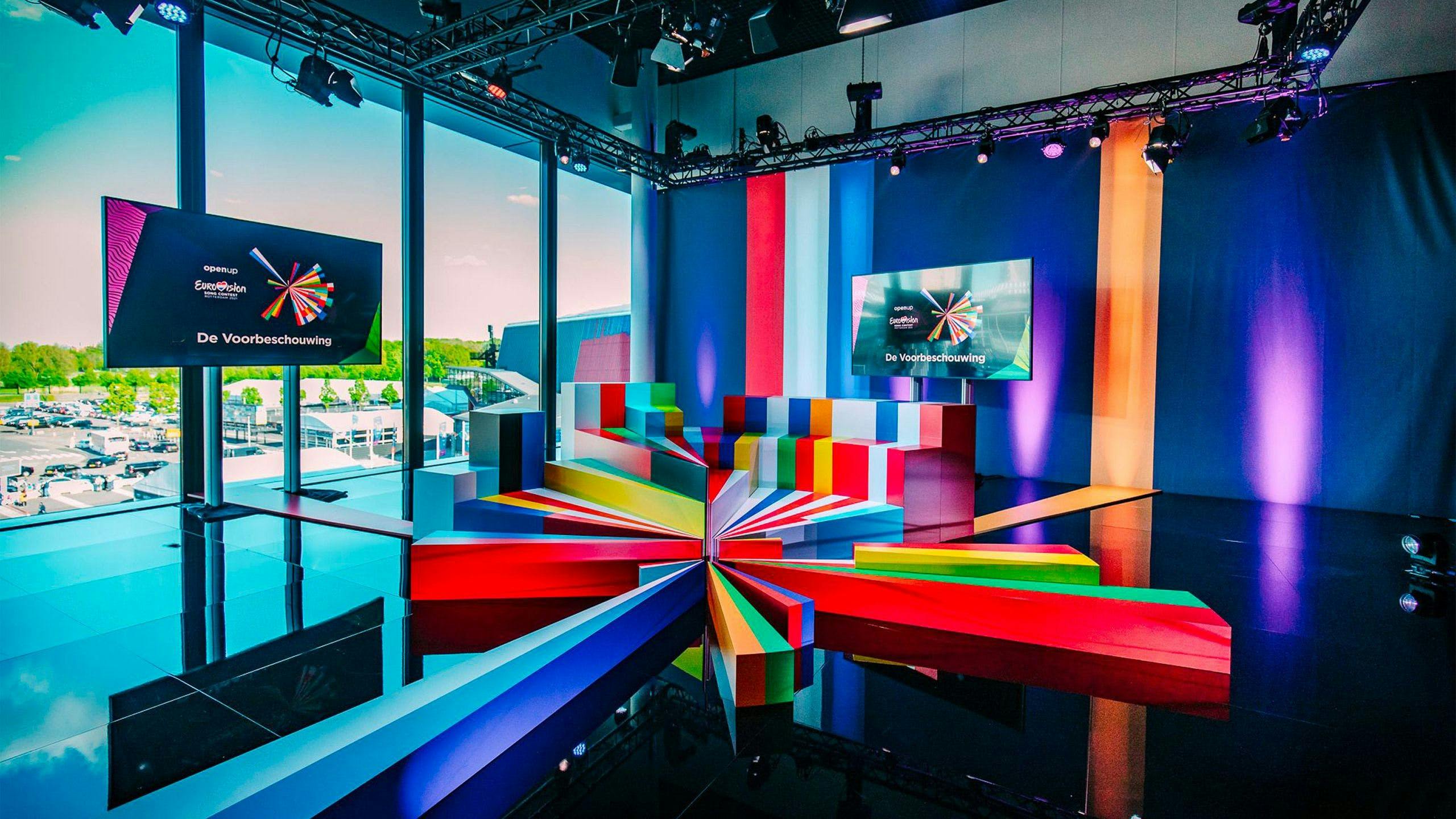
The identity is complex, consisting of multiple layers to explore. At first glance, it’s visually attractive and can be applied in many different ways, but there is a story behind it that complements the theme of Eurovision 2020 and 2021, ‘Open Up’. Both in static images and motion, we tied our design to this theme by using the logo in a way that it both brings out the unifying feeling and opens up through time.
Extension
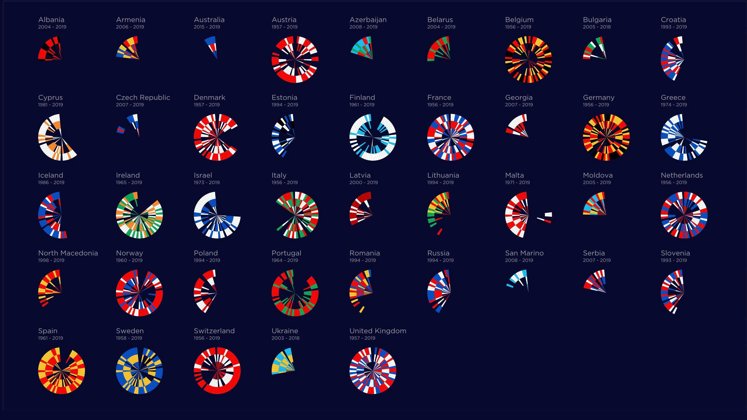
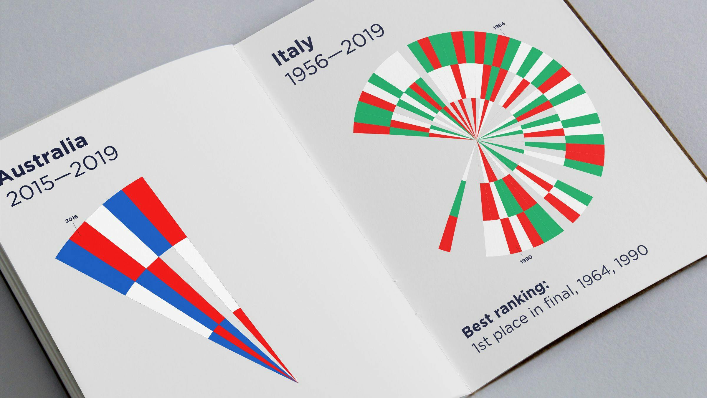
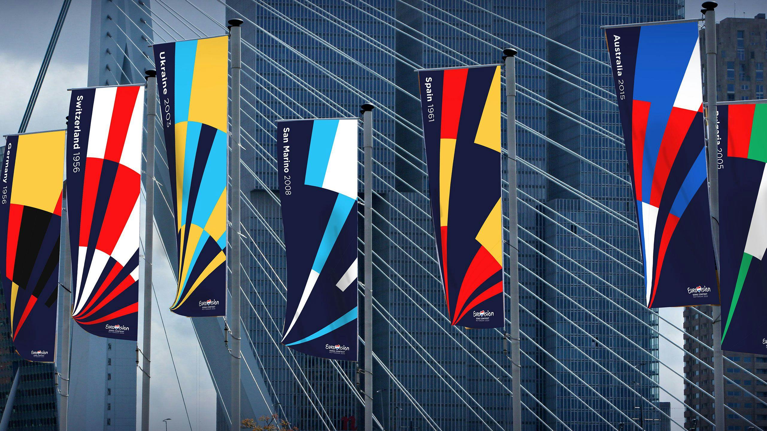
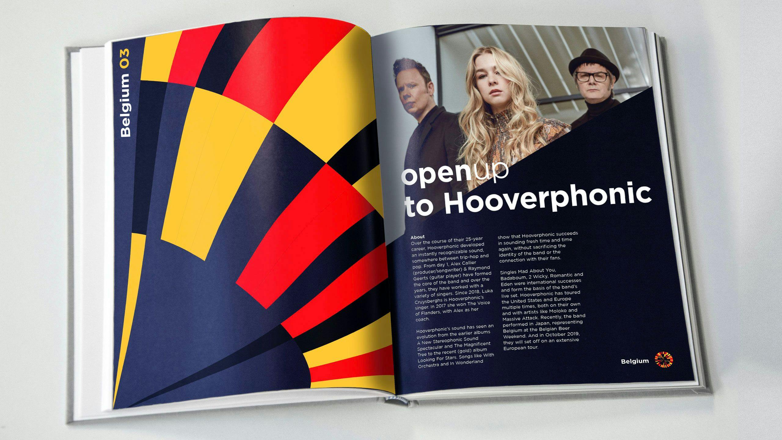
Countryvignettes
To further enhance the identity and bring the story of this 65th edition even more to life we have created unique visualizations for each participating country. The vignettes represent 65 years of data and position the colors of each country based on its ranking performance throughout the history of the Eurovision Song Contest.
These vignettes are used to tell specific stories about each participant and enable the brand team to implement the design system in a more dynamic way. This allows the story of the identity to become even more colorful and diverse.
2021edition
The Eurovision Song Contest is a celebration of sovereign mentalities. Rather than looking at what divides us, we created something that unites.
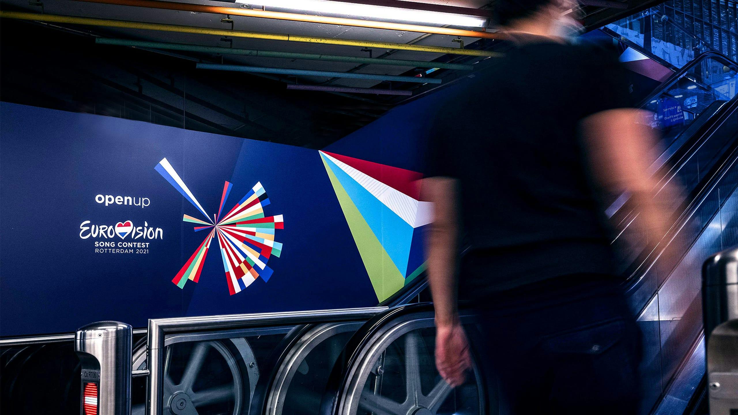
Logo2021edition
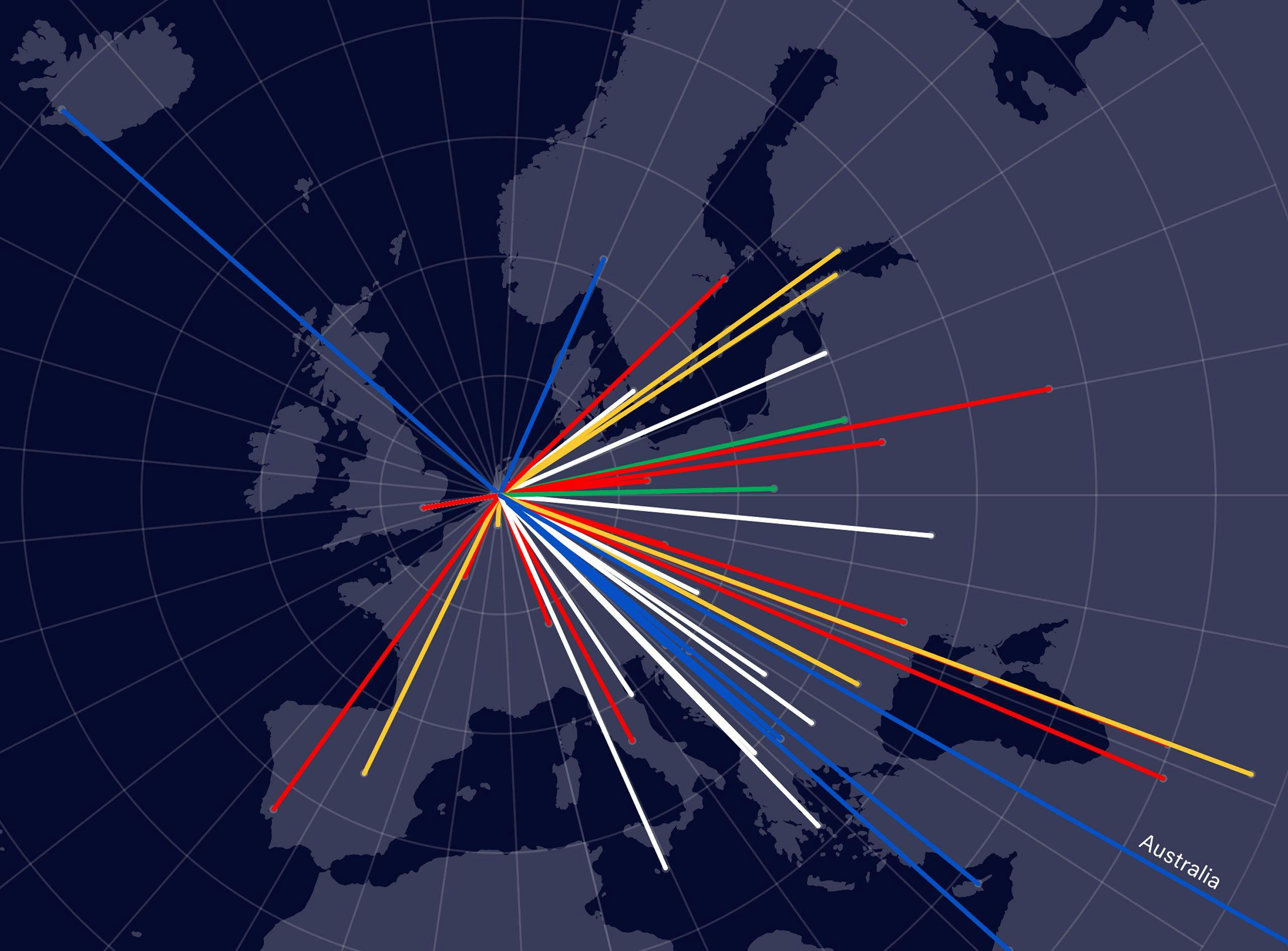
The 2021 logo shows Eurovision’s connecting power in a minimalist and experimental way. It visually connects Rotterdam with all participating countries’ capitals and shows how all participants will come together again during the contest in Rotterdam in 2021. It symbolizes that we are open to everything the participants present to us. It portrays the event in a festive way by using the colors of the participants’ flags.
Concept
Each segment of the symbol is made up of two colors from the flags of the participating countries. The country’s segment position is determined by the angle and distance from its capital in relation to Rotterdam.
Softwaredevelopment
The logo of 2021 is generated using custom-made software.
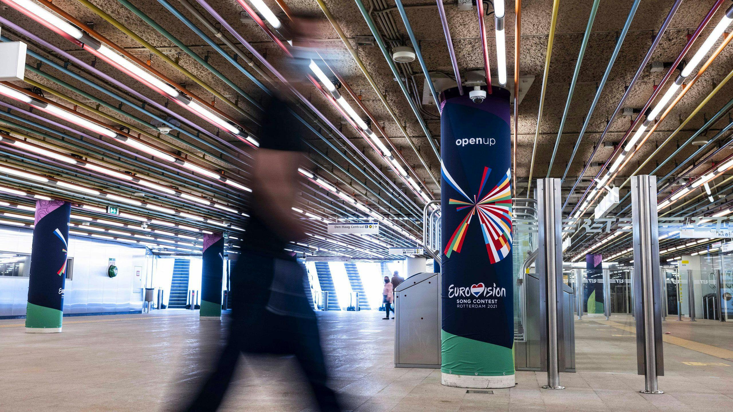
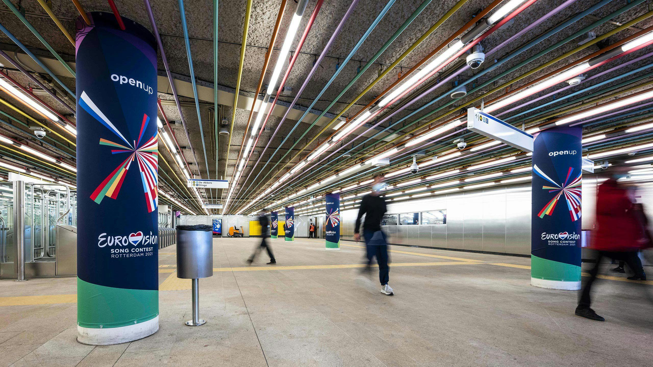
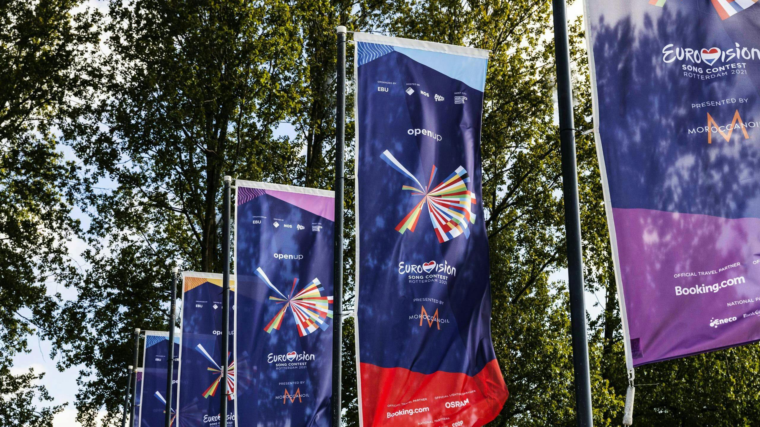
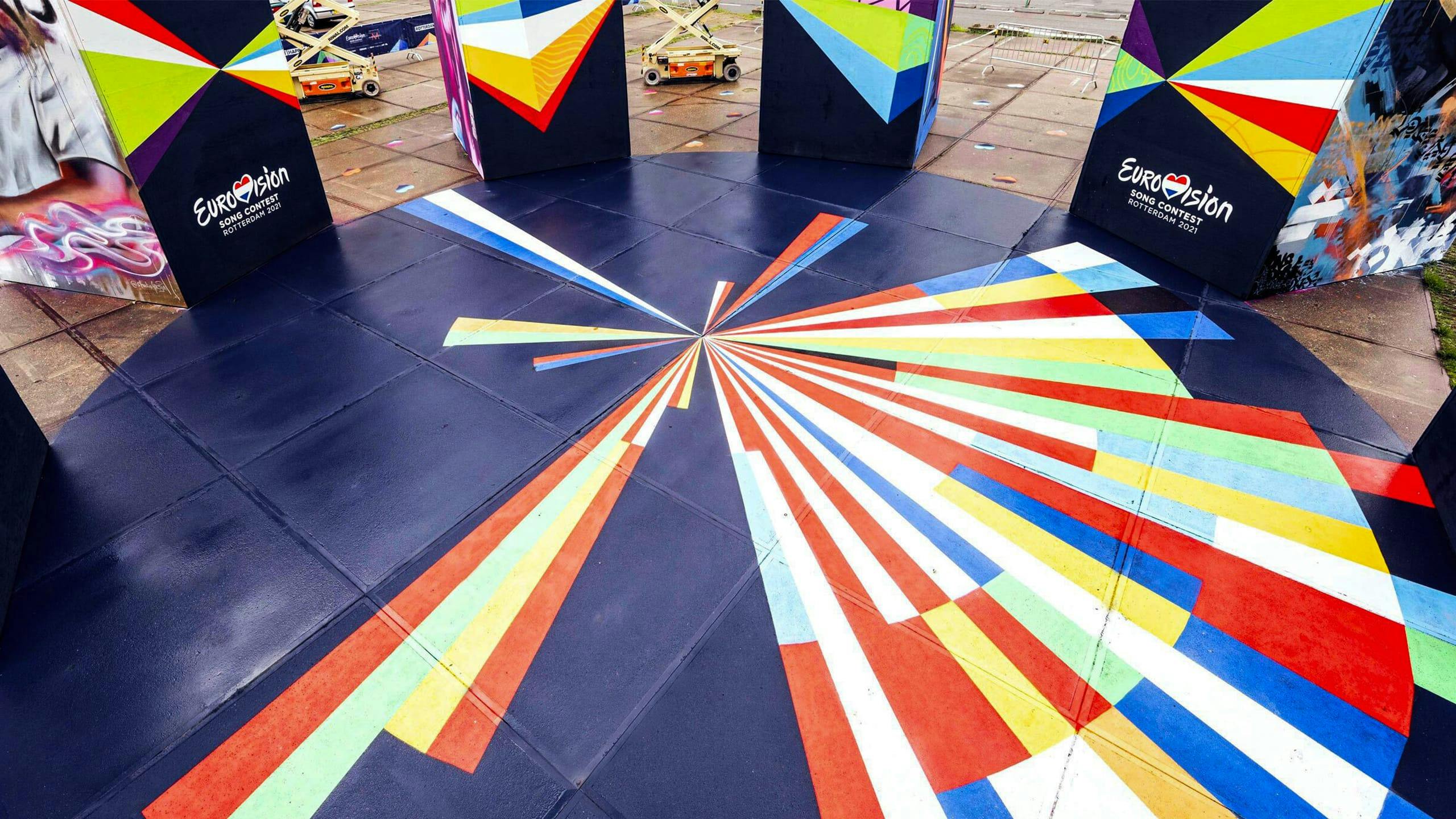
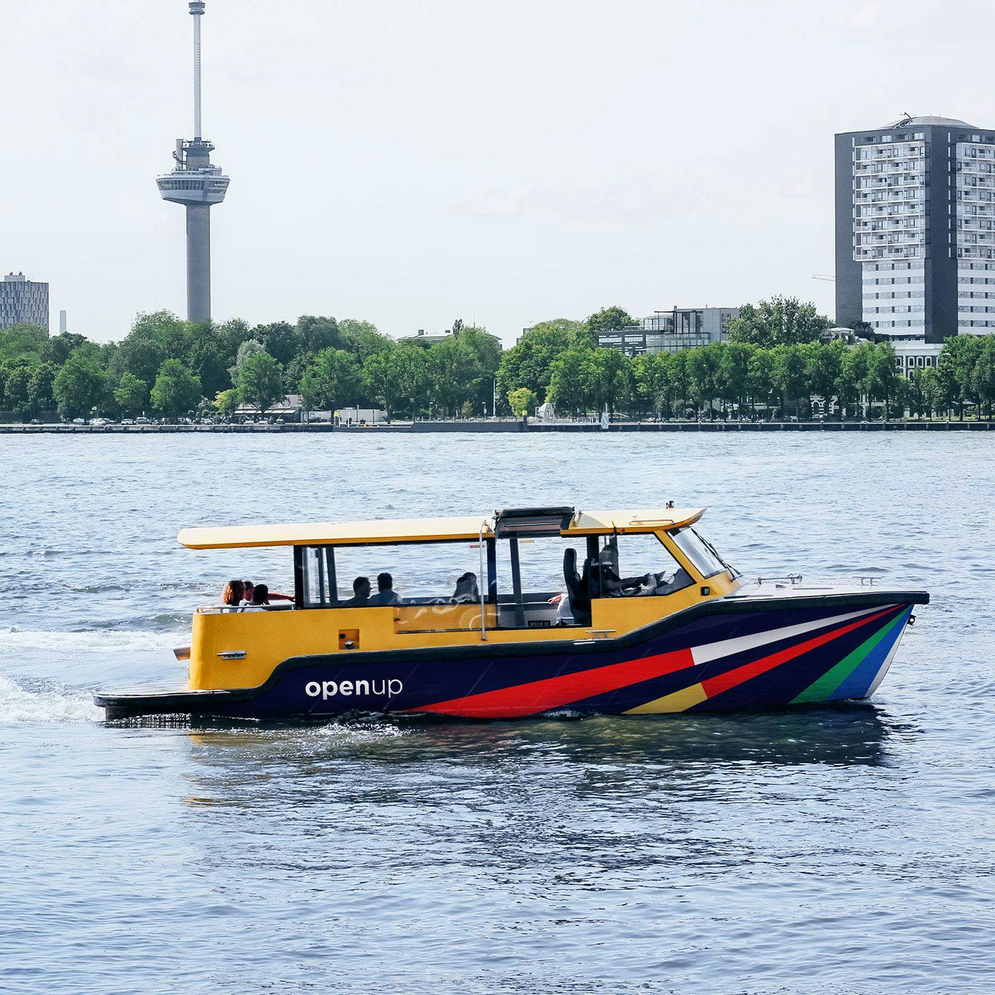
Rotterdamcitydressing
After the cancellation of the 2020 edition, the Song Contest took place in real life. Rotterdam was dressed in the 2021 edition of the logo, which brought a festive atmosphere to the city in the days leading up to the contest.
Styleguide
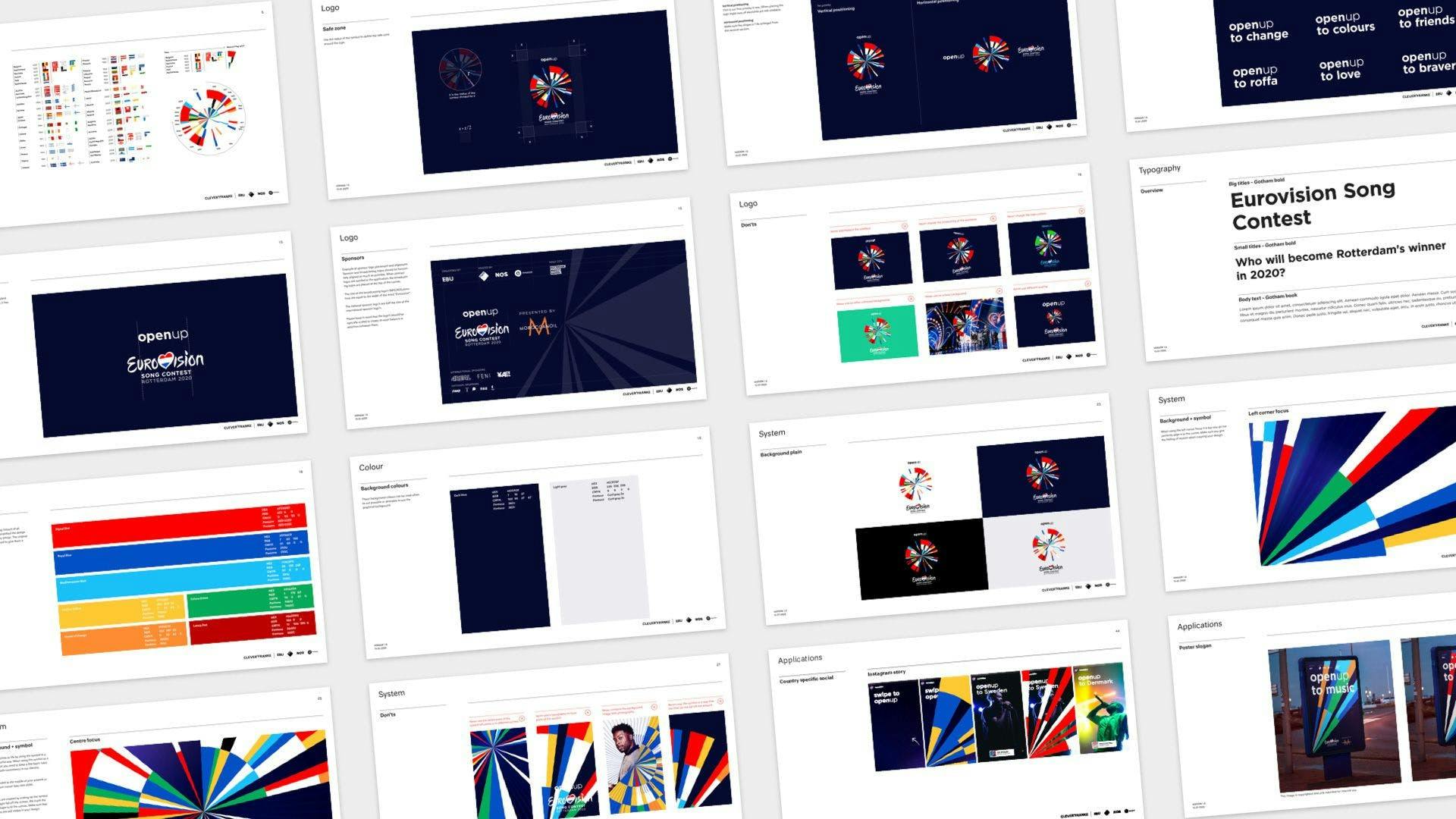
Communicatingthesystem
In order to support the Eurovision team and all the other organizations that need to apply our design, we created a style guide. As the Song Contest’s communication spans across TV graphics, event & city dressing, merchandise, social media and internet content, the style guide serves to keep all the outcomes consistent and recognizable. It describes how the design system works by showing examples, and what can and cannot be done with the design system.
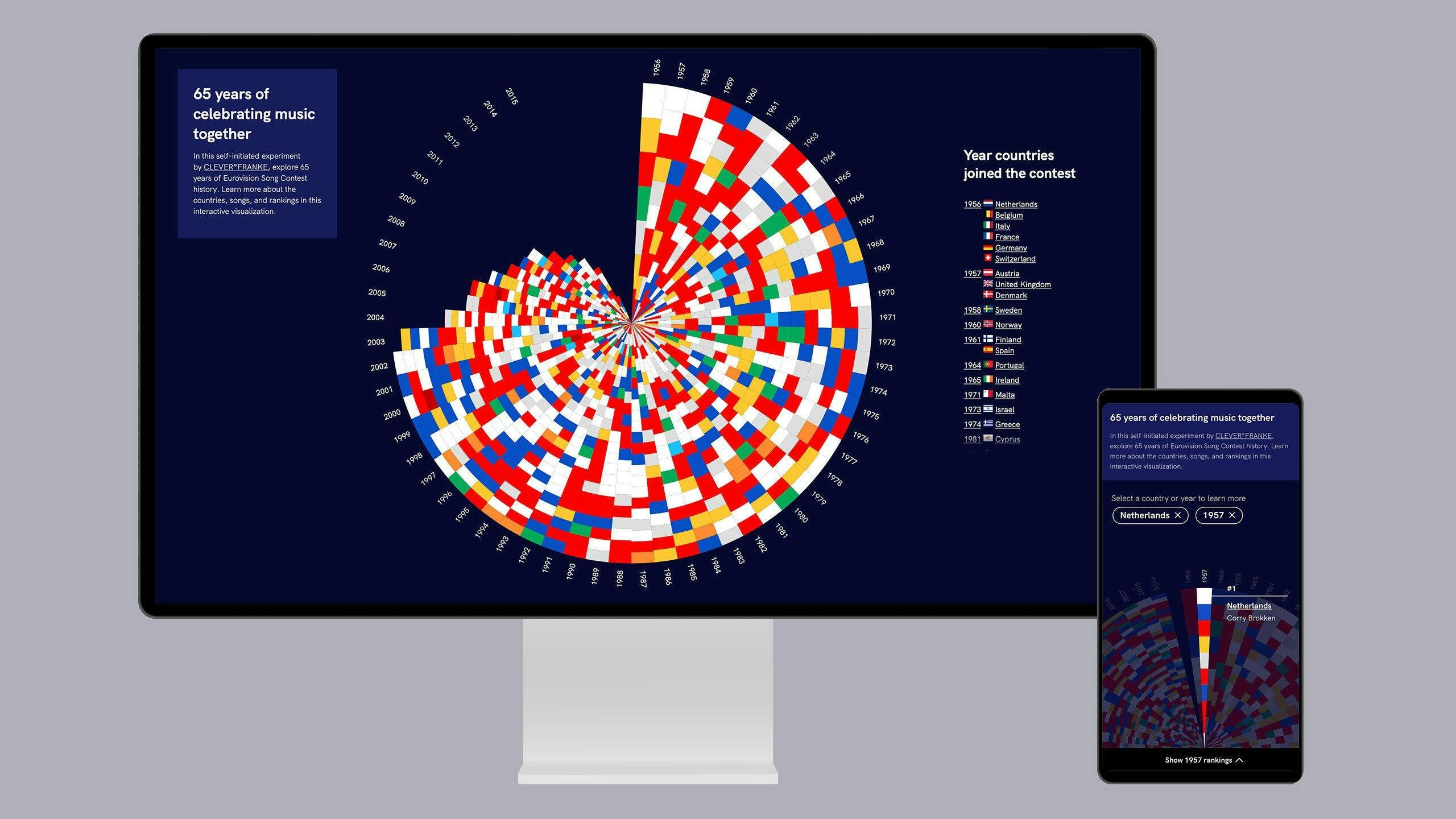
Historyvisualization
As a self-initiated experiment, we explored different ways to engage with the extensive Eurovision Song Contest history. We provide an interactive experience to learn more about the countries, songs, and rankings.
We designed it in a way that allows the elaborate visualization to work on your laptop and smartphone.
Results
We are extremely pleased with the artwork for the Eurovision Song Contest 2020 that perfectly celebrates our 65-year heritage. The impactful design also encapsulates the event’s modern values of diversity and inclusivity and beautifully complements this year’s slogan ‘Open Up’.
Jon Ola Sand
Executive Supervisor of the Eurovision Song Contest for the European Broadcasting Union (EBU)