Showcasing how to experiment with data
- Client
- Self-initiated project
- Deliverables
- Five posters
The challenge
The Weather Chart is an engaging way in which CLEVER°FRANKE demonstrates the power and use of data in an easily understood format. Every edition reproduces weather data in a new and unique chart, visualizing particular aspects of meteorological activity. With each edition, we challenge ourselves to explore new ways of visualizing data.
The Weather Chart holds an important position in the heritage of CLEVER°FRANKE. The degree sign in our name, a reference to the astronomer Anders Celsius (°C) and the physicist Daniel Fahrenheit (°F), the minds behind the units with which we measure temperature, is also an assertion to our affinity with the weather and serves as the basis for the design of our visual identity. The Weather Charts are part of the collection of the leading modern and contemporary art and design museum Stedelijk Museum Amsterdam.
Value delivered
A decade of discovering new ways to visualize weather data. It has become part of the Stedelijk Museum Amsterdam collection.
Sketches
An overview of sketches made for several versions of the C°F Weather chart, made over the last ten years.
Fifthedition
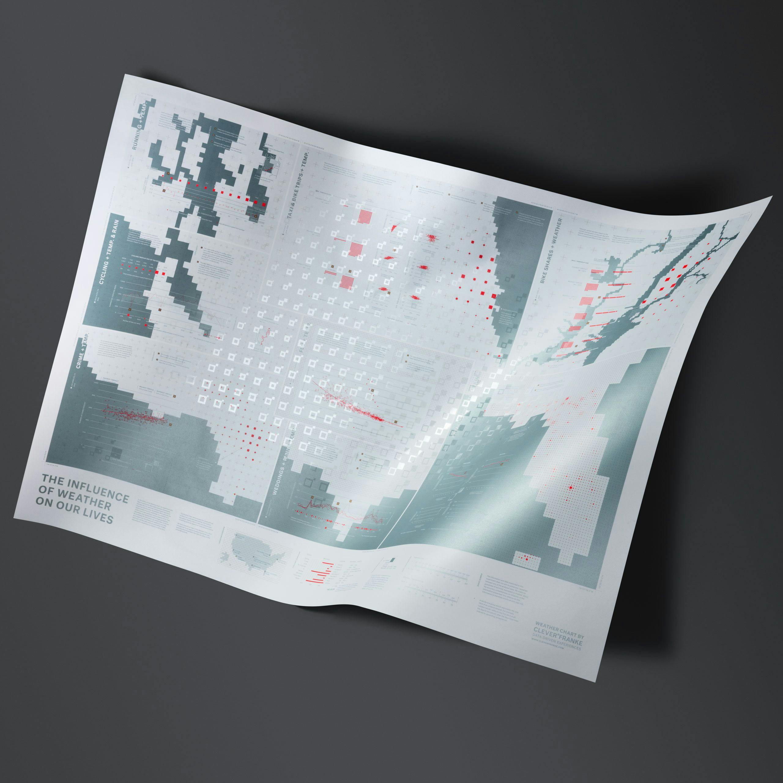
Theinfluenceofweatheronourlives
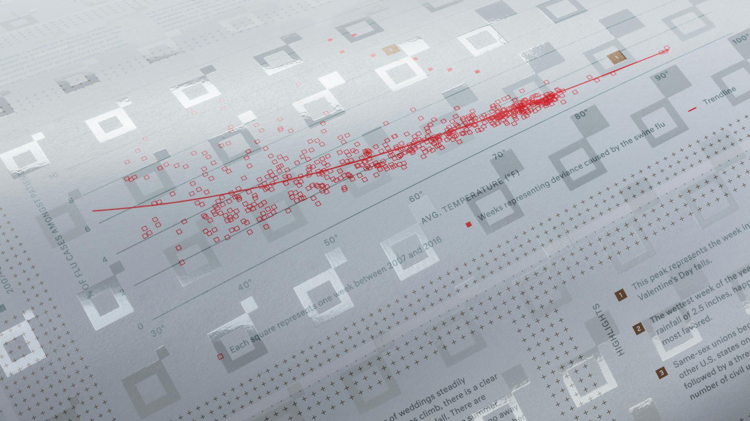
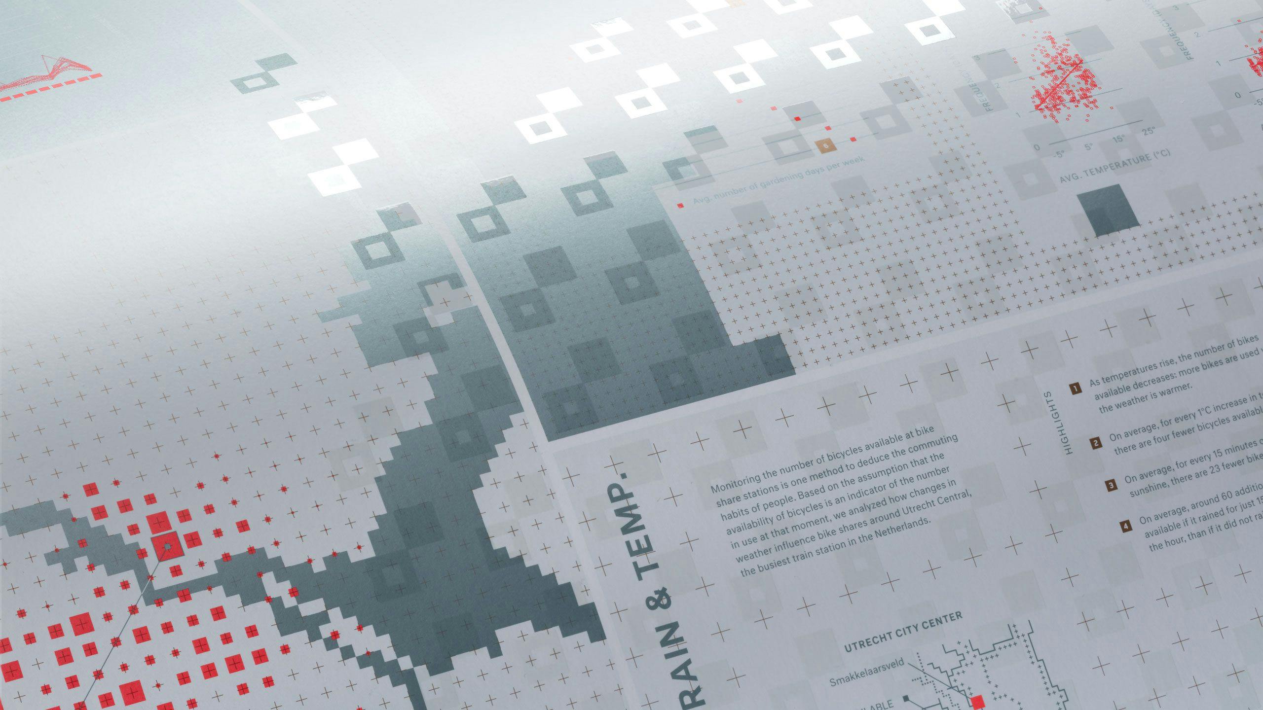
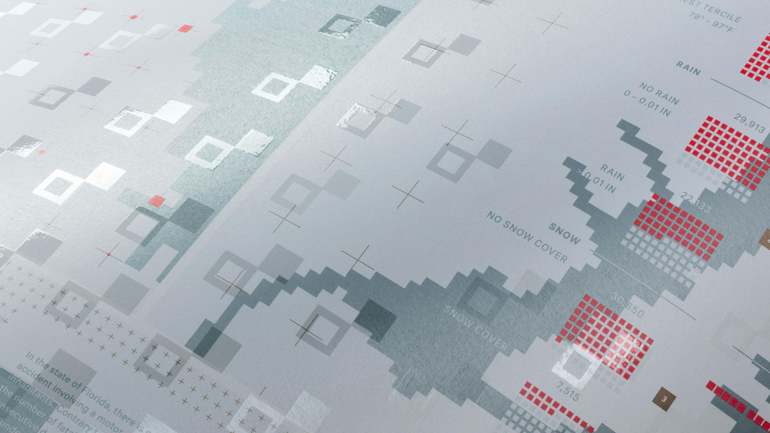
In this edition of our Weather Chart, we experiment with data to explore the relationship between the weather and daily life. For centuries, meteorologists have been observing and recording the weather. More recently, the rapid increase in sensor technology has enabled us to collect more data relating to various aspects of our lives.
Separately, each dataset provides a single perspective. By combining this information, we reveal a layer of context and insights into the influence of weather on our lives. Each topic we have selected is an exploration of data, expressed as a visualization to uncover a story.
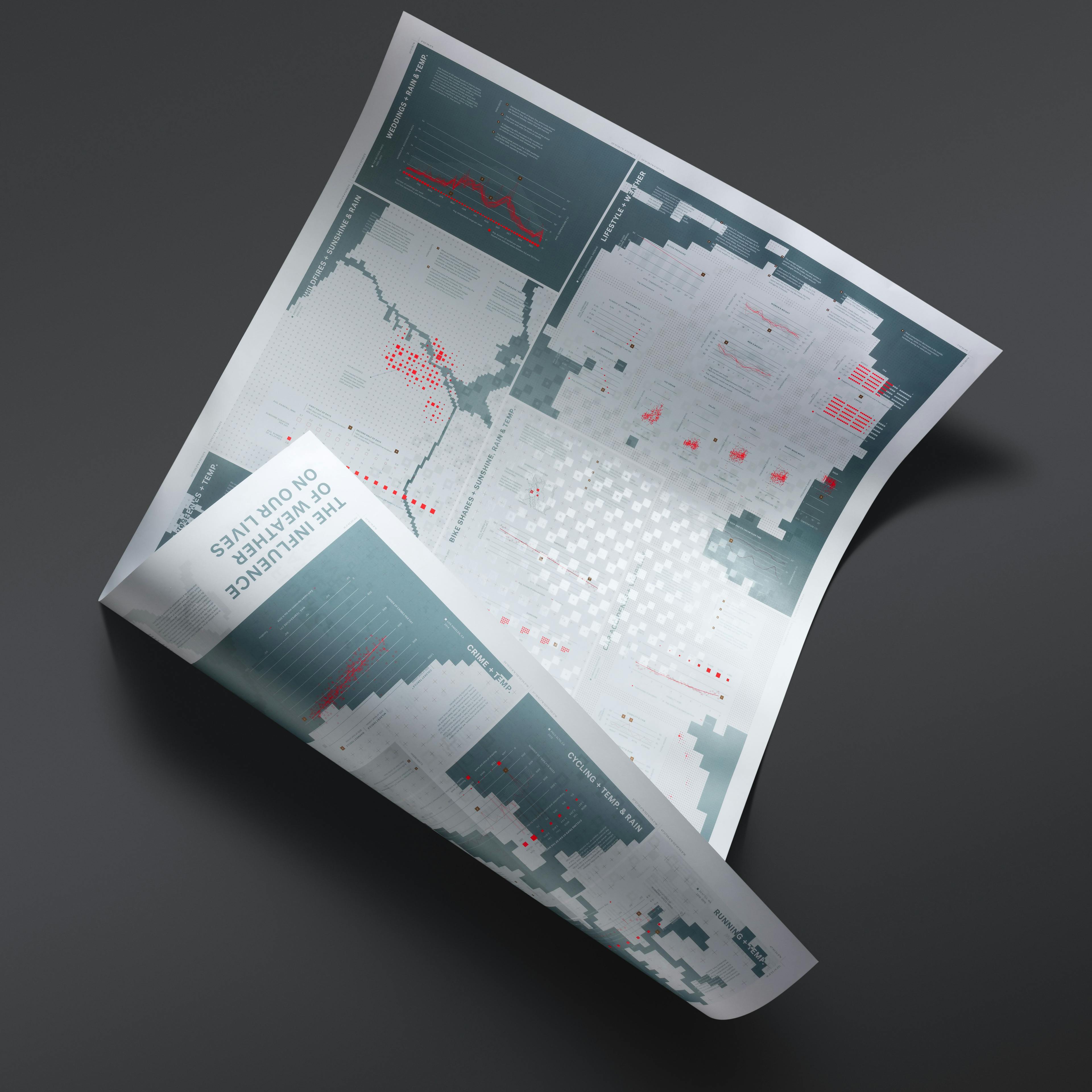

Highlights
Working with over 100 data sets and poring through more than 445 million data points, we were able to find interesting connections and correlations, and present them in over 60 data visualizations.
- We discovered that despite couples choosing to marry in warmer months, the fourth most popular week in Travis County, happens to be the wettest of the year with an average rainfall of 2.5 inches. In the Netherlands the Dutch prefer to celebrate King’s Day, which is in late April, to getting married.
- Surprisingly, in Florida, with every consecutive day of rainfall the average number of fatal car accidents decreases by 4.1%.
- Though there is an increase in the number of crimes in Los Angeles as weather warms, the temperature rise may simply provide better opportunities for crime – i.e. people leaving the home to enjoy the weather – rather than being a cause. In contrast, street robberies in Rotterdam increase in colder weather.
- In Groningen, men and women are at their lowest weight in July and highest in the colder months. However, men’s weight varies greater than that of women.
- In general, runners in Seattle maintain an average speed of 6.5 mph – 10.5 kmh – except in extreme weather conditions.
Watch a short video with a few highlights here.
Fourthedition
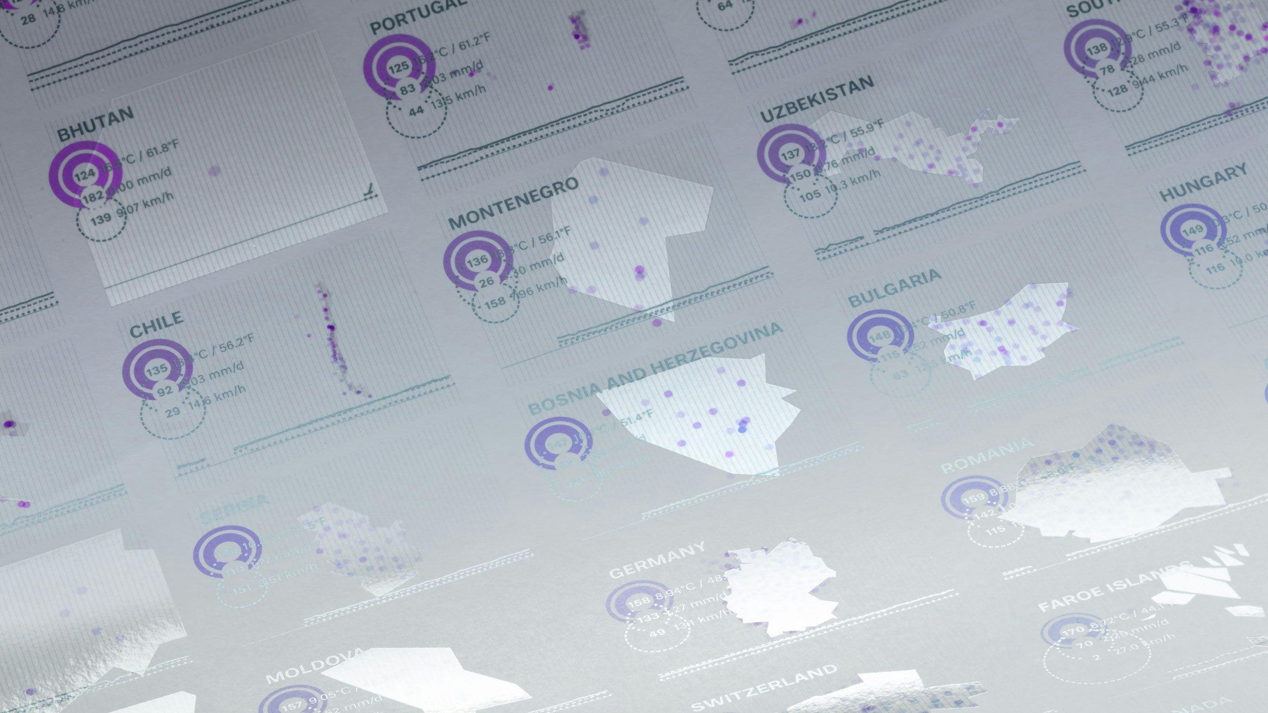
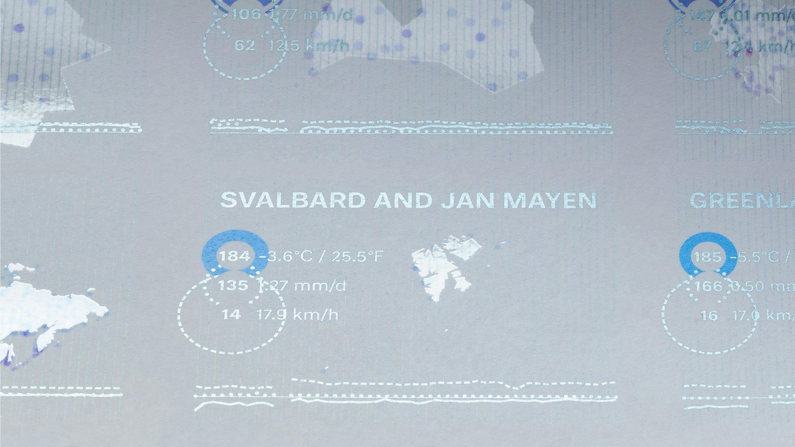
Globalweather;countryranks(1962-2021)
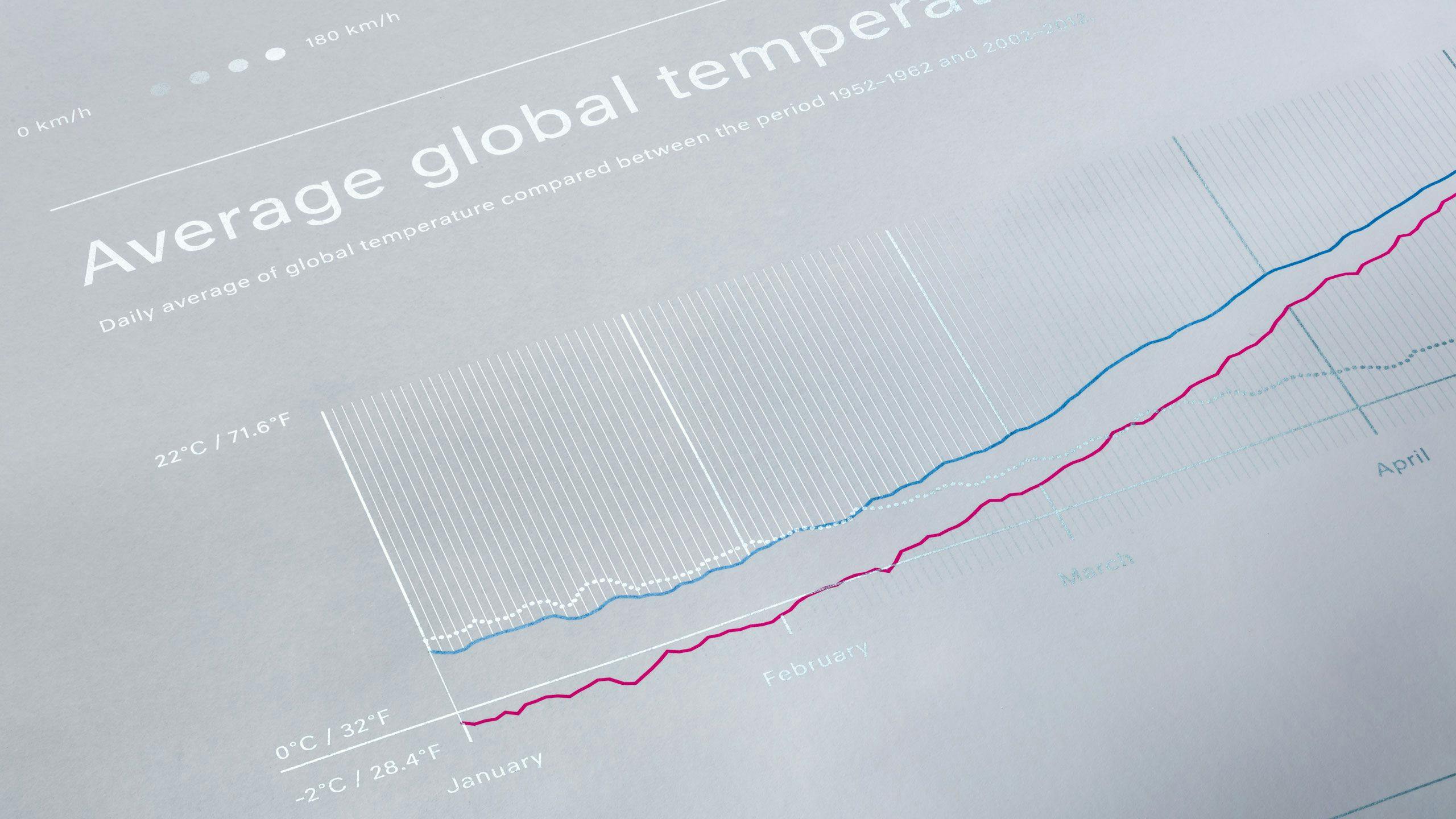
The fourth chart in our series examined global weather data from ±30,000 weather stations (based on the analysis of 736,995,534 global measurements of the National Climatic Data Center) over the last 50 years.
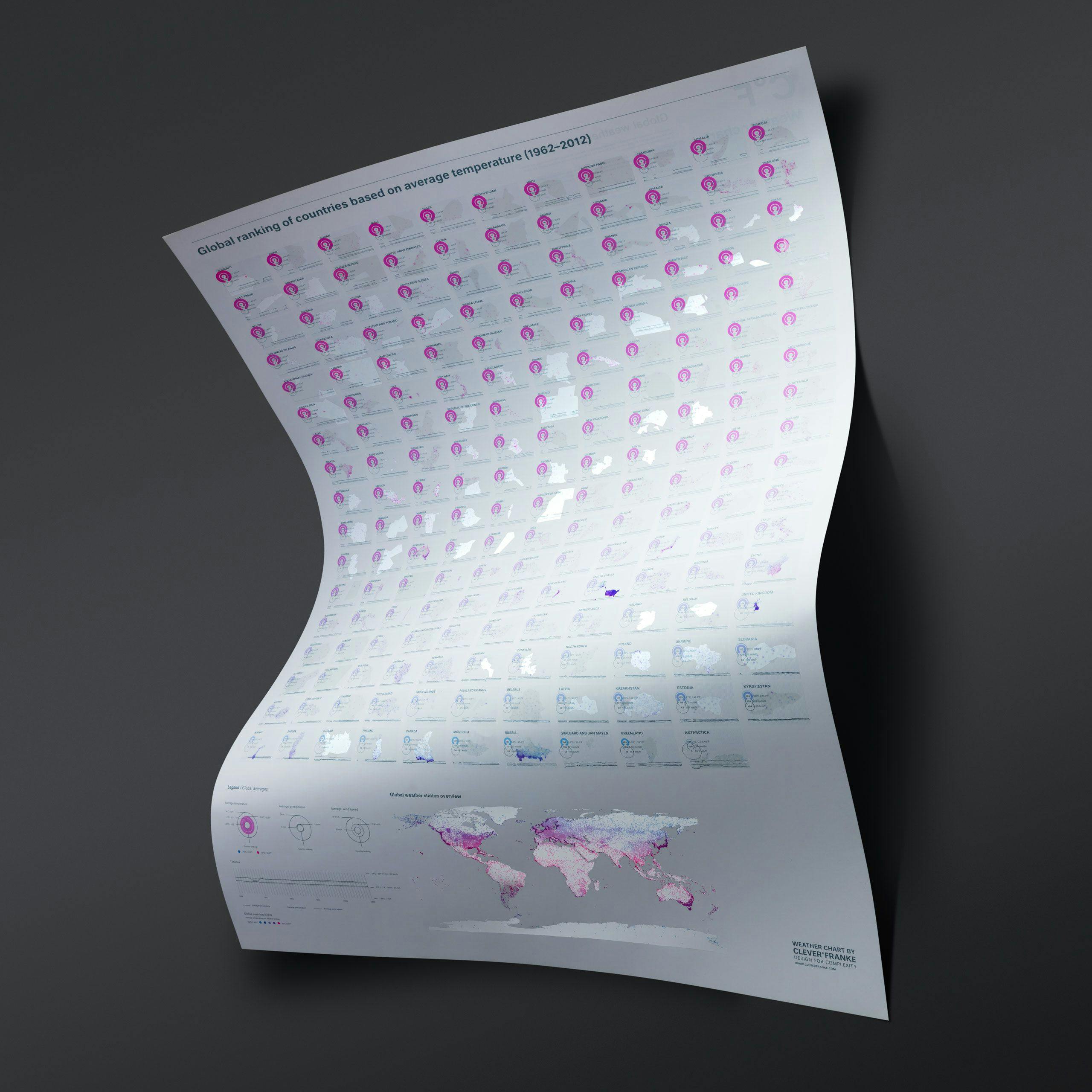
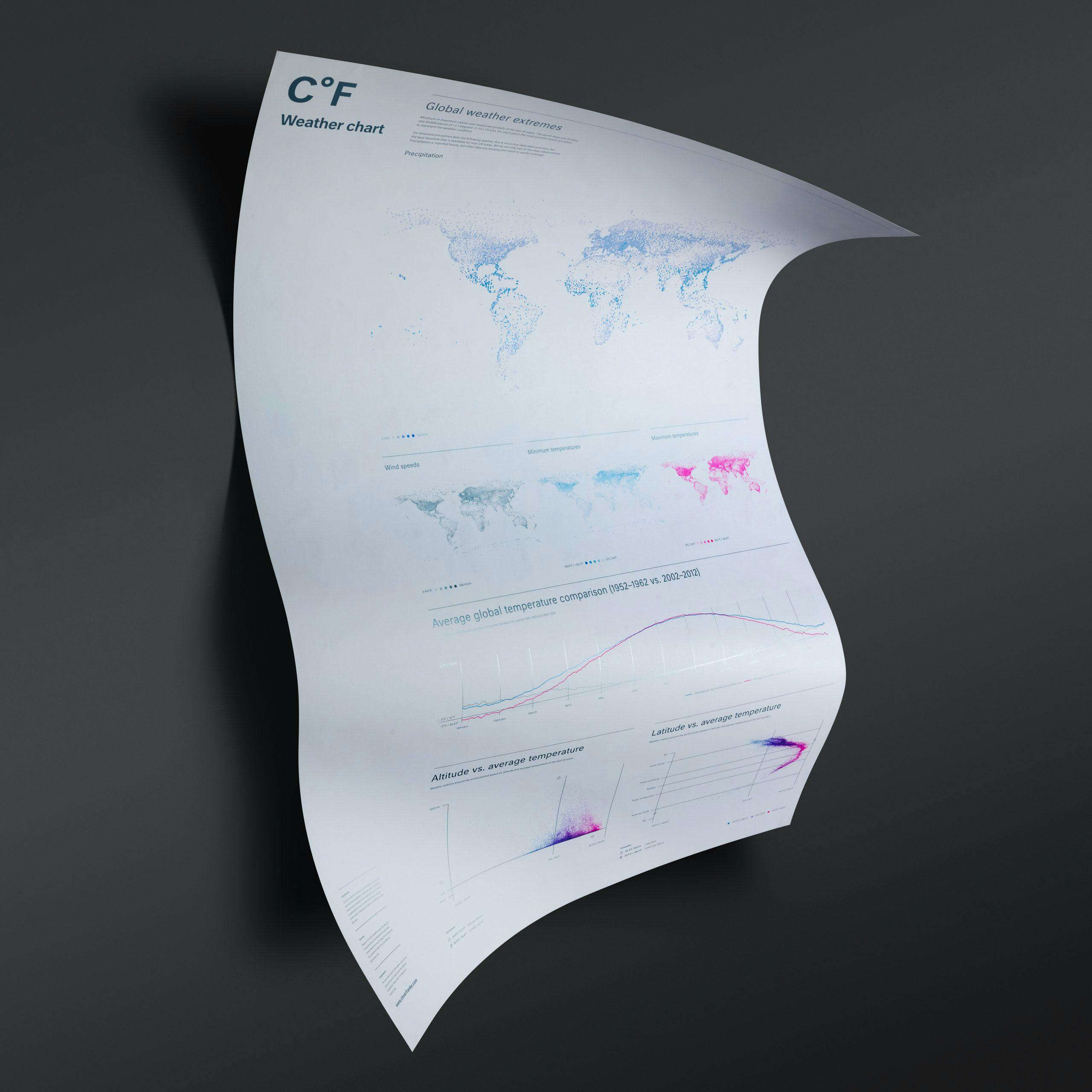
Highlights
- We found Djibouti to be the hottest country in the world, where an average temperature of 30.4°C / 86.8°F was measured.
- While the coldest area, not surprisingly, was Antarctica, where the average temperature is -15°C / -26.1°F. French Guyana was the wettest country in the world with an average daily rainfall of 6.6 mm.
- The Falkland Islands experienced wind speeds averaging 27 km/h, in stark contrast to the ‘calmest’ country, Myanmar (Burma) with an average wind speed of 3.88 km/h.
- Global averages over the past 50 years were 10.9°C / 51.7°F, 1.6 mm of precipitation per day and a wind speed of 12.6 km/h.
- With an average temperature of 10.1°C / 50.3°F, The Netherlands took the 151st position, was ranked the 101st rainiest country with an average daily precipitation of 1.77 mm, and is amongst the windiest countries (placed 13th) with an average wind speed of 18.1 km/h.
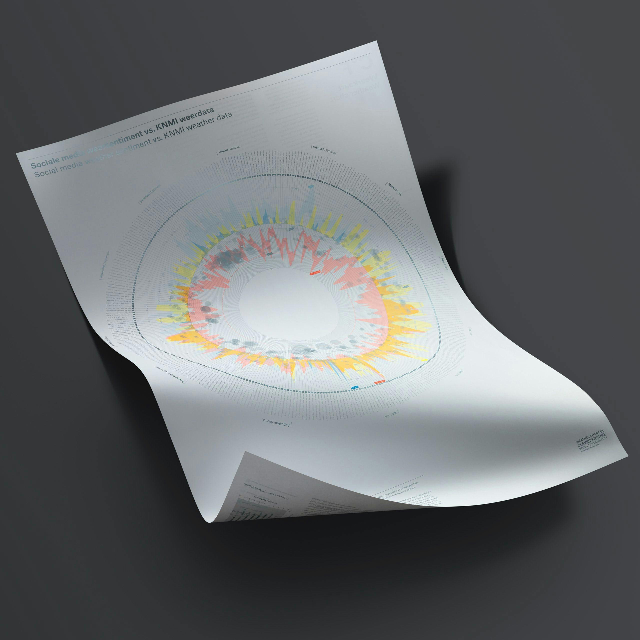
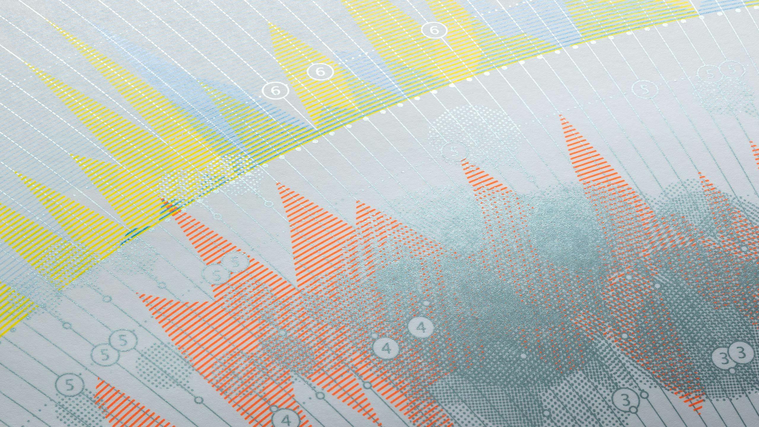
Thirdedition
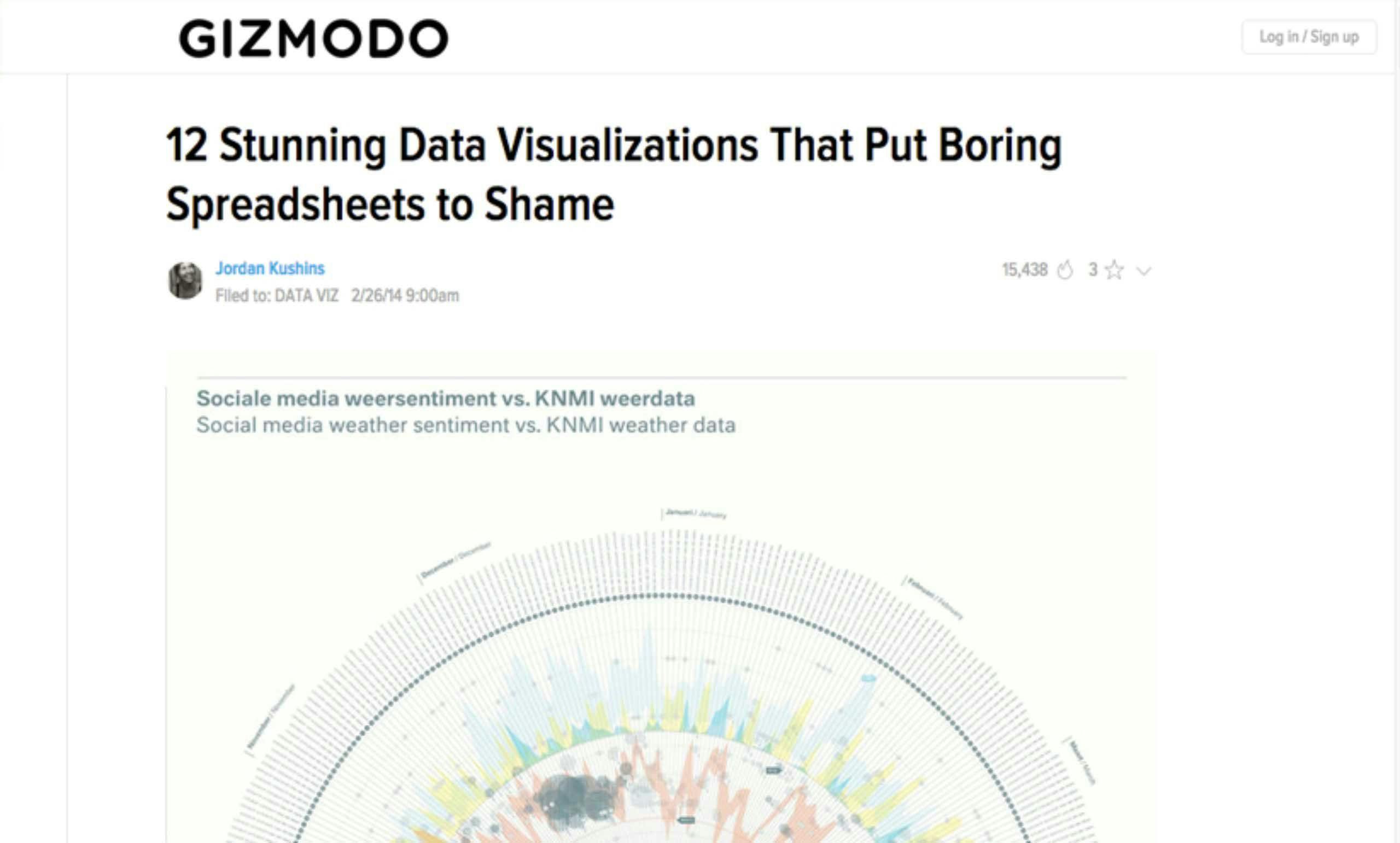
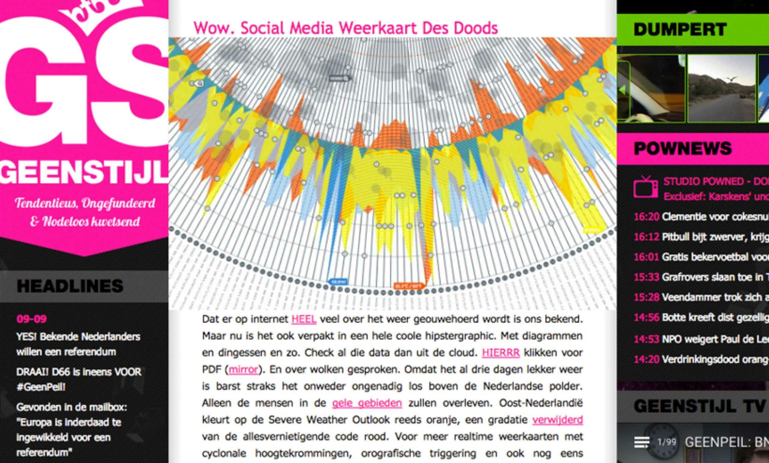
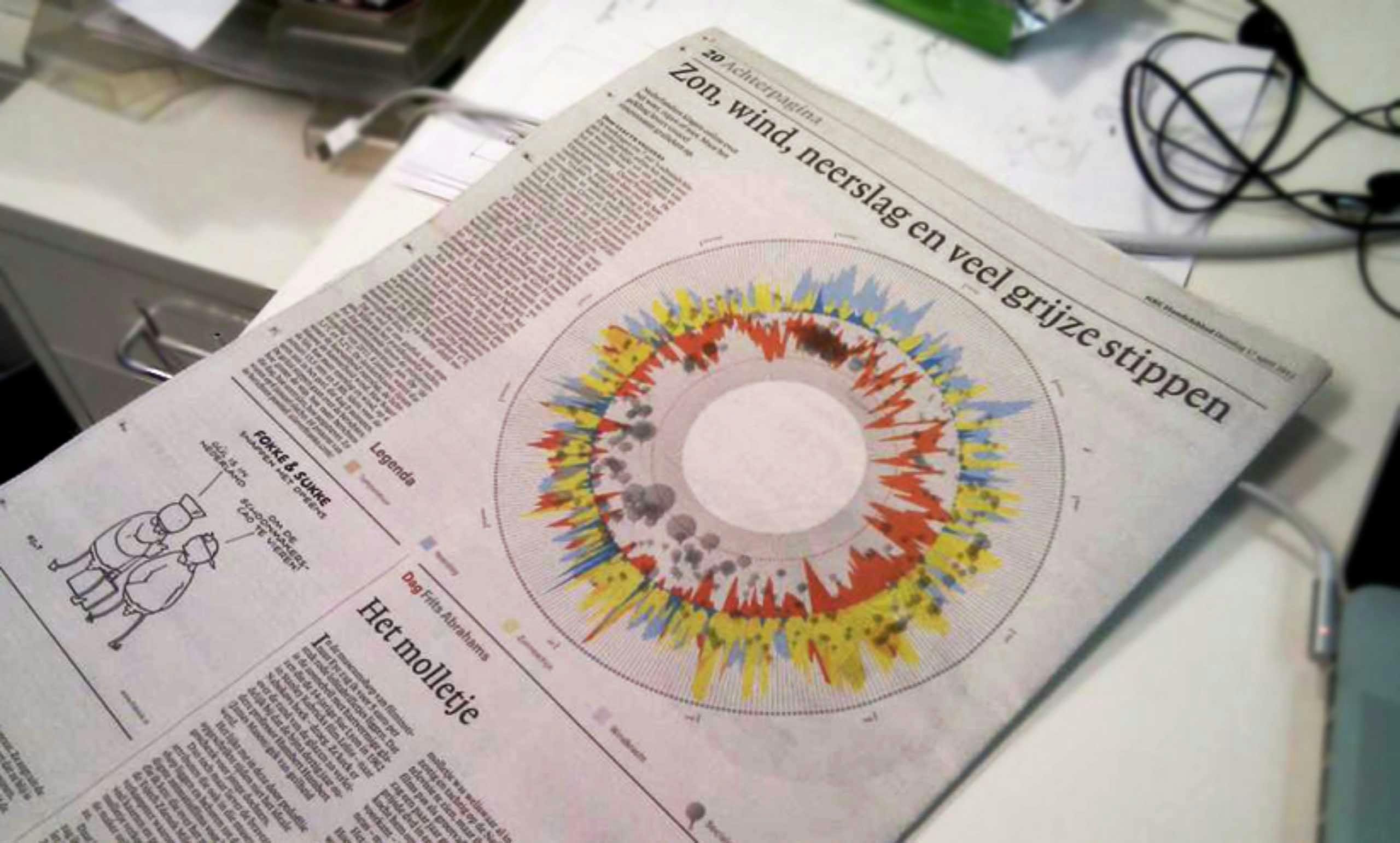
Socialmediasentimentoftheweather
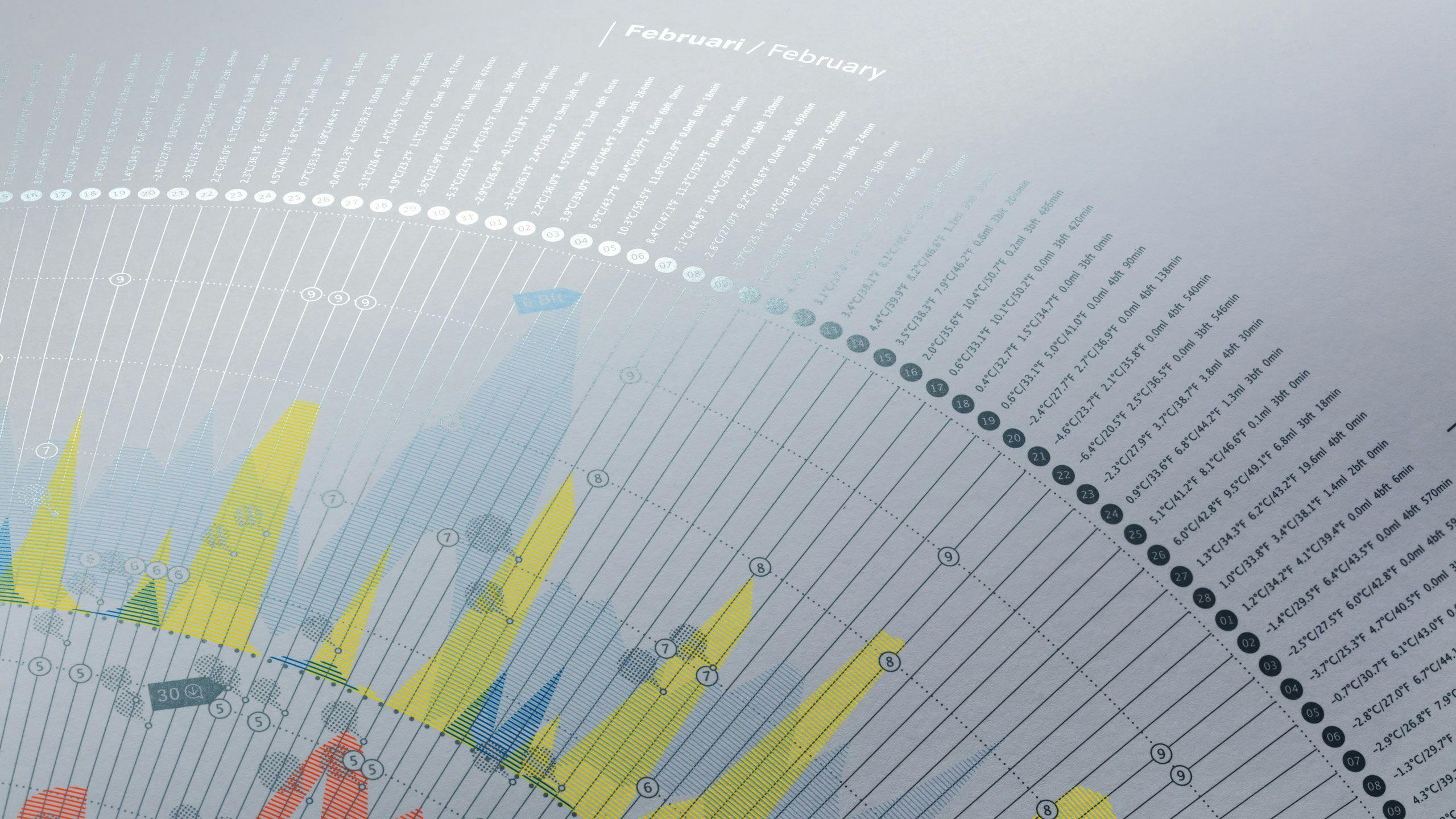
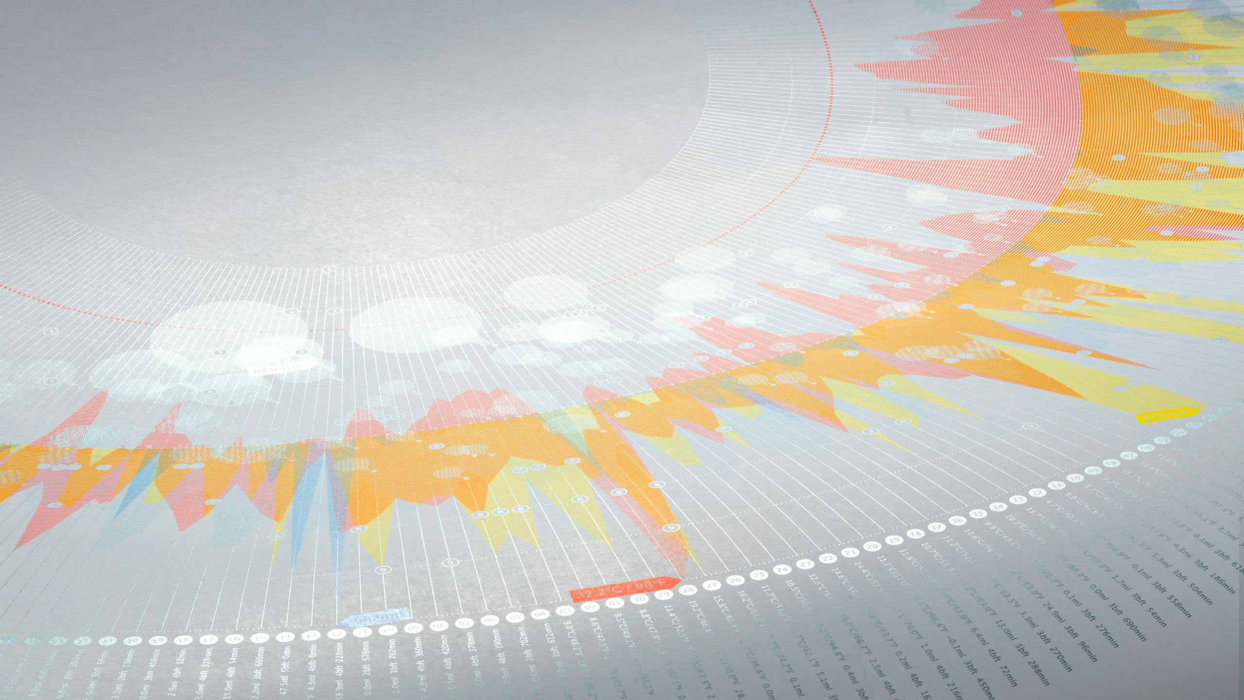
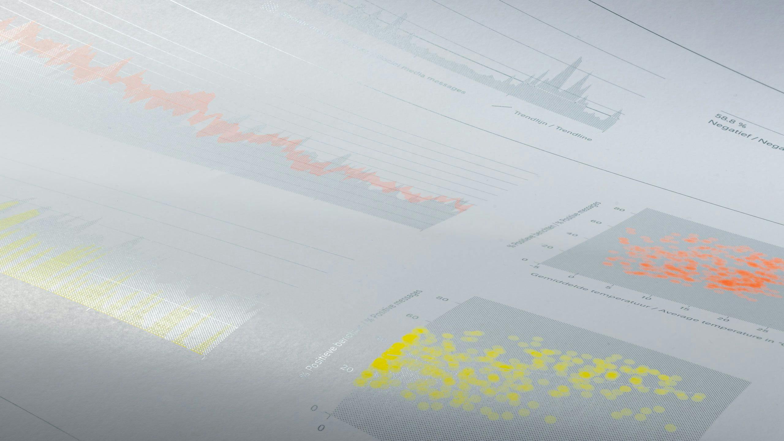
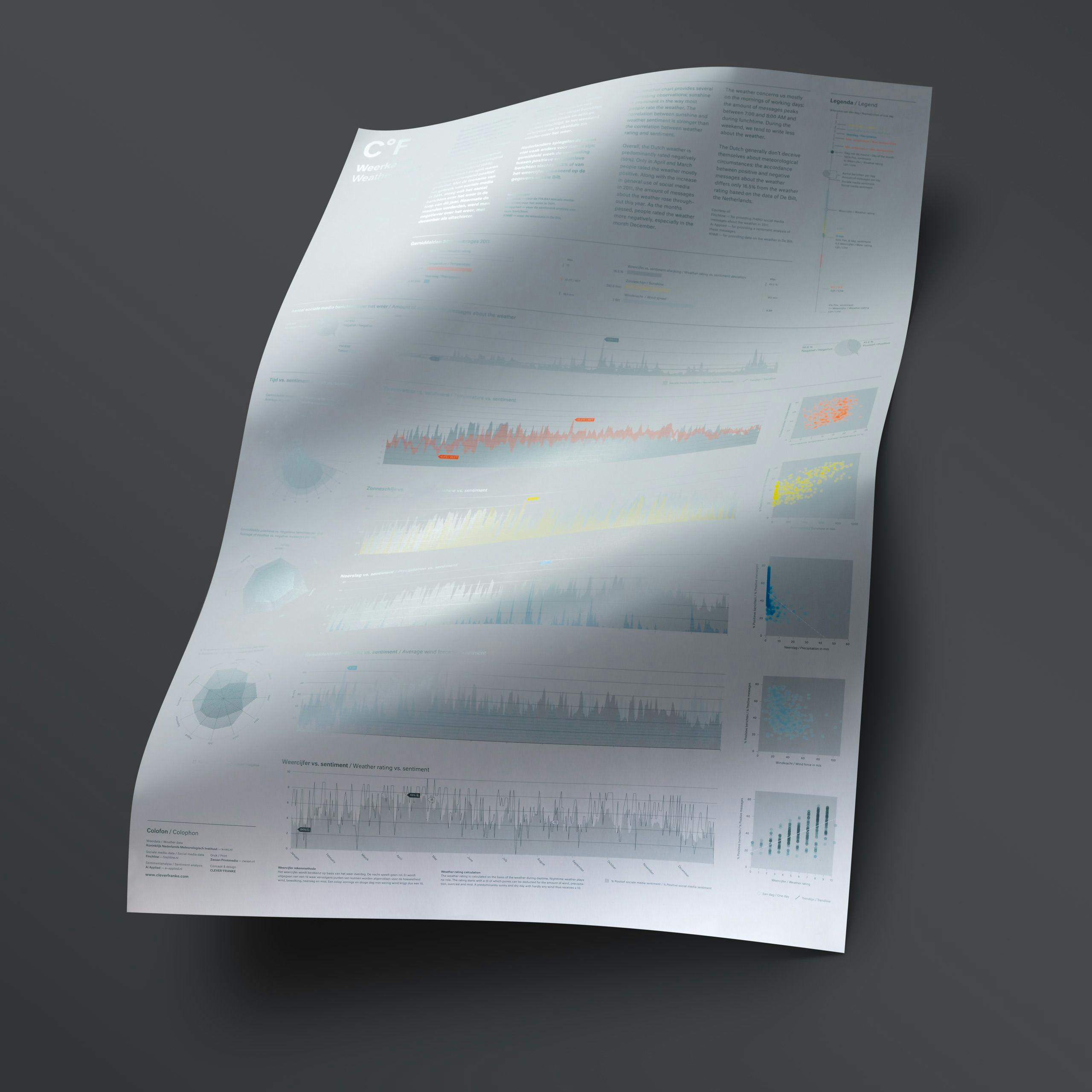
Compiled using weather data from 2012, the third edition focused on the relationship between weather data provided by the KNMI (Royal Dutch Meteorological Institute) and the reactions to the weather in social media. The idea behind this edition, was to investigate how the public rated the weather on the Internet and if there was any correspondence with the meteorological facts.
To analyze this, we used 714,843 messages collected from a variety of websites, social media platforms and Internet forums, provided by Finchline, a company specialized in monitoring social media.
Highlights
The results of the Weather Chart provided some interesting observations. For instance; sunshine is a prominent component in the way most people rate the weather. The correlation between sunshine and the reaction to the weather is stronger than the correlation between the predicted rating for the weather of that day and sentiment. When the sun shone, people experienced that day more positively over the predicted rating.
- Overall, the weather in the Netherlands had a predominantly negatively rating (58%).
- The exceptions being only in the months of April and March, when the weather was mostly positively rated.
- As the year progressed, the rating of the weather became increasingly negatively, especially in the month of December.
- Along with a general increase in social media activity in 2011, the number of messages concerning the weather rose throughout the year.
- Of most concern in the morning during the week, the number of messages about the weather peaked between 7:00 and 8:00am, and again during the lunch hour.
- Messages on the weekend, tend to center less around the weather.
- The Dutch show little discrepancy in their reaction to the weather: the correlation between positive and negative messages about the weather differed only by 16.5% from the weather rating based on the data provided by the KNMI.
Secondedition
Theweatherin2011
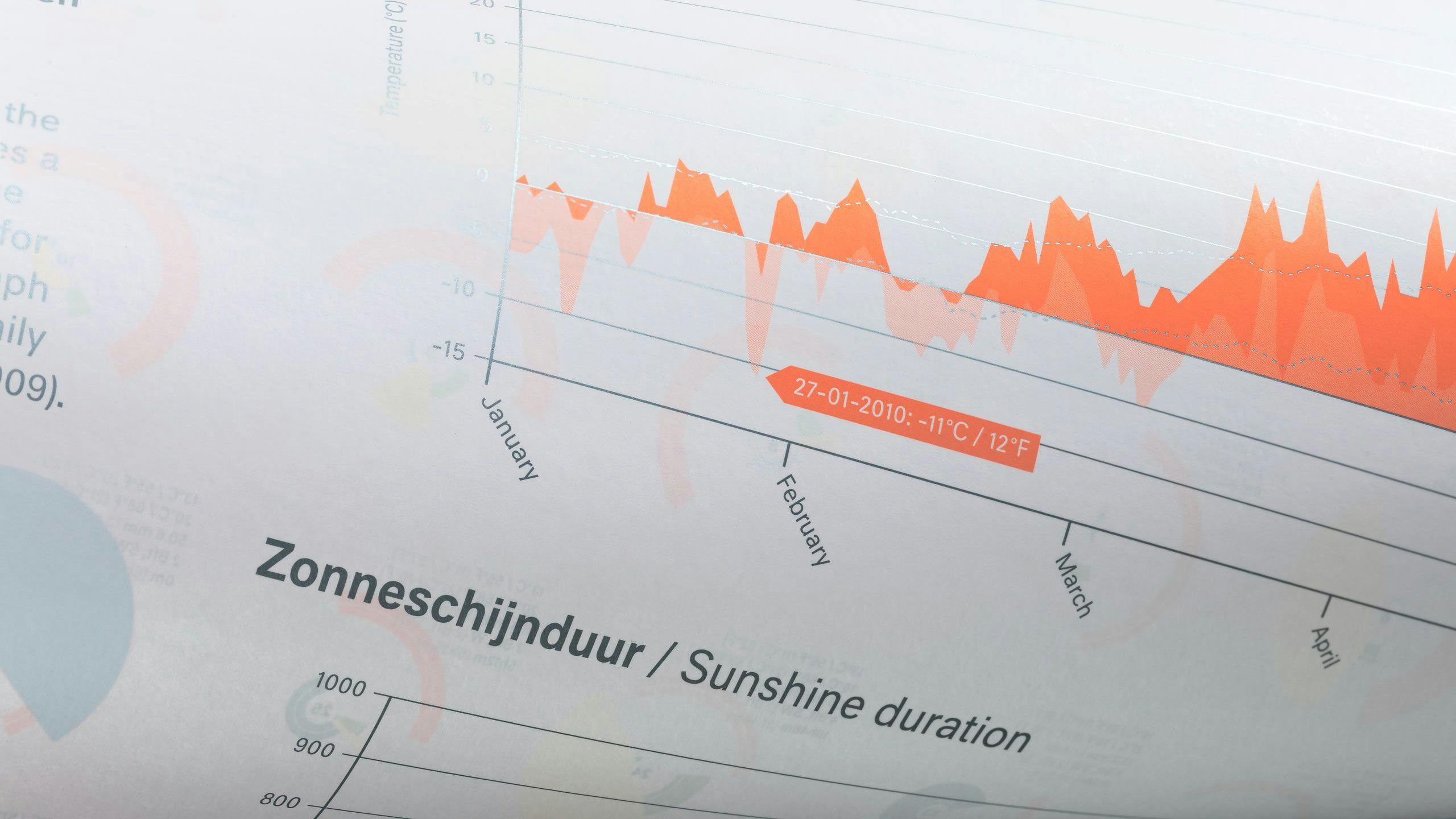
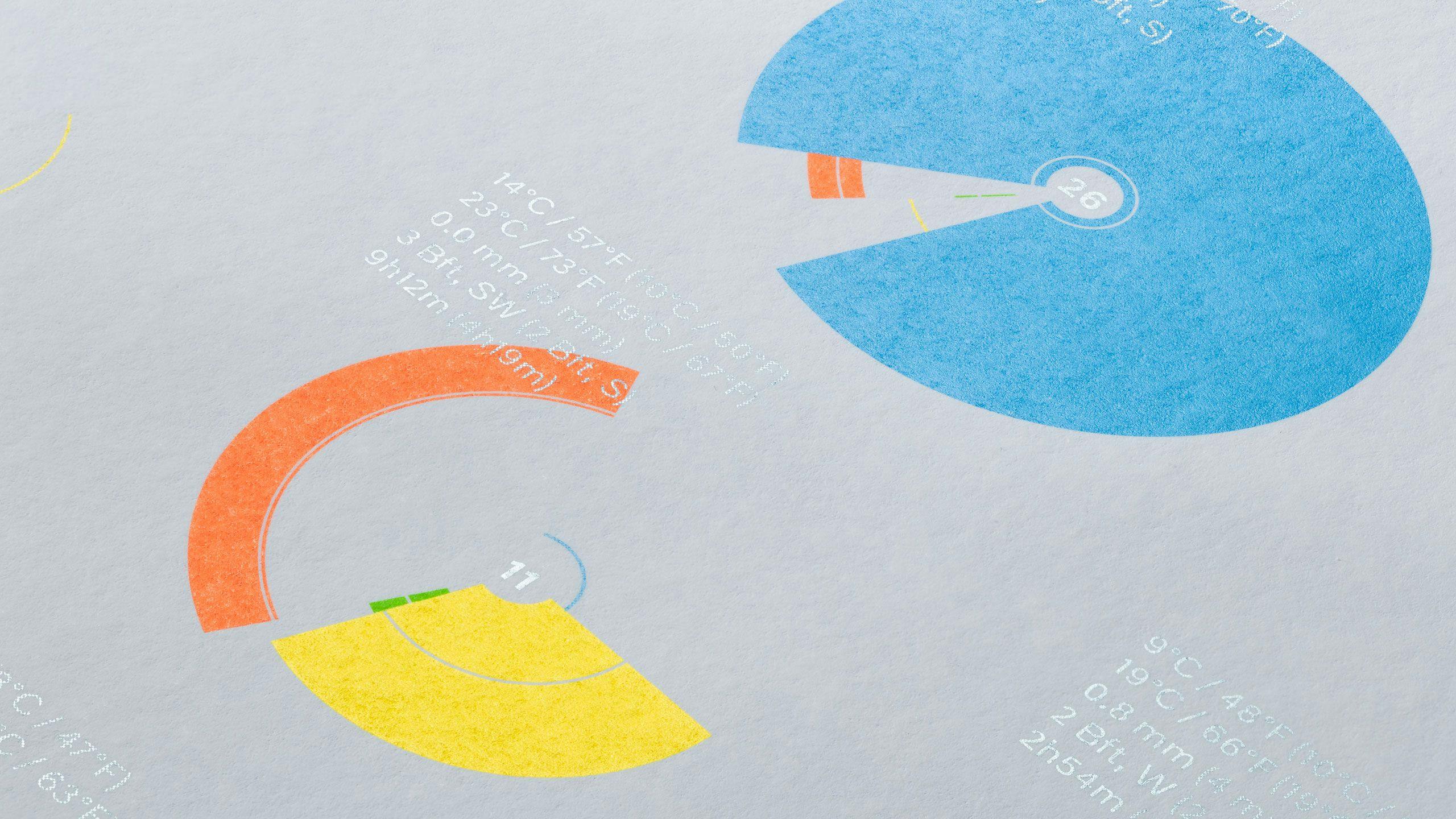
The second edition of the Weather Chart focused on the weather in 2011. We highlighted the most prominent weather condition on a specific day, for every day of the year in a glance.
We did this by showing the angle of the ‘pie slice’ in relation to the other weather elements and the deviation in comparison to the absolute average of 2010. As such, every day in 2010 could be easily classified as sunny, rainy or windy.


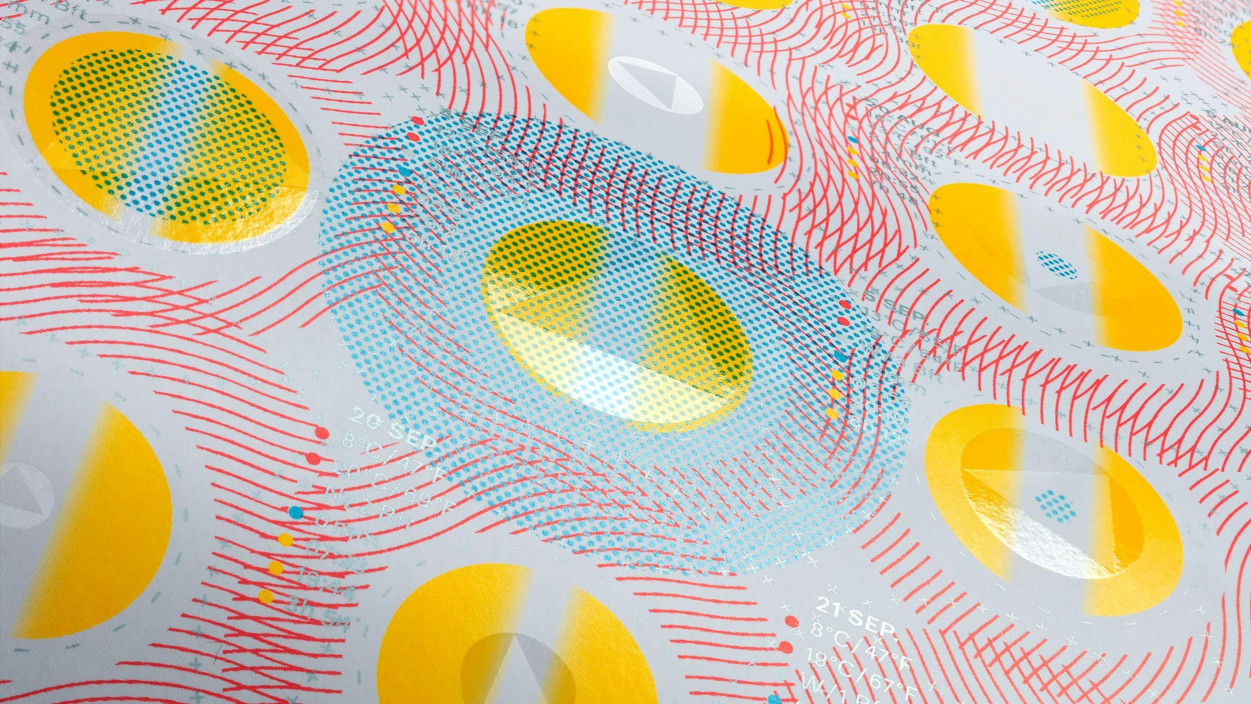
Firstedition
Firstedition
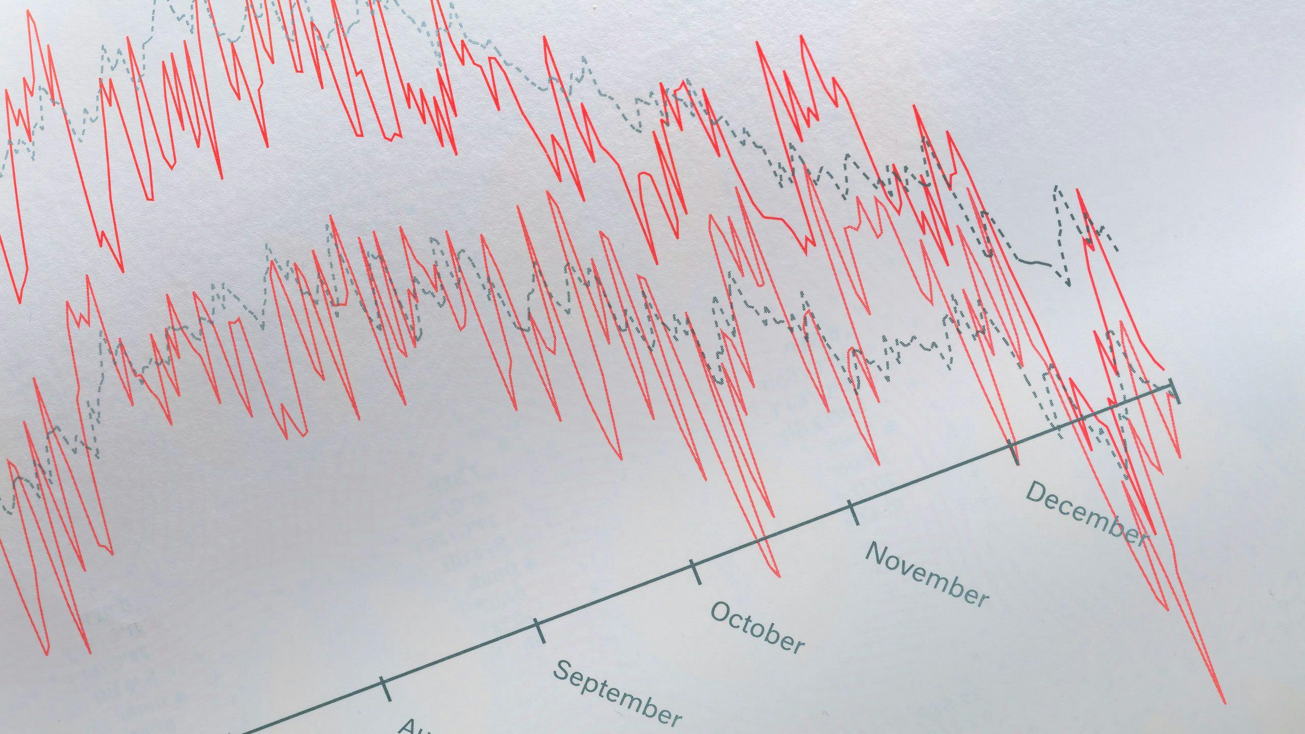
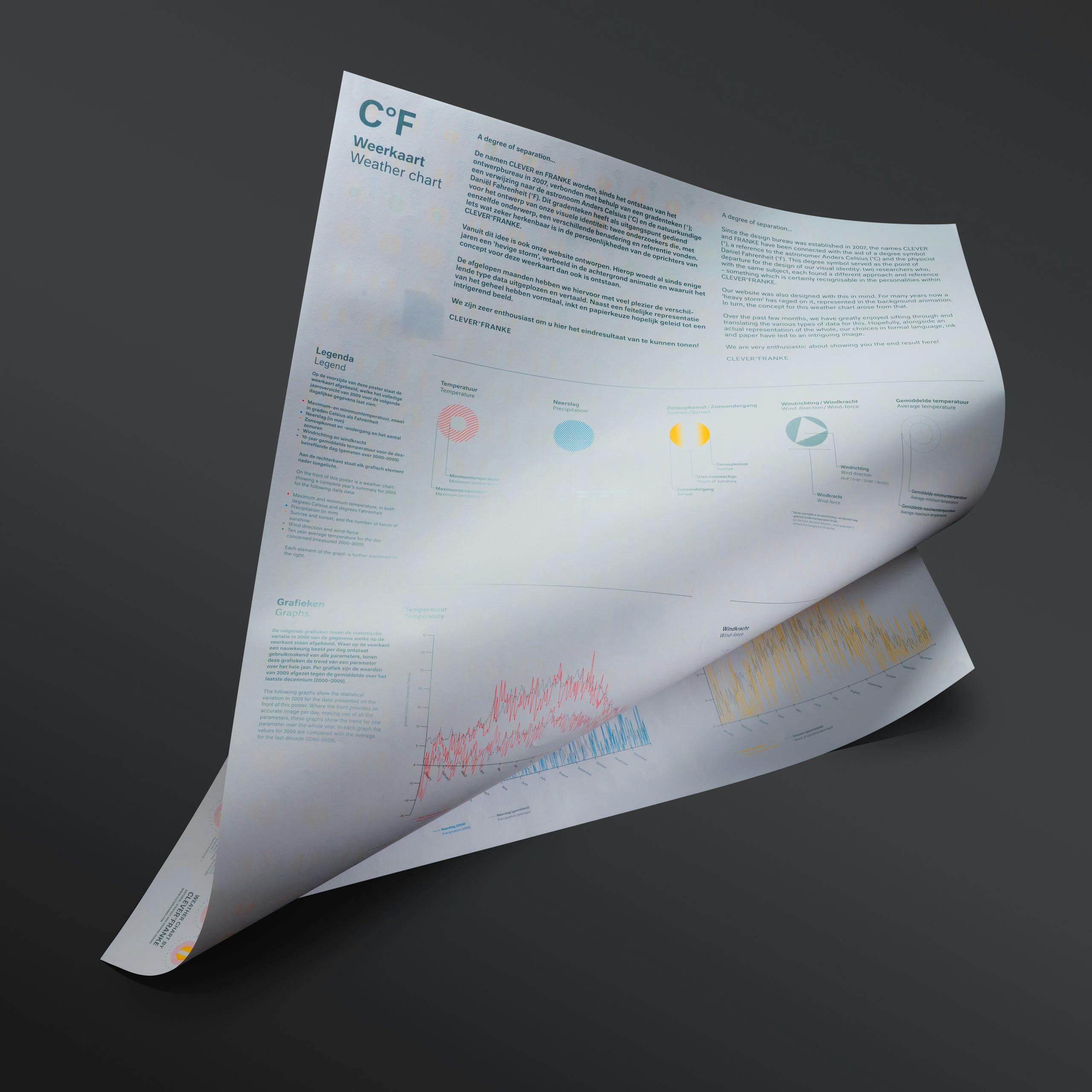
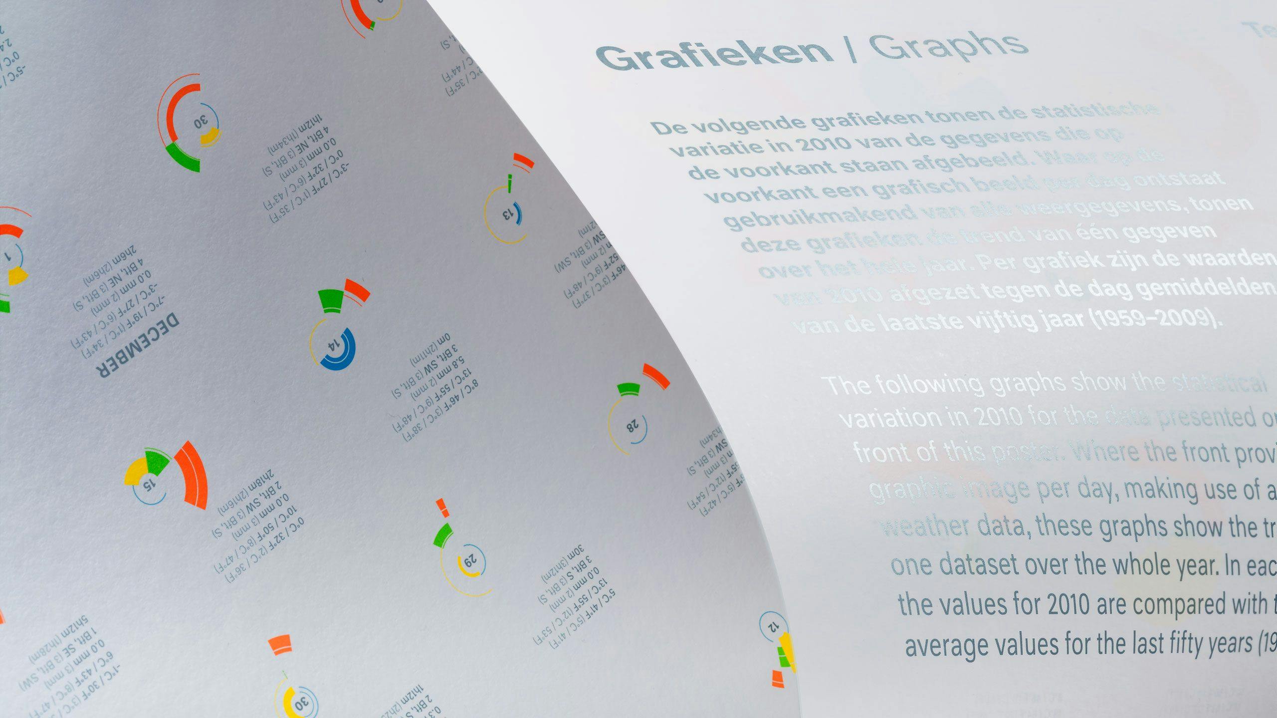
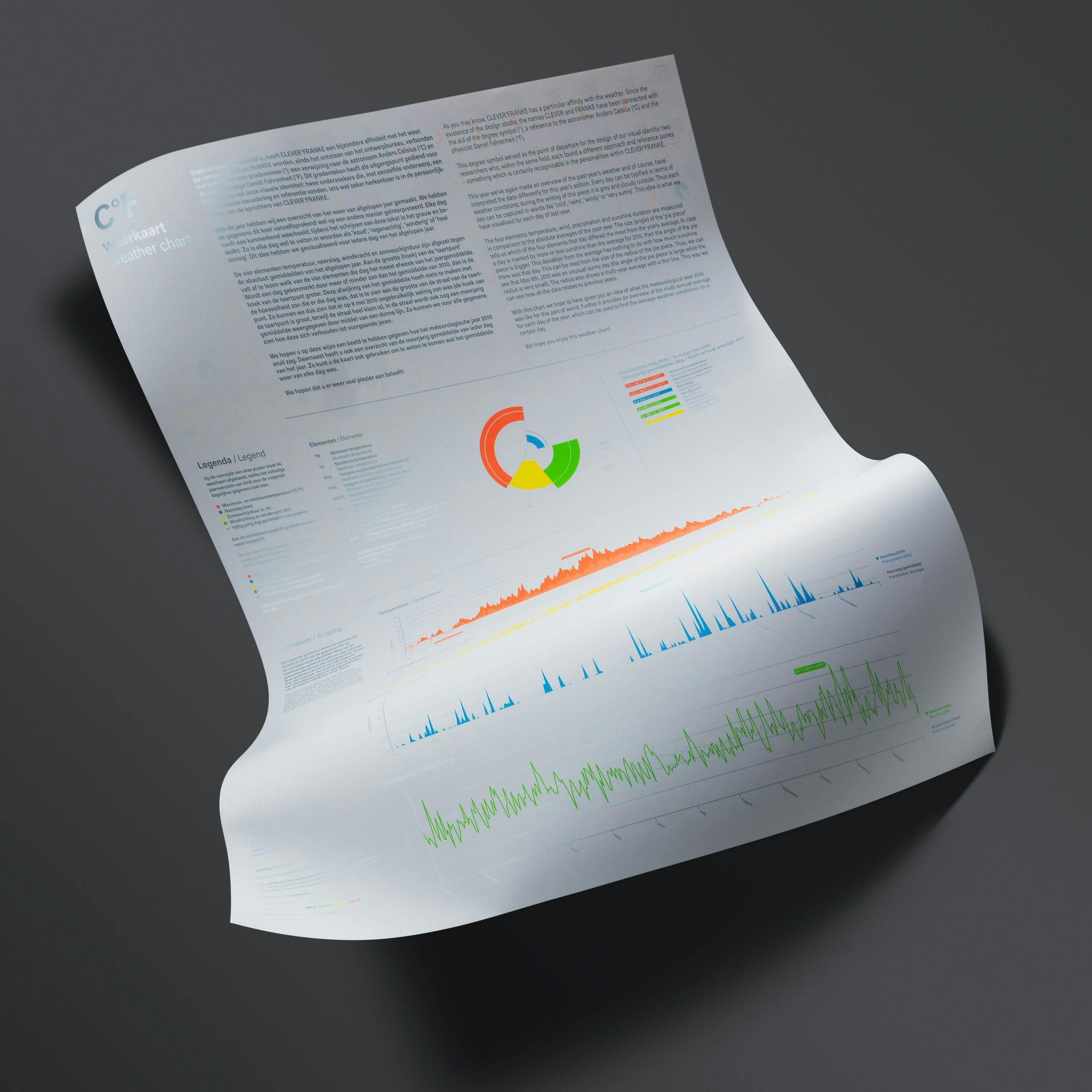
The very first edition of the Weather Chart features an overview of the weather for our location in the Netherlands for each day of the year 2009.
Per day, the Weather Chart captures data relating to the minimum and maximum temperatures, wind speed and direction, precipitation, the amount of sunshine, sunrise and sunset and the averages of all the data for the period over 2000 until 2010.