Visualizing scientific progress and insights in a blockchain driven open platform
- Client
- Knowledgr
- Deliverables
- Digital platform design
The challenge
Knowledgr is a public blockchain and open-access scientific platform designed to modernize the infrastructure for scientific funding, research, and publishing.
Knowledgr asked us to visualize the method and progress of scientific research over-time in an interactive data visualization. This blockchain based platform revolutionizes the scientific world as it enables open science sharing. It serves as a new way for different audiences to navigate and explore science and see how different scientific researches connect.
The platform had to not only build on open science access, but also introduce a new way of funding, democratize the industry and give credit to authors using blockchain technology.
Value delivered
We turned a complex new scientific ecosystem into a friendly and accessible visualization, which reflects the technical aspects of science research and experimentation.
Background
Even though the platform is built on blockchain technology, the concept was based on spreading scientific knowledge to all and making science more understandable, accessible and open.
In the exploration phase, it was crucial for us to understand the data and structure behind it: the entities in the blockchain and how they relate to the scientific method.
Followingtheprocessofscientificresearch
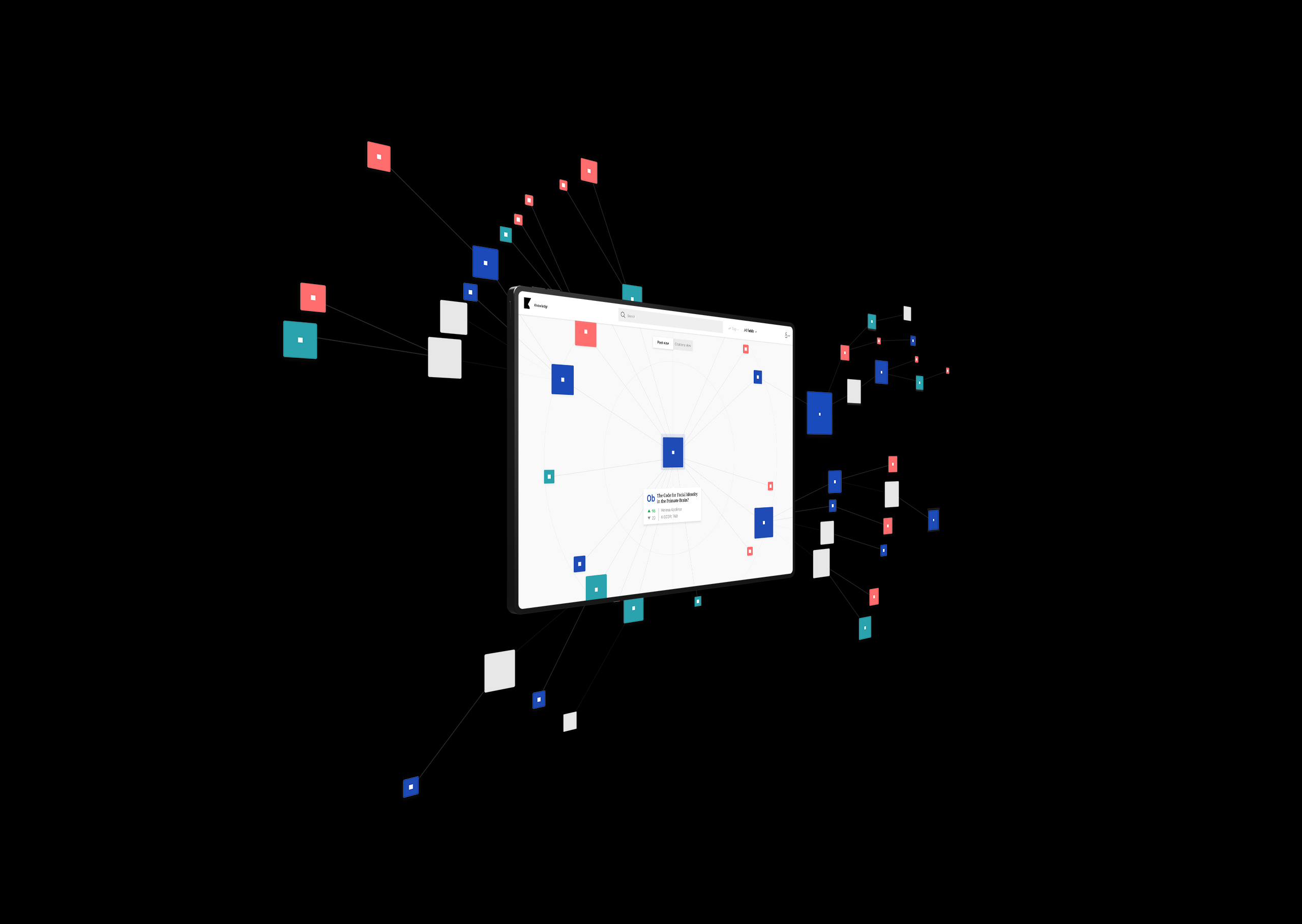
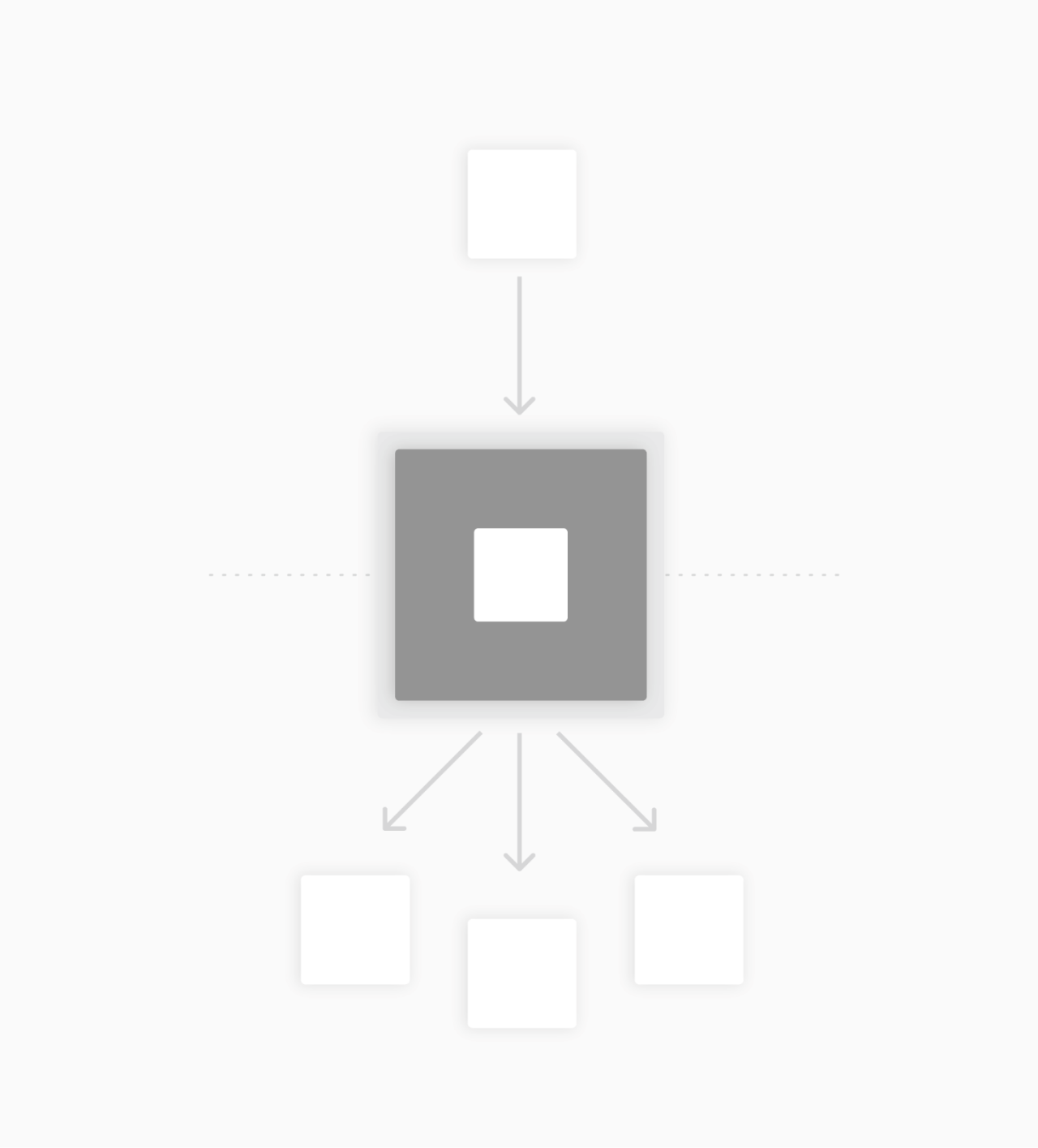
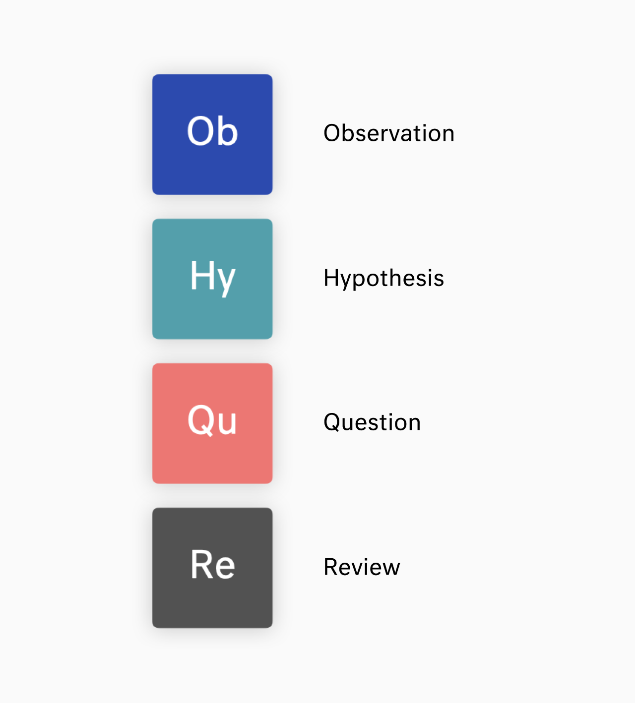
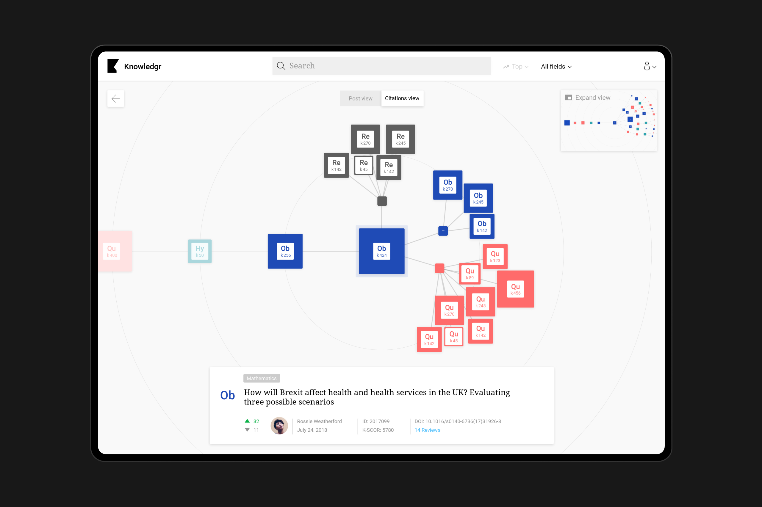
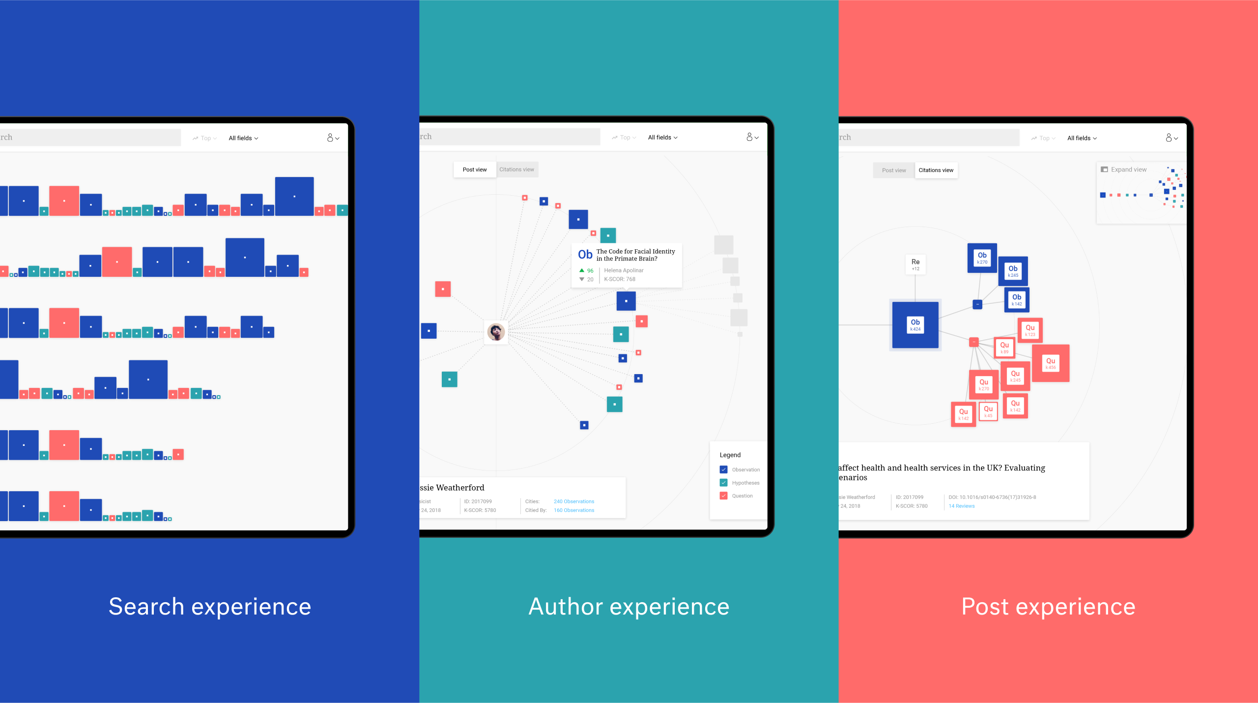
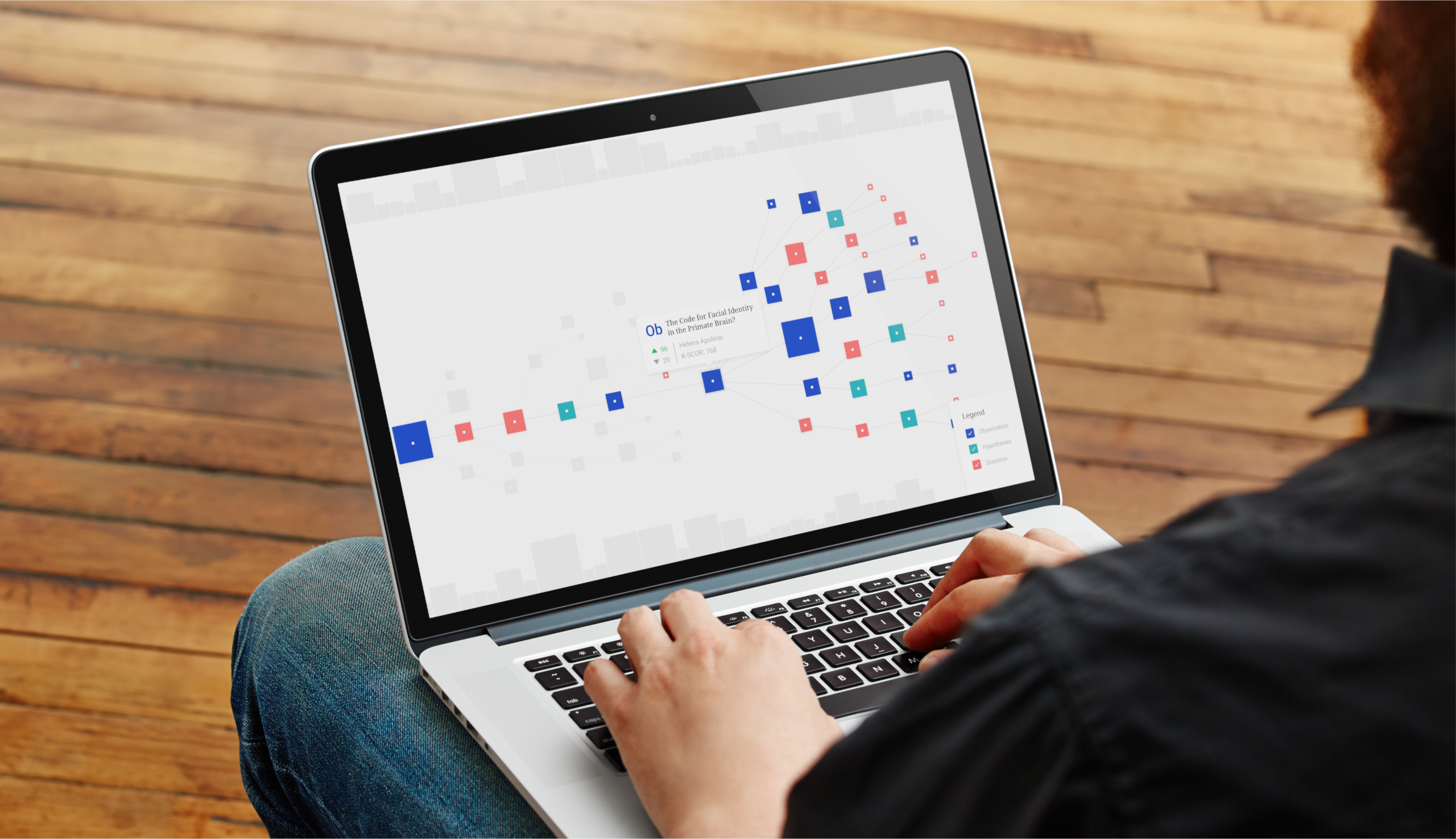
The Knowledgr platform creates a knowledge graph of user posted questions, hypotheses and observations linked to each other following the scientific method. To visualize the process of the scientific method, we took the user post as a starting point to explore the posts that came before and the posts that it inspired.
Posttypes
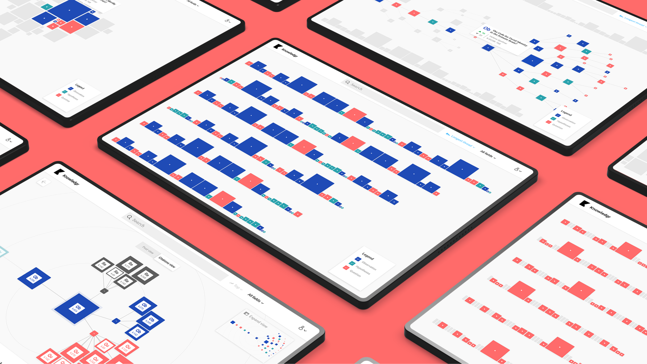
Colored squares represent the different posts types in line with the steps of the scientific method. The shape of the squares was subtly inspired by the periodic table.
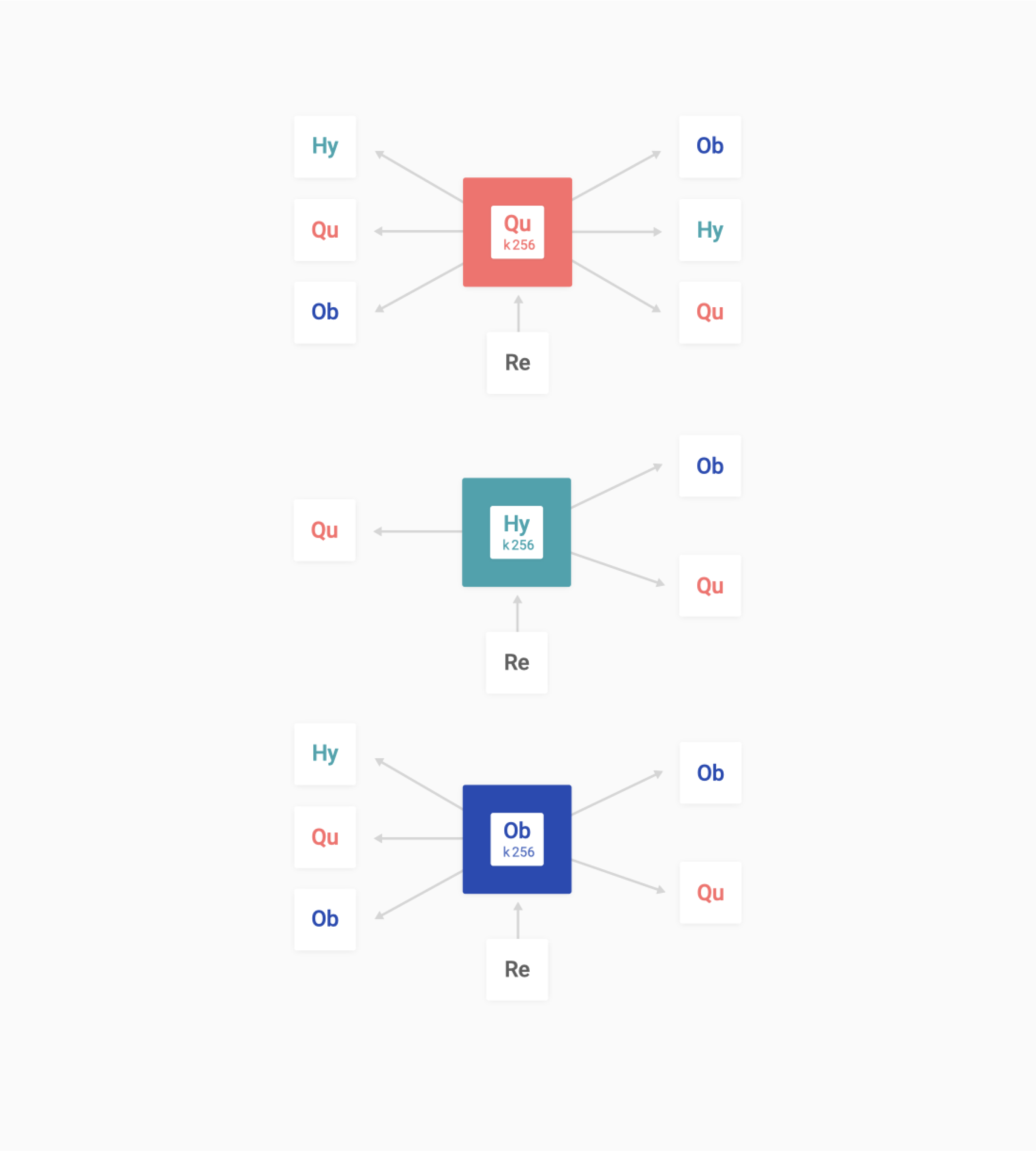
Connectingtheresearchideas
User posts build upon each other. Taking that idea, we outlined the logic for how posts would relate to each other and flow within the UI. The visualization shows the selected post centrally and the origin of the post to the left and the impact of the post to the right to indicate to the user that you can navigate in multiple directions.
Phases and toolkit items used
Design
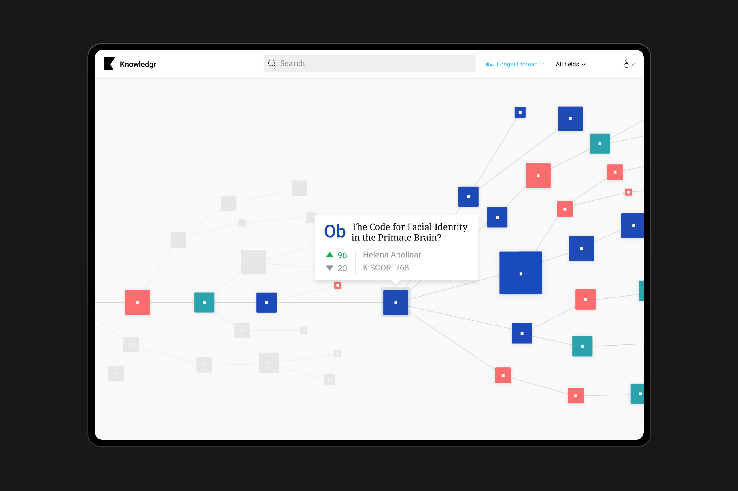
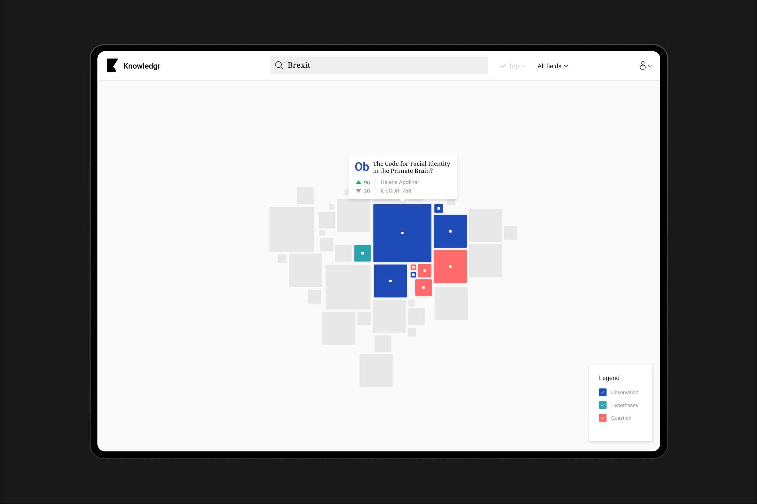
We created a new type of network visualization with a friendly and accessible UI that still reflects the technical aspects of scientific research and experimentation. Rather than showing the entire network or blockchain as a network, we focussed first on a single entity in the network: a question, hypothesis, or observation.
Then, a user can look back to trace the origin, or find new observations or hypotheses. This way, the interface provides transparency and actionable information.
Keyfeatures
Visualexploration
We provide a visual way to explore and browse the entire graph of scientific research and thought, empowering the user to browse through the scientific method, tracing each observation or hypothesis to its original source.
Providingcontext
From any post in the Knowledgr platform you can see what posts came before and what posts it inspired. Zooming in and out goes seamlessly, and each level automatically goes to different views, each enabling unique insights.
Accessibleforall
Through simple interaction paradigms and accessible colors, typography, and design we strive to make the visualization accessible to a diverse audience.
Results
This is going to feel and look incredible! There is nothing out there like this, which is mind-blowing given the added utility.
Cristina Escoda, Co-founder Knowledgr